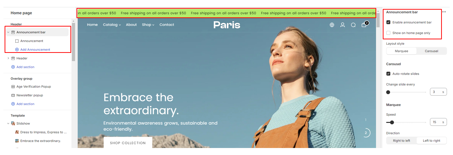
Using the Announcement bar section
The announcement bar section in our Paris Theme allows you to display important messages, promotions, or announcements prominently at the top of your store header. This documentation will guide you through the process of configuring and customizing the announcement bar section in our theme, including the layout options of "Marquee" and "Carousel" views.
Configure the announcement bar section
- Navigate to Customize Theme editor: From the “Online Store” click on "Themes", locate our Paris theme and click on the Customize button:
- On the Section settings on the left side-bar locate the Announcement bar section
Once you've added the announcement bar section, you can configure its settings to suit your needs, including the layout options.
- Enable Announcement Bar: Toggle this setting to enable the announcement bar section.
- Show on Homepage Only: Choose whether to display the announcement bar on the homepage only or on all pages of your store.
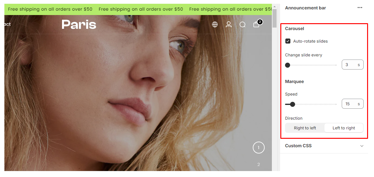
- Layout Options: Choose between the "Marquee" and "Carousel" views for your announcement bar.
- Marquee: This option scrolls the announcement message horizontally across the screen.
- Carousel: This option displays multiple announcements in a rotating carousel format.
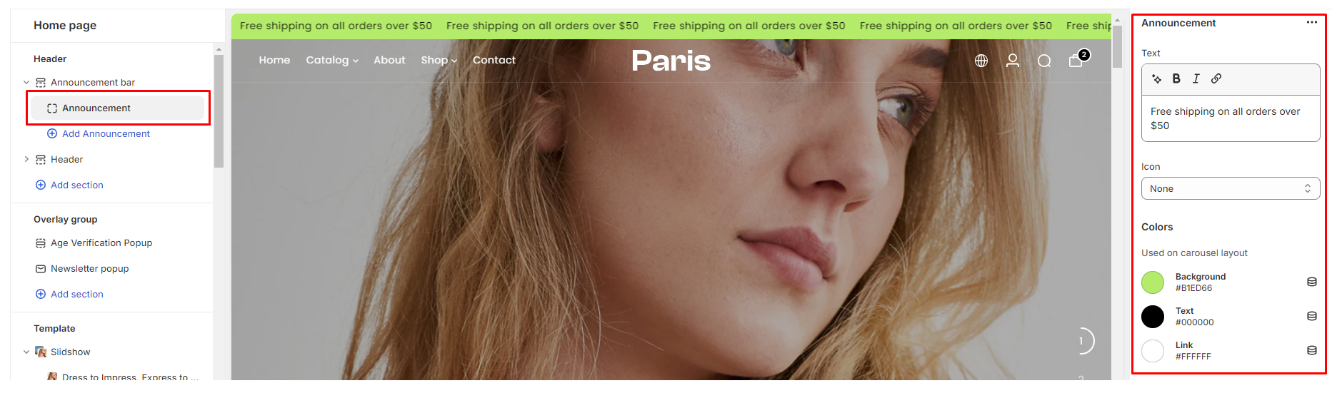
Block settings
- Text: Add your announcement message in the text area provided. This could include promotions, shipping information, or any other important announcements you want to convey to your customers.
- Icon: Optionally, you can add an icon to the announcement bar to draw attention to it.
- Colors (Carousel Layout): Customize the appearance of the announcement bar for the carousel layout. This includes background color, text color, and link color.
Best Practices
- Keep your announcement brief and to the point to ensure it grabs customers' attention.
- Use contrasting colors for the text and background to make the announcement stand out.
- Update the announcement regularly to keep customers informed about new promotions or important updates.
- Consider using urgency language to encourage customers to take action, such as "Limited Time Offer" or "Ending Soon."
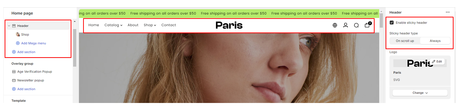
Header
The header of your Shopify store plays a vital role in shaping the overall user experience and branding of your online storefront. It serves as a navigational hub, providing visitors with essential links and functionalities to explore your products or services seamlessly.
Utilizing the Header section
- Navigate to Customize Theme editor: From the “Online Store” click on "Themes" locate our Paris theme, and click on the Customize button:
- On the Section settings on the left side-bar locate the Header section
Configure the Header section
There are a number of settings available to configure the header which include:
- Enable Sticky Header
The Sticky Header feature allows your header to remain visible at the top of the page even as users scroll down. You can choose between two types of sticky headers:
- On Scroll Up: The sticky header will appear only when the user scrolls up the page.
- Always: The sticky header will always remain visible at the top of the page regardless of the scrolling direction.
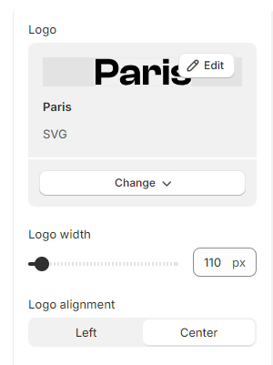
- Logo
- On Upload Field: You can upload your logo image here.
- Logo Width: Adjust the width of your logo for optimal display.
- Logo Alignment: Choose whether to align your logo to the left or center of the header.
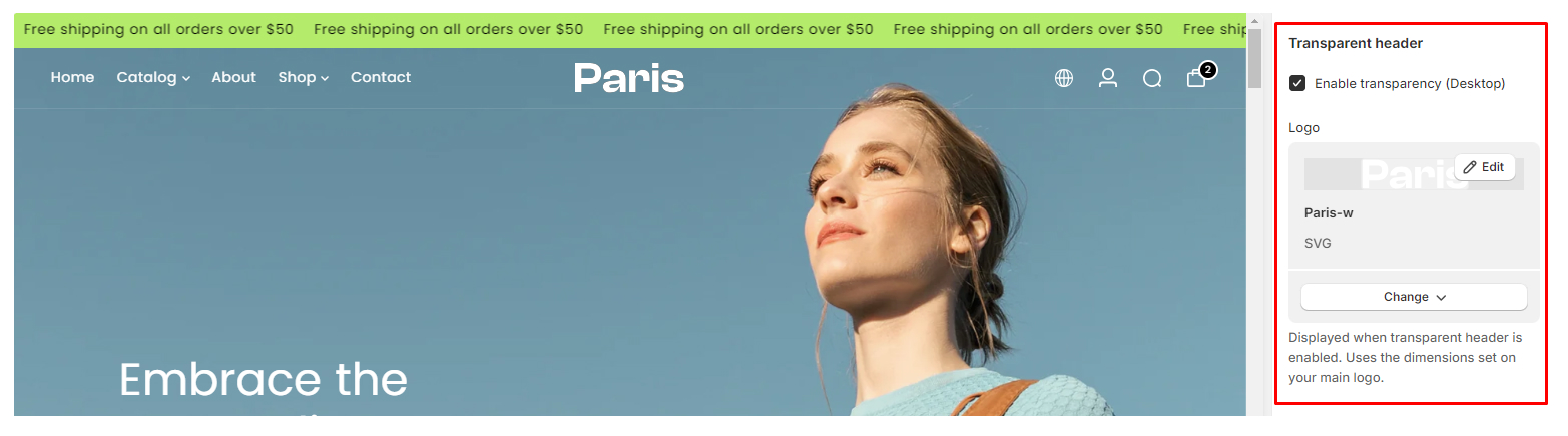
- Transparent Header
The Transparent Header feature allows you to make your header partially transparent. This can create a modern and visually appealing effect. You can enable transparency for the desktop view and upload a specific logo for the transparent header.
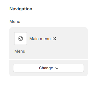
- Navigation
Select the navigation menu you want to display in the header. You can create the Navigation for your shop in the Online store --> Navigation on your admin.
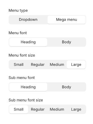
- Menu Type
Choose between two types of dropdown views for your menu:
Dropdown: Standard dropdown menu.
Mega Menu: A larger, more feature-rich dropdown menu with additional content and options.
- Menu Font
Select the font style for your menu items. You can choose between the Heading or Body font styles configured in the Typography settings.
- Menu Font Size
Adjust the font size of your menu items to suit your design preferences.
- Sub Menu Font
Select the font style for the submenu items. You can also choose between the Heading or Body font styles configured in the Typography settings.
- Sub Menu Font Size
Adjust the font size of your submenu items for optimal readability and design consistency.
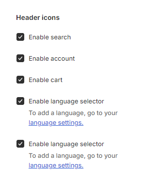
- Header Icons
Enable icons for Search, Account, and Cart, allowing for quick access to essential functionalities directly from the header.
- Language Selector
Enable Shopify’s Multi-language selector directly on the header, providing visitors with the option to view your store in their preferred language.
- Currency Selector
Enable Shopify’s Multi-currency selector, allowing visitors to easily switch between different currencies to view prices in their preferred currency.
Menu Style
Dropdown Menu designThe Dropdown design offers a traditional and compact menu design, ideal for displaying a straightforward navigation structure with primary links visible at a glance. When users hover or click on a menu item, a dropdown menu will appear below it, revealing additional subcategories or links. This design is intuitive and space-efficient, making it suitable for websites with a moderate number of menu items and submenus.
The Mega Menu design provides a more expansive and visually rich menu design, offering additional space for content, images, and customization options. Unlike the Dropdown View, Mega Menus typically display multiple menu columns of content including images or promotional banners
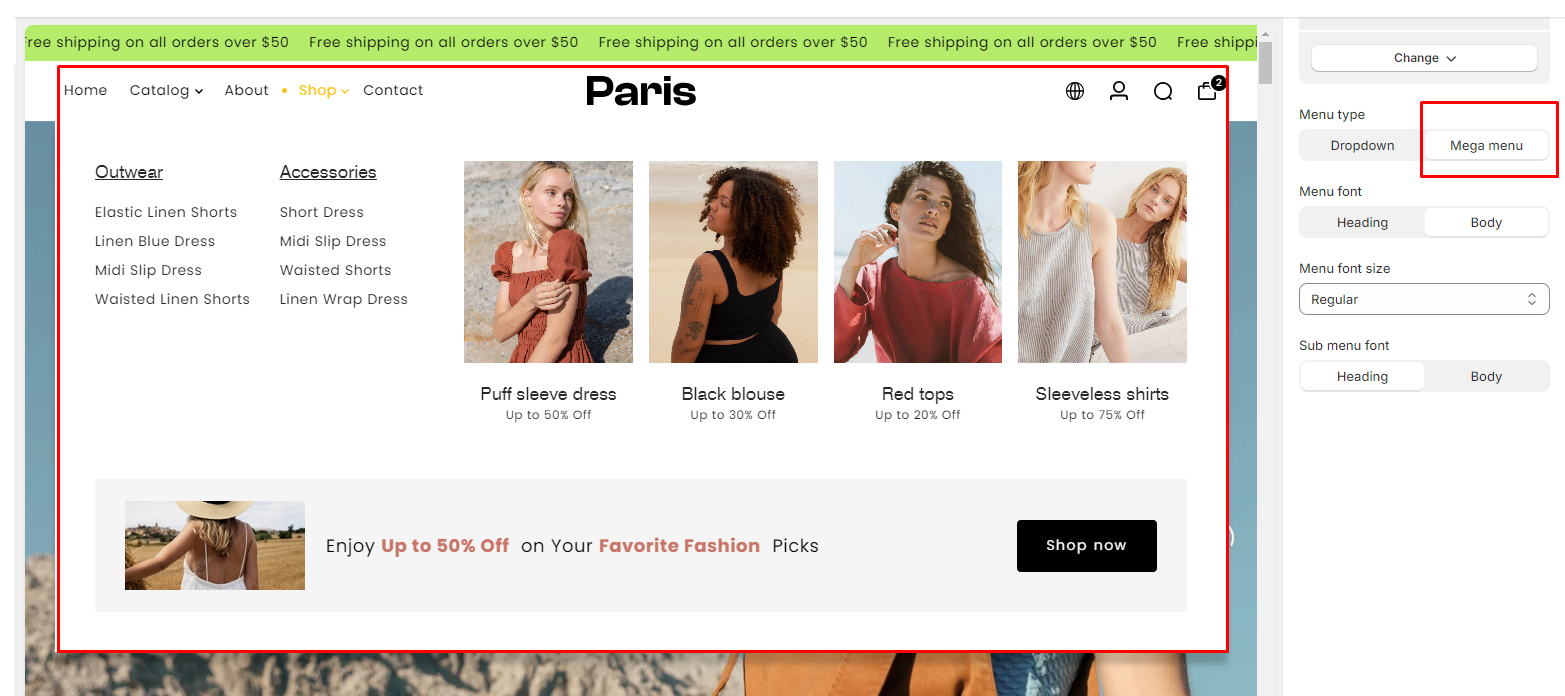
Configure mega menu blocks in the header
The Mega Menu block allows you to create expansive and visually rich dropdown menus with multiple columns of content. Follow these steps to configure the Mega Menu block effectively:
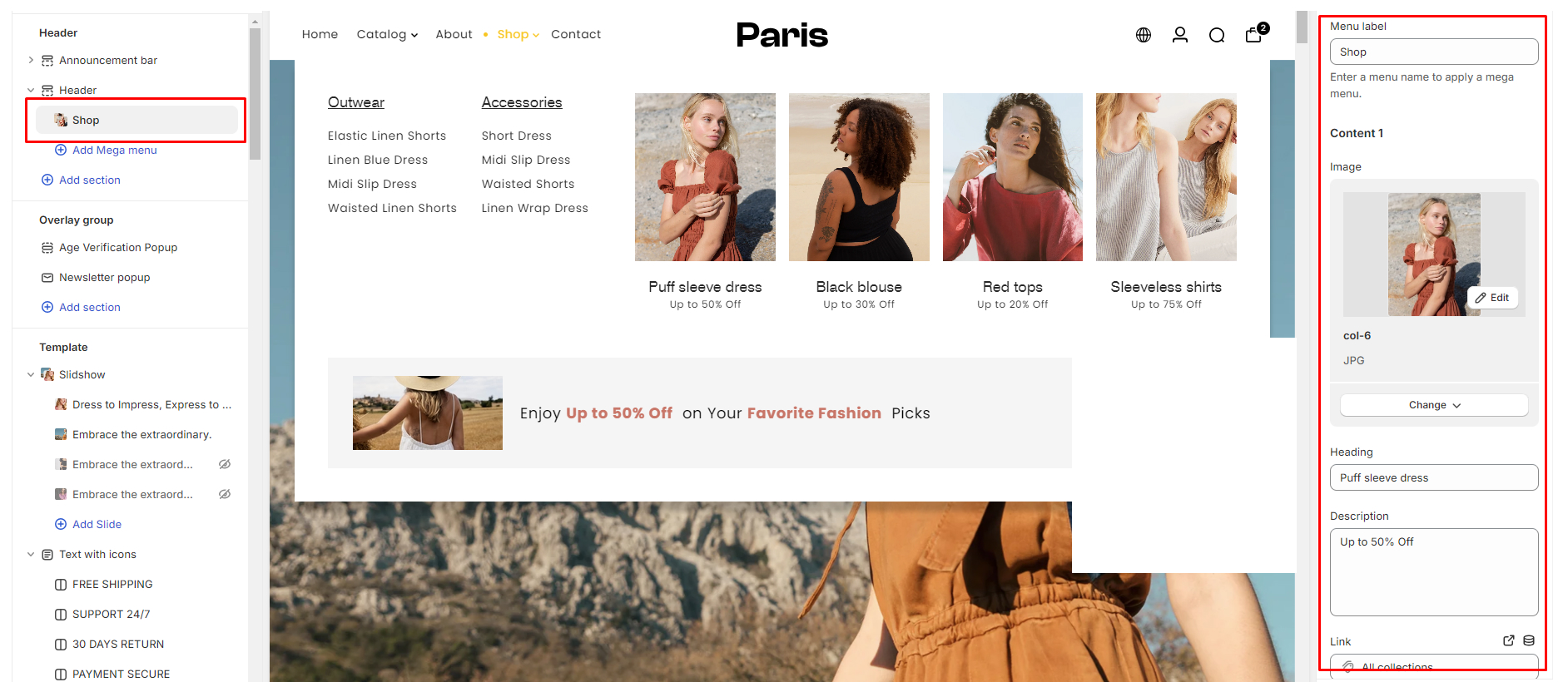
Step 1: Add Mega Menu Block
- From your Customize theme editor, locate the Header section
- Select the header section and add the Mega Menu block.
Step 2: Menu Label
- Once the Mega Menu block is added, you'll find the "Menu label" field.
- Choose the main menu label to which you want to attach the mega menu. This will determine where the Mega Menu will appear in your navigation structure.
Step 3: Content Settings
- After selecting the menu label, proceed to configure the content settings for the Mega Menu block.
- You can add multiple content column (up to 5 content columns) within the Mega Menu block to create a rich and engaging dropdown menu experience.
Content Options:
- Image Upload Field: Upload images to showcase products, categories, or promotional banners within the Mega Menu.
- Heading: Add descriptive headings
- Description: Provide brief descriptions or additional information about menu items or categories.
- Link: Assign hyperlinks to direct users to specific pages, products, or collections within your store.
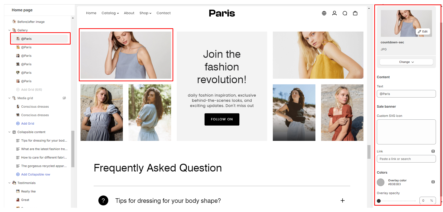
Configuring the Mega Menu Block with Sale Banner
In addition to adding content elements within the Mega Menu block, you can also include a Sale banner option below the Mega Menu columns. Follow these steps to configure the Sale banner effectively:
Step 1: Add Sale Banner
- Within the Mega Menu block settings, locate the option to enable the Sale banner.
Step 2: Sale Banner Settings
- You'll find a few settings options to customize its appearance and content.
- Configure the following settings according to your preferences:
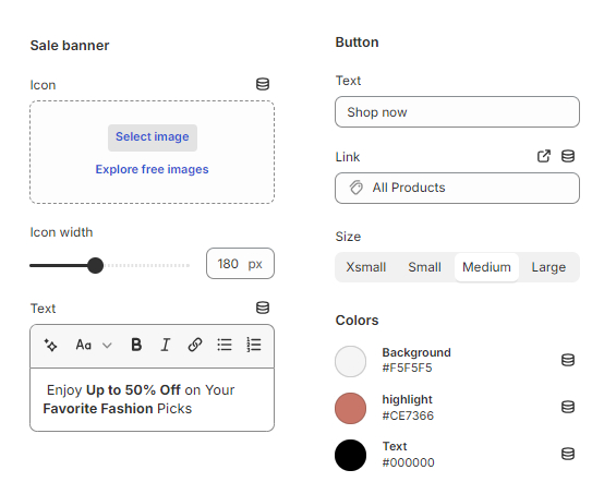
Sale Banner Settings:
- Icon: Upload an image for the icon that will appear alongside the Sale banner. This icon can help visually indicate a special promotion or sale.
- Icon Width: Adjust the width of the icon to ensure optimal display within the Sale banner.
- Text: Add a short description or message to accompany the Sale banner, highlighting the promotion or offer.
- Label: Define the call-to-action (CTA) button text that will be displayed on the Sale banner. This text encourages users to take action, such as "Shop Now" or "View Sale Items."
- Link: Specify the destination URL to which users will be directed when clicking on the Sale banner. This could link to a specific collection, promotional page, or product category.
Using Slideshow section
The Slideshow section in our Shopify theme offers a dynamic and visually appealing way to showcase important content or products on your website. With customizable settings, you have the flexibility to tailor the slideshow to fit your branding and messaging needs. In this documentation, we will guide you through utilizing the Slideshow section effectively to create stunning banners that captivate your audience.
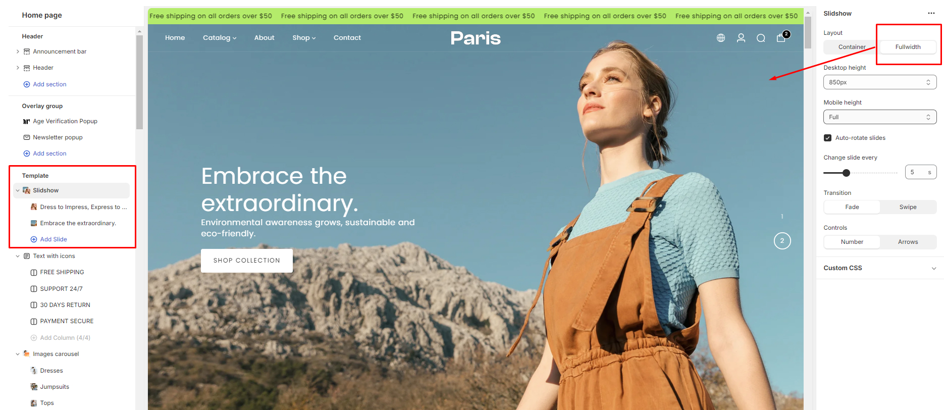
Configuring the Slideshow section
-
Layout:
- Choose between "Container" and "Fullwidth" layout options.
- "Container" confines the slideshow within a defined width, while "Fullwidth" expands it to the entire width of the screen.
-
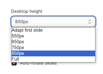
Desktop Height:
- Adjust the height of the banner specifically for desktop viewing.
- Note: Setting a smaller height than the image's default height may result in the image appearing cropped.
-
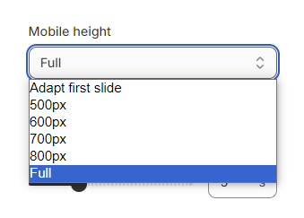
Mobile Height:
- Similar to desktop height, customize the banner's height specifically for mobile devices.
- For optimal results on mobile, we recommend using portrait-oriented images.
-
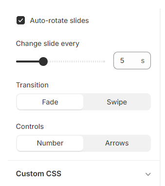
Auto-Rotate Slides:
- Enable or disable automatic rotation of slides.
- When enabled, the slideshow will automatically transition between slides without user input.
-
Change Slides Every:
- Set the frequency for auto-rotating slides.
- Specify the duration between slide transitions, allowing you to control the pace of the slideshow.
-
Transition:
- Choose between "Fade" and "Swipe" transition effects.
- "Fade" smoothly transitions between slides by gradually blending them.
- "Swipe" shifts slides horizontally, mimicking the swipe gesture commonly associated with touch-enabled devices.
-
Controls:
- Customize the slider navigation controls.
- ○ Choose between "Number" or "Arrow" options.
"Number" displays numerical indicators for each slide, allowing users to navigate directly to a specific slide."Arrow" provides directional arrows for users to move between slides.
- "Swipe" shifts slides horizontally, mimicking the swipe gesture commonly associated with touch-enabled devices.
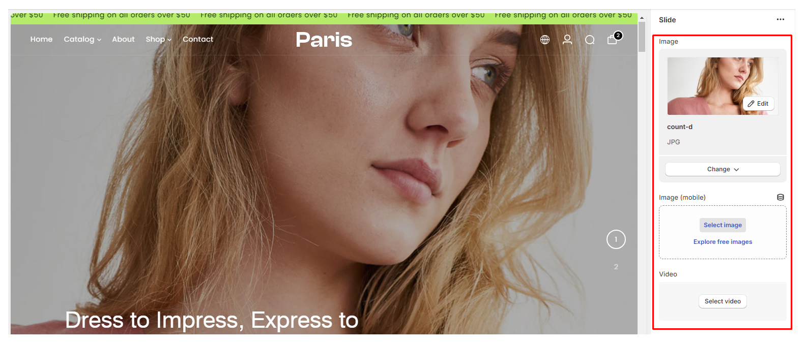
Configuring the Slide block
The Slide Block is a versatile component within the Slideshow section, allowing you to create engaging and interactive slides to capture your audience's attention. Here's how to configure each aspect of the Slide Block:
-
Image Upload:
- Upload different images tailored for desktop and mobile viewing.
- Ensure the images are optimized for clarity and visual impact across devices.
-
Video:
- Optionally, include a video slide by selecting a Shopify-hosted video.
- Videos can add dynamic content to your slideshow, providing an immersive experience for your audience.
-
Slide Link:
- Optionally, include a video slide by selecting a Shopify-hosted video.
- Videos can add dynamic content to your slideshow, providing an immersive experience for your audience.
-
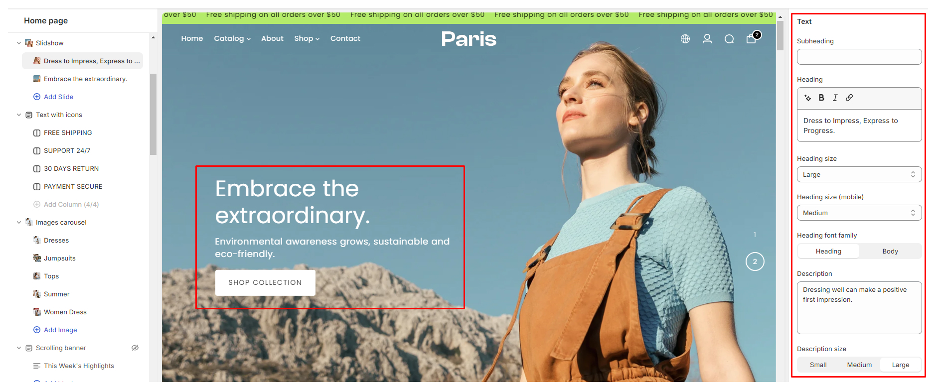
Text:
- Customize the textual elements of the slide.
Subheading: Provide a brief additional description or context for the slide.Heading: Craft a compelling headline to capture attention.Heading Size (Desktop & Mobile): Adjust the size of the heading for optimal readability on different devices.Heading Font Family: Select a font style that aligns with your brand's aesthetic.Description: Include detailed information or supplementary content.Description Size (Small, Medium, or Large): Choose the appropriate size for the description text to maintain visual balance.Heading Size (Desktop & Mobile): Adjust the size of the heading for optimal readability on different devices.Heading Font Family: Select a font style that aligns with your brand's aesthetic.
-
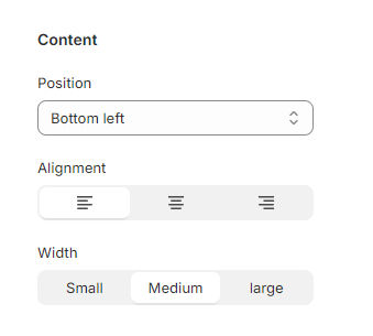
Content:
Control the positioning and alignment of the slide's caption content.Text Position: Determine where the text appears relative to the image or video.Alignment : (Left, Center, or Right): Align the text within its designated position.Width : (Left, Cent(Small, Medium, or Large): Adjust the width of the content area to optimize layout and readability.
-
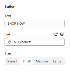
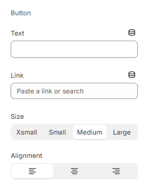
Button 1 & Button 2:
Incorporate call-to-action (CTA) buttons to prompt user interaction.
Label: Define the text displayed on the button to convey the desired action.Link: Specify the destination URL users will be directed to upon clicking the button.Alignment : (Left, Center, or Right): Align the text within its designated position.Size : (Xsmall, Small, Medium, or Large): Determine the button's dimensions for prominence and usability.Use Text Button : Optionally, toggle the checkbox to use a text-based button instead of a graphical button.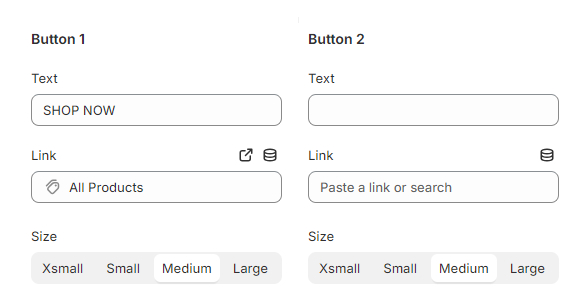
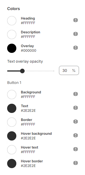
- "Color"
Customize the visual styling of text and buttons to align with your brand's identity.Caption Text Color : Define the color of the textual content within the slide.Size : Individual CTA Button Color Styling:Use Text Button : Optionally, toggle the checkbox to use a text-based button instead of a graphical button.
- Customize the textual elements of the slide.
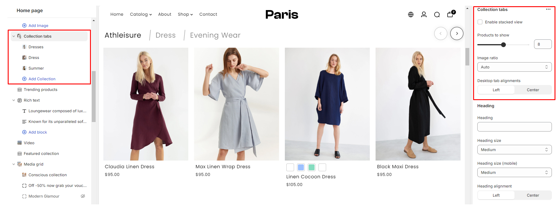
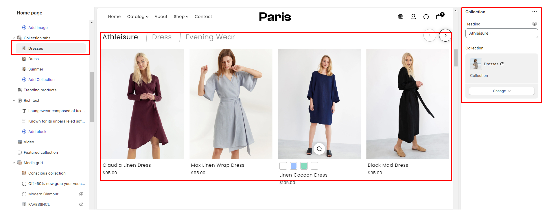
Using the Collection Tabs Section
Configuring the Collection Tabs Section
-
Enable Stacked View:
- Toggle this option to display your collections in a stacked layout, offering a visually distinct presentation.
-
Products to Show:
- Choose the number of products you want to display within each collection.
-
Image Ratio:
- ○ Select the ideal image ratio for your collection displays. Options include Auto, Landscape, Portrait, and Square, allowing you to optimize the visual coherence and aesthetics of your collections.
-
Desktop Tab Alignments:
- Customize the alignment of your collection tabs for desktop users. Choose between Left and Center alignment to ensure a cohesive and visually pleasing layout.
-
Text Customization:
- Title: Add titles to your collections to provide context and clarity to your customers.
- Heading Font Size (Desktop & Mobile): Adjust the font size of your collection across different devices.
- Heading Alignment: Tailor the alignment of your collection headings you can choose between Left and Center alignment options for optimal presentation.
-
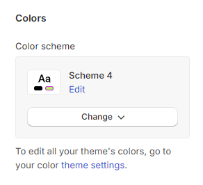
Color:
- Color Scheme: Configurable via "Theme settings > Color"
-
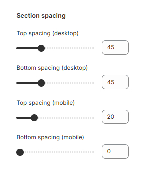
Section Spacing:
- Adjust spacing across desktop and mobile platforms
Configuring the Collection blocks
You can add up to 4 collection blocks, each offering a unique showcase of your collections.
-
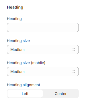
Heading:
- Enter a descriptive heading for the collection block. This heading will serve as a title for the displayed collection, providing context and guiding your customers' attention.
-
Collection Select Field:
- Choose the specific collection you wish to feature in this block from the dropdown menu. This selection determines which products will be showcased within the block, allowing you to curate tailored displays for different sections of your store.
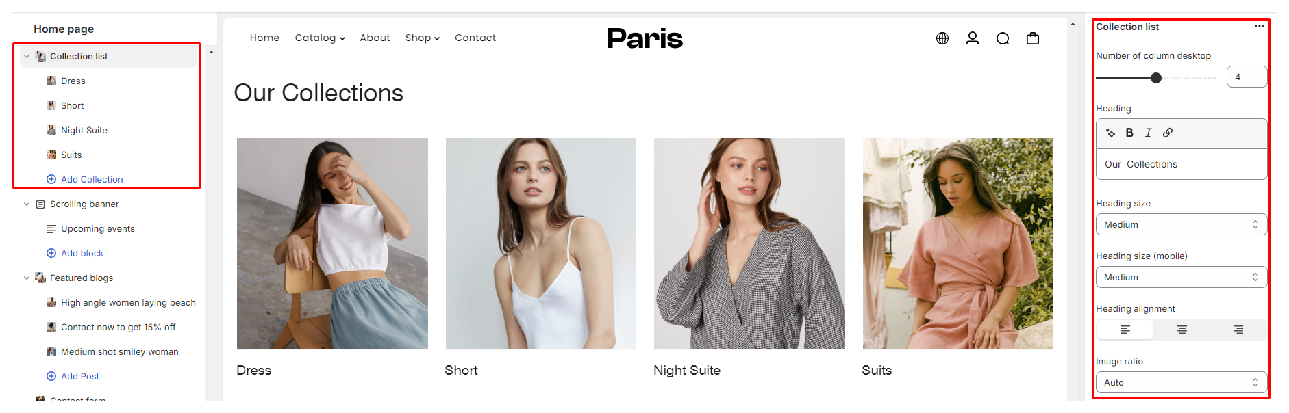
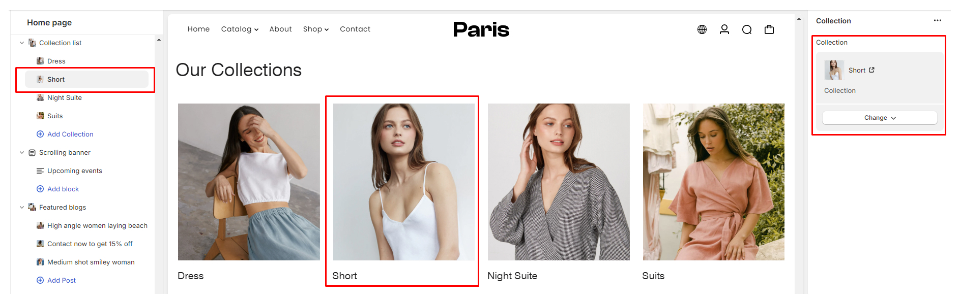
Using the Collection List section
Creating an appealing Collection List section is crucial for showcasing products effectively on your store. This guide provides step-by-step instructions to customize various aspects of the Collection List section, including the number of columns, heading, heading size, alignment, and image ratio.
Configuring the Collection List section
-
Number of columns desktop:
- Adjust the number of collections displayed per row on desktop devices by adjusting the slider or input the desired number.
-
Heading:
- Add a section heading to the Collection List.
-
Heading size:
- Customize the font size of the heading for desktop and mobile separately.- Within the theme editor, locate "Heading size" and adjust the font size options for each device.
-
Heading alignment:
- Choose the alignment of the heading text within the Collection List section you can select between Left, Center, or Right alignment.
-
Image ratio:
- Select the aspect ratio for collection images displayed in the Collection List.- On the "Image ratio," choose from Auto, Landscape, Portrait, or Square options.
Styling Settings:
- Color: - Color Scheme: Configurable via "Theme settings > Color"
- Overlay Settings: Change the color of the overlaying heading or text color
- Step 3 - Lorem the It is a long established fact that a read.
Section Spacing:
Adjust spacing across desktop and mobile platforms
Configuring the Collection List block
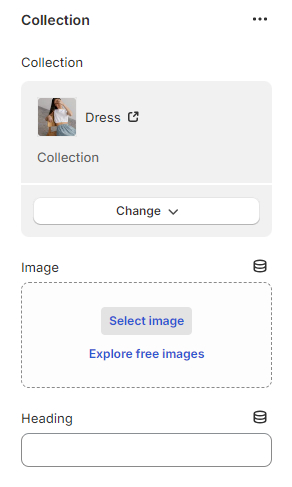
Collection: Select the collections you want to feature in the section.
Using the Collection carousel Section
Configuring the collection carousel section
Enable Grid Style:
This setting allows you to choose whether the collection carousel is displayed in a grid-style layout. When enabled, the collection items will be arranged in a grid format.
Heading:
Enter the heading you want to display above the collection carousel. This heading serves as a title for the section.
Heading Font Size:
Adjust the font size of the heading for both mobile and desktop views. Use the slider to select the desired font size, ensuring optimal readability across different devices.
Heading Alignment:
Choose the alignment for the section heading. You can opt to align the heading to the left or center of the section.
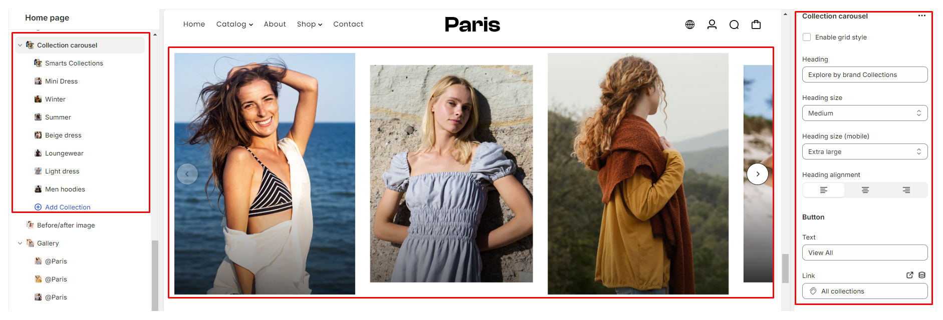
Button:
- Text: Enter the text to be displayed on the button.
- Link: Provide the URL where the button should direct visitors.

Styling Settings:
- Color: Color Scheme: Configurable via "Theme settings > Color"
- Section Spacing: Adjust spacing across desktop and mobile platforms
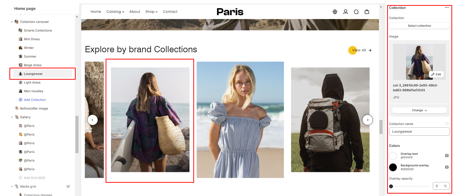
Collection carousel blocks
You can add Collection Carousel Blocks to the Collection Carousel Section to display different collections. Each block represents a collection that will be featured within the carousel. You can add a maximum of 10 blocks to the Collection Carousel Section.
Configuring the Collection Carousel Block:
-
Select Collection:
Choose the collection you want to feature in the carousel from the dropdown menu. This collection will be showcased within the block.
-
Image Upload:
Upload a custom banner image to represent the collection within the carousel. This image serves as a visual representation of the collection and enhances its presentation.
-
Collection Name:
Enter the name of the collection. This name will be displayed as overlay text on the collection banner within the carousel block.
-
Color Styling:
Customize the styling of the overlay text and background overlay to complement the collection banner. Choose the desired text color and background overlay color to achieve the desired visual effect.
-
Overlay Opacity:
Adjust the opacity of the background overlay to control its transparency. This allows you to strike the right balance between showcasing the collection banner and ensuring the overlay text remains readable.
Using the Countdown Section
The Countdown section allows you to create engaging countdowns for promotions, sales, or any time-sensitive events on your store.
Configuring the Countdown section
-
Enable Countdown
Enable countdown: This checkbox enables or disables the countdown functionality.
-
Heading
Heading: Field to input the heading text.
-
Heading Size
Heading size: Adjusts the font size of the heading for both desktop and mobile views.
-
Content Alignment
Content alignment: Choose Left, Center, or Right alignment.
-
End Date
End date: Set the date when the countdown will end. The date must be in the format DD/MM/YYYY and must be a future date.
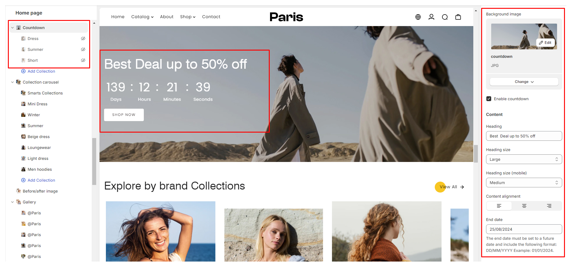
-
Button
Text: Specify the text to display on the button.Link: Input the button destination URL.Button Size: Choose the size of the button, you can select between Xsmall, Small, Medium, or Large
Collection Layout
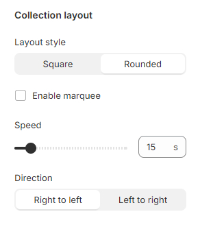
- Layout style: Choose between "Square" and "Rounded" for the collection items.
- Enable Marquee: Activate a scrolling effect for the collection items.
- Speed: Adjust the speed of the marquee scrolling.
- Direction: Choose scrolling direction (Right to Left or Left to Right).
Styling Settings:
-
Color:
Color Scheme: Configurable via "Theme settings > Color"
-
Section Spacing:
Adjust spacing across desktop and mobile platforms
Configuring the Collection Countdown block
-
Select Collection:
Choose the desired collection to feature in the countdown block.
-
Image Upload:
Upload an image to accompany the countdown block (if applicable).
-
Heading:
Input the heading text for the countdown block.
Using the Feature Product Section
This section serves as a curated spotlight on a particular product, where you can highlight one of our top offerings to provide you with an in-depth look and understanding of its features and benefits.
Configuring the Featured Product Section
Now, let's delve into the customizable settings of this section:
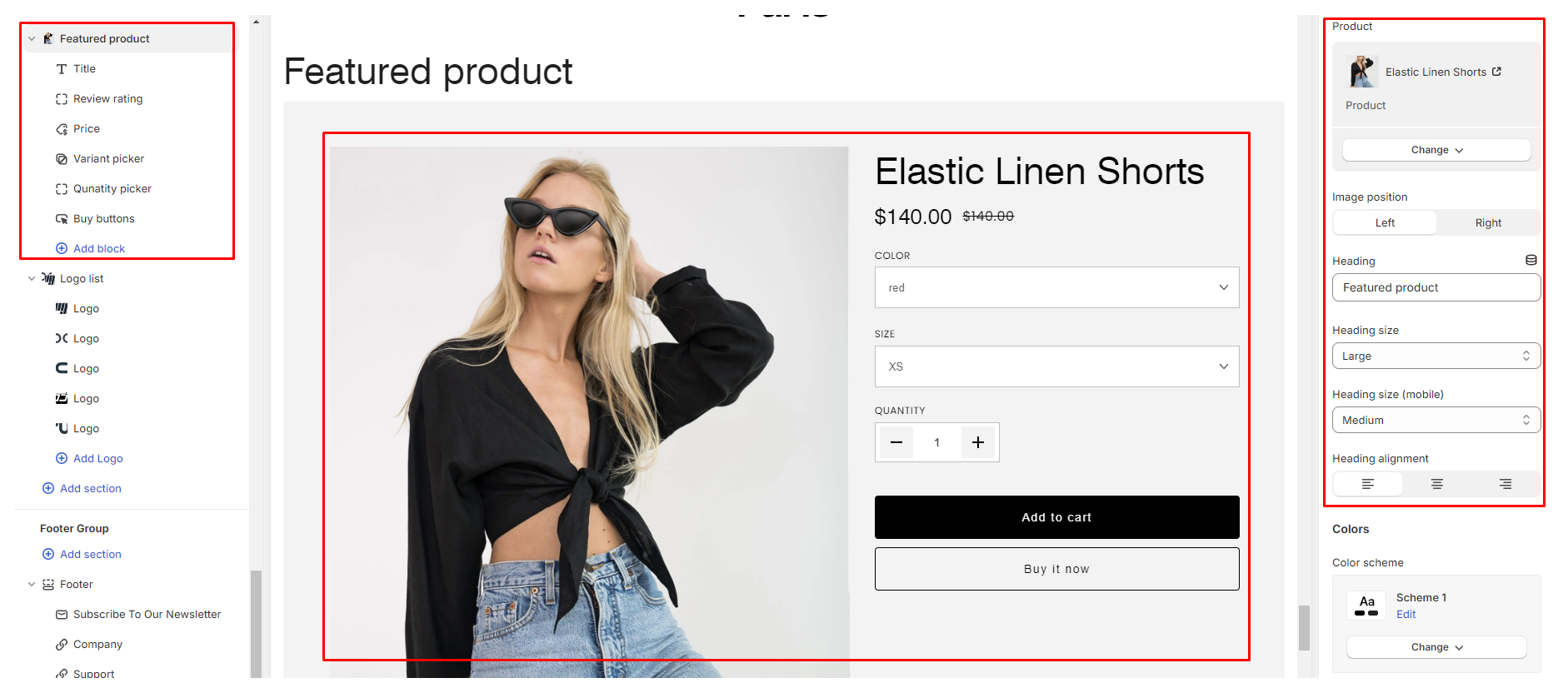
- Select Product: Choose the product you'd like to feature, allowing you to showcase its unique qualities.
- Image Position: Tailor the visual presentation by selecting the image position, offering flexibility between Left or Right alignment to best suit your design preferences.
- Heading: Craft a compelling section heading that captures attention and provides clarity about the highlighted product.
- Heading Size: Customize the size of the heading text to ensure optimal readability and visual appeal across both desktop and mobile devices.
- Heading Alignment: Fine-tune the alignment of the section heading according to your layout preferences, with options to align Left, Center, or Right.
- Color: Color Scheme: Configurable via "Theme settings > Color"
- Section Spacing: Adjust spacing across desktop and mobile platforms
Configuring the Featured Product block
In the Featured Product section, we provide a comprehensive set of blocks to enhance your showcasing experience. Each block is designed to provide essential information and functionality to your audience. Let's explore these blocks:
- Title: Display the product title prominently to grab attention and create instant recognition.
- SKU: Showcase the product SKU for easy reference and tracking.
- Text: Utilize a customizable text field to add additional information or promotional messages related to the product.
- Price: Highlight the product's price, ensuring transparency and facilitating purchase decisions.
- Review Widget: Enhance credibility and trustworthiness by displaying star review badges, and showcasing the product's ratings and reviews.
- Variant Picker: Allow customers to explore product variants, such as different colors, sizes, or styles, providing options to suit their preferences.
- Quantity Picker: Enable customers to adjust the quantity of the product they wish to purchase, ensuring a seamless shopping experience.
- Buy Button: Include prominent buy buttons, offering options such as "Add to Cart" for traditional purchases and Shopify's "Dynamic Checkout" for swift and convenient transactions.
- Social Sharing: Foster engagement and broaden reach by incorporating social sharing buttons, allowing customers to easily share the product with their network.
- Description: Provide a detailed product description to educate customers about its features, benefits, and specifications.
- Custom Liquid: Integrate custom code seamlessly into the block to tailor the presentation or functionality according to your specific needs.
- Inventory Status: Display the remaining inventory to create urgency and encourage prompt purchase decisions.
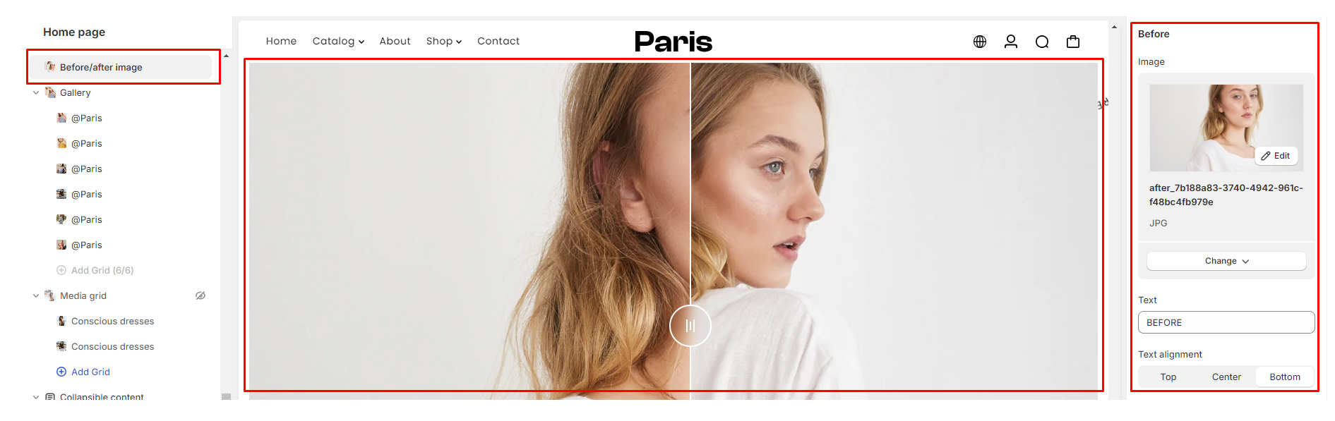
Using the Before/After Image Section
This dynamic section empowers you to visually showcase transformations effectively on your website. Whether you're highlighting a renovation project, a makeover, or any other kind of transformation, this section allows your audience to see the change in action.
- Heading: Input the section heading.
- Heading Size: Adjust the size of the heading for both mobile and desktop views to ensure it's readable and visually appealing on different devices.
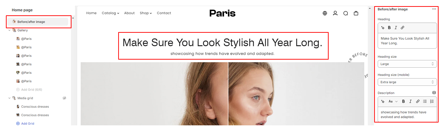
- Description: Provide additional information or context for the section. It could be a brief description of what the before/after images showcase.
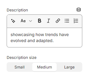
- Description Size: Choose between Small, Medium, or Large to determine the size of the description text.
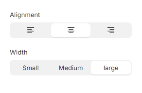
- Alignment: Select whether you want the content of the section to be aligned to the Left, Center, or Right of the page.
- Width: Determine the width of the section on the page by selecting between Small, Medium, or Large options.
- Before & After Settings:
- Upload the before and after images to showcase the transformation or comparison.- Add accompanying text to provide further explanation or details about the images.- Choose the alignment of the text to ensure it complements the images properly.
- Desktop & Mobile Height: Adjust the height of the section for both desktop and mobile views to achieve the desired visual impact.
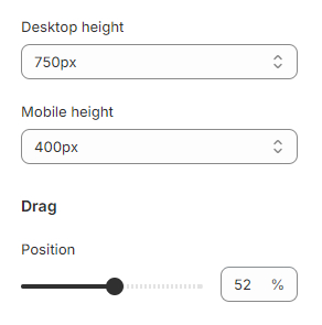
- Drag Position: Determine the starting position of the draggable slider that allows users to interactively compare the before and after images.
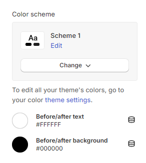
Styling Settings:
- Color: Color Scheme: Configurable via "Theme settings > Color"
- Section Spacing: Adjust spacing across desktop and mobile platforms
Using the Featured Collection section
Featured Collection section – your curated showcase for standout products.
Configuring the featured collection section
- Image Ratio: This setting allows you to select the orientation of the product grid images. The options available Auto, Square, Landscape, or portrait.
- Heading: This is the title of the section displayed prominently. You can customize it to suit your branding or the specific collection you're featuring.
- Heading Size: Adjust the font size of the heading for both desktop and mobile views.
- Heading Alignment: Choose the alignment of the section title. Options typically include Left, Center, and Right alignment.
- Show Collection Title: This option enables or disables the display of the collection title above the product grid.
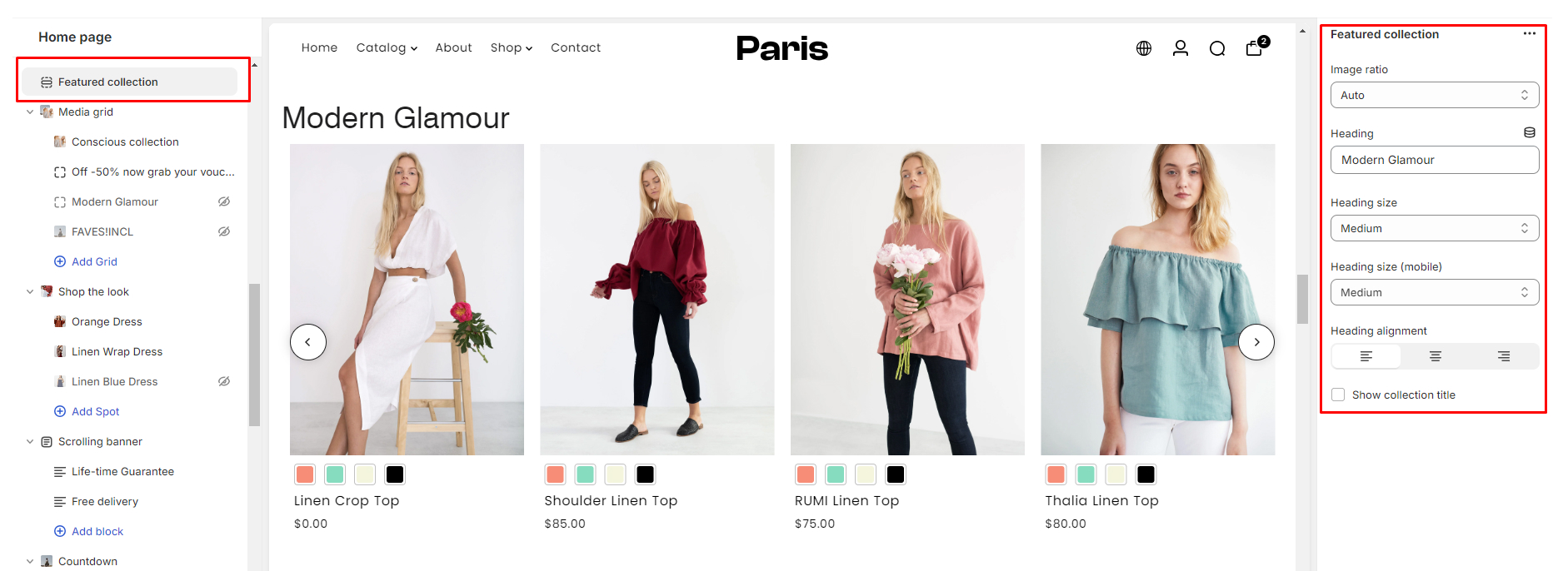
- Select the Collection Field: Choose which collection to feature in this section. This allows you to dynamically change the collection being showcased without modifying the theme code.
- Enable Carousel: Check this box to enable a carousel view for the product grid. This allows users to scroll through products horizontally.
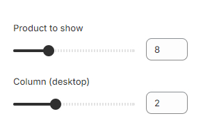
- Products to Show: Specify the number of products to display in the grid. Consider the available space and the overall design aesthetic when determining this value.
- Number of Products per Row: Adjust the number of products displayed in each row specifically for desktop view. This helps optimize the layout for larger screens.
- Button: Add a button at the bottom of the section to encourage visitors to explore the featured collection further.
- Text: Enter the text to be displayed on the button.
- Link: Provide the URL where the button should direct visitors.
- Size: Choose from options like small, medium, or large to control the button's visual prominence.
- Button Alignment: Select the alignment of the button within the section, ensuring it complements the overall layout.
Styling Settings:
- Color: Color Scheme: Configurable via "Theme settings > Color"

- Section Spacing: Adjust spacing across desktop and mobile platforms
Using the Gallery Section
The Gallery section in the theme allows you to showcase images along with headings, descriptions, and buttons to enhance the visual appeal of your store.
Configuring the Gallery section
- Heading: Enter a title or heading for your gallery section.
- Heading Size: Choose the font size for the heading, allowing you to adjust it for both desktop and mobile views separately.
- Description: Add a brief description to provide context or additional information about your gallery.
- Description Size: Adjust the font size of the description to ensure it's readable and complements the heading.
- Description Alignment: Select the alignment of the description text (e.g., left, center, right) to achieve the desired layout and visual balance within the gallery section.
- Button: Customize the button within the gallery section. You can configure the following settings:
- Label: Enter the text you want to display on the button, such as "View More" or "Shop Now."
- Link: Specify the URL where clicking the button will redirect users. This could be a product page, a collection, or any other relevant destination.
- Size: Choose the size of the button to ensure it's prominent and easily clickable.
- Color: - Color Scheme: Configurable via "Theme settings > Color"
- Section Spacing: Adjust spacing across desktop and mobile platforms
Configuring the Gallery block
Each text block in the Gallery section allows you to upload an image, enhancing visual appeal and providing context to the associated content.
- Image Upload: Click on the image upload option to choose an image from your computer or select one from your Shopify media library.
Content:
Text blocks enable you to provide additional information or context related to the images. Here's how to configure the content settings:
- Text Field: Enter descriptive text that corresponds to the image or conveys relevant information.
- Icon: Optionally, you can include an icon to enhance visual appeal or indicate a specific action. Custom icon SVG field allows you to upload or select an icon that aligns with your brand identity or the message you want to convey.
- Link: Attach a URL link to the text or icon, directing visitors to a relevant page or action. This could be a product page, a collection, or any other destination that aligns with the content of the text block.
- color: Customize the overlay color and opacity to create visual contrast and highlight the text or image.
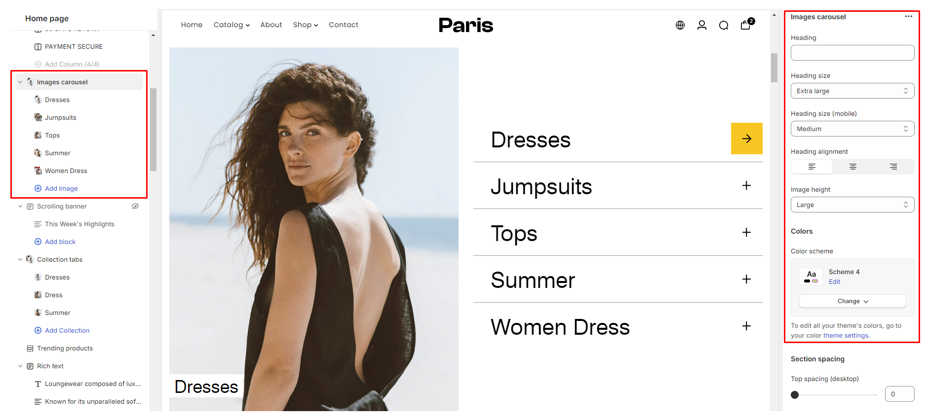
Using the Image Carousel section
The Image Carousel section provides an engaging way to showcase multiple images in a carousel format on your store.
Configuring the Image Carousel section
- Heading: Enter the heading you want to display above the Image carousel carousel. This heading serves as a title for the section.
- Heading Size: Adjust the font size of the heading for both mobile and desktop views. Use the slider to select the desired font size, ensuring optimal readability across different devices.
- Heading Alignment: Choose the alignment for the section heading. You can opt to align the heading to the left, center & right of the section.
- Styling Settings: Customize the button within the gallery section. You can configure the following settings:
- Color: Color Scheme: Configurable via "Theme settings > Color"
- Section Spacing: Adjust spacing across desktop and mobile platforms
- Color: Color Scheme: Configurable via "Theme settings > Color"
Configuring the Image block in the Image Carousel section
The Image Carousel section allows you to incorporate up to six image blocks, each offering an opportunity to showcase specific content or products. Here are the customizable settings available for each image block:
- Collection: Select a collection from your store to associate with the respective image block. This feature enables you to link the image directly to a collection page.
- Heading: Add a descriptive heading to accompany the image block.
- Image: Upload an image to be displayed within the image block.
Using the Image with Text section
The Image with Text section allows precise placement of images within text, offering advanced control over visual presentation. This dynamic section provides advanced flexibility in positioning images within textual content, offering precise control over visual layout and presentation.
Configuring the Image with Text section
- Image Upload:
- First Image Upload: Upload your primary image here.- Second Image Upload: Optionally, upload a secondary image for additional visual impact.
- Image Height: - Adjust the height of the images to optimize visual appeal.
- Image Width: - Choose between Small, Medium, or Large sizes to best fit your layout and design preferences.
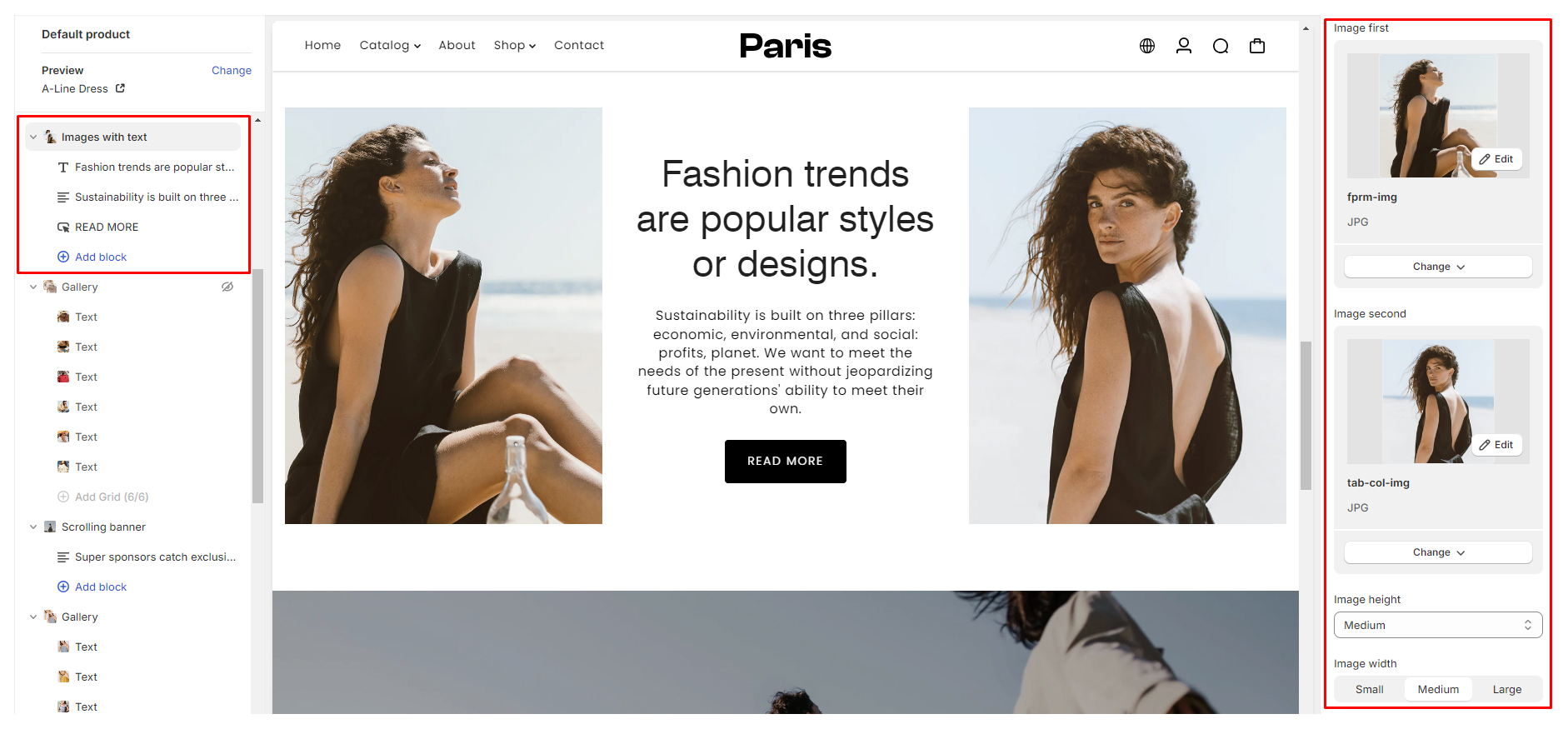
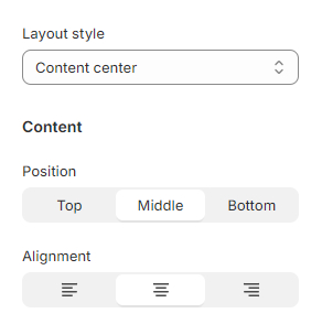
- Layout Style: - Select the layout style that complements your content presentation.
- Content Settings:
- Position: Determine whether the content appears at the Top, Middle, or Bottom of the section.
- Alignment: Choose between Left, Center, or Right alignment for text and image placement.
- Color: - Color Scheme: Configurable via "Theme settings > Color"
- Section Spacing: Adjust spacing across desktop and mobile platforms
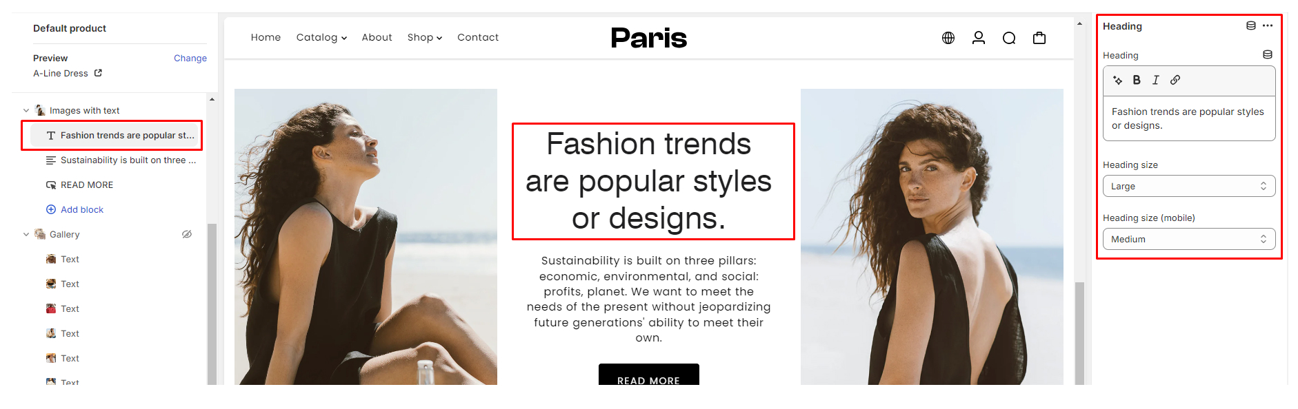
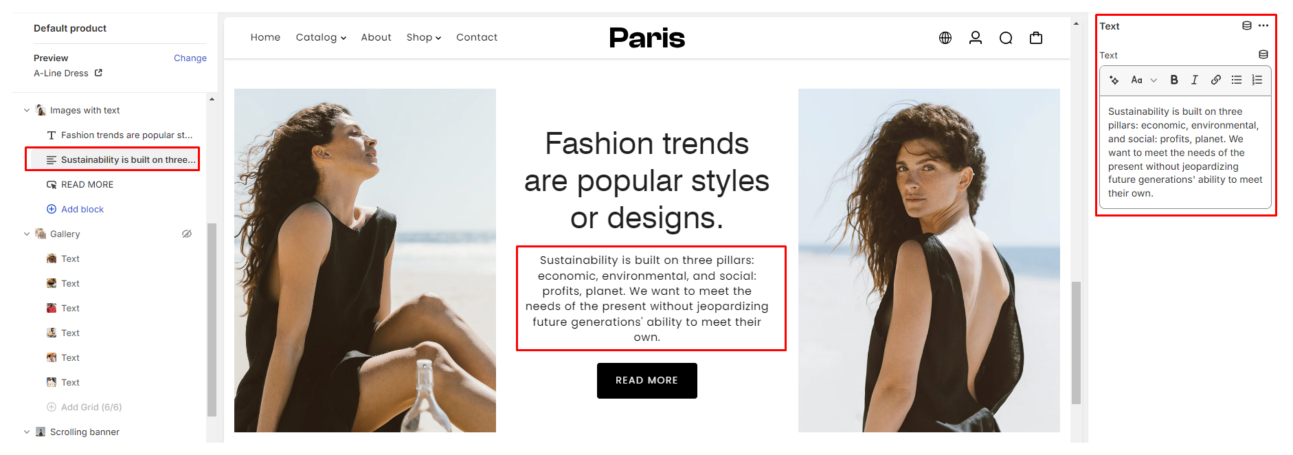
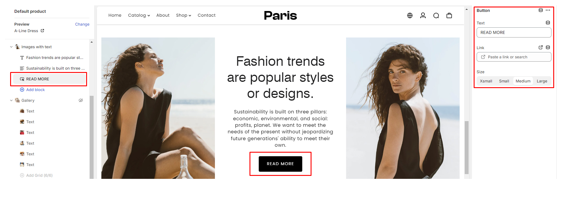
Configuring the Image with Text blocks
When setting up the Image with Text block, you'll be working with three main components to capture your Text content effectively: Heading, Text, and Button.
- Heading: This field allows you to input a captivating headline or title for your content.
- Text: Use this space to provide additional details, descriptions, or any other textual content that complements your headline.
- Button: The button component enables you to add a call-to-action (CTA) element to your content. Customize the button text to encourage desired actions such as "Shop Now," "Read More," or any other relevant action.
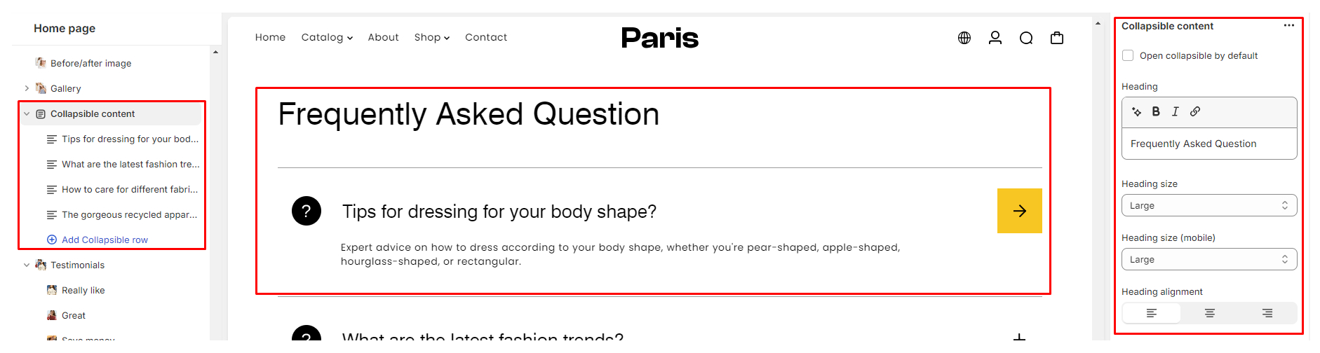
Using the Collapsible Content Section
The Collapsible Content Section is a flexible feature that allows you to organize and present information in a collapsible format, enhancing the user experience of your store. This guide will walk you through the settings and options available for configuring the Collapsible Content Section.
Configuring the Collapsible Content Section
- Open Collapsible by Default: This setting determines whether the collapsible blocks are initially open or closed when the page loads.
- Heading: The Heading option allows you to specify the title or heading for each collapsible section. This heading provides users with a brief overview of the content within the collapsible block.
- Heading Size: The Heading Size setting allows you to customize the font size of the collapsible section heading for both desktop and mobile devices separately.
- Heading Alignment: The Heading Alignment option enables you to choose the alignment of the collapsible section heading within its container. This can help you achieve the desired visual presentation of your content. You can select between “Left Alignment, Center Alignment & Right Alignment
- Styling Settings:
- Color: Color Scheme: Configurable via "Theme settings > Color"
- Section Spacing: Adjust spacing across desktop and mobile platforms
- Color: Color Scheme: Configurable via "Theme settings > Color"
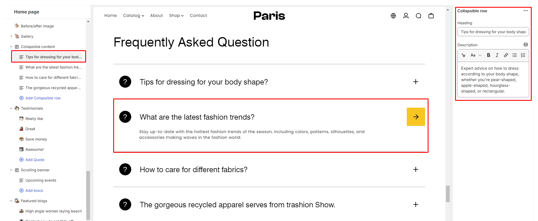
Configuring the Collapsible Content block
In the Collapsible Content section settings panel, you'll find options for configuring the block.
- Heading: Enter the title or heading for the collapsible block in the provided field.
- Description: Add a description or additional information related to the collapsible block in the provided text area.
Using the Logo List section
The Logo List section in your Shopify theme helps display logos or brand images on your store.
Configuring the Logo List section
- Number of Columns (Desktop): Choose how many columns of logos you want on desktop.
- Heading: Add a title or heading for your logo list.
- Heading Size: Adjust the size of the heading text for desktop and mobile.
- Heading Alignment: Decide whether the heading text is aligned Left, Center, or Right.
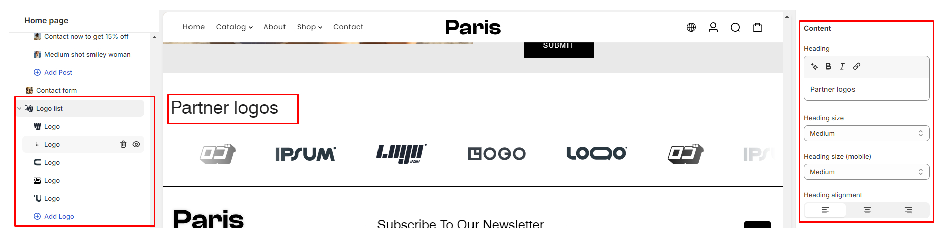
- Image Ratio: Select the aspect ratio for the images (Auto, Landscape, Portrait, Square).
- Styling Settings:
- Color: - Color Scheme: Configurable via "Theme settings > Color"
Overlay Settings: Change the color of the overlaying heading or text color
- Section Spacing: - Adjust spacing across desktop and mobile platforms
- Color: - Color Scheme: Configurable via "Theme settings > Color"
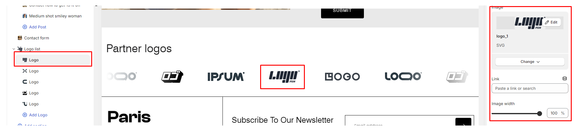
Configuring the Logo List block
In the Collapsible Content section settings panel, you'll find options for configuring the block.
- Upload Logo Image: Choose the desired logo image file
- Image Link: Enter the URL for where clicking the logo should lead.
- Adjust Image Width: Specify how wide you want the logo to be displayed.
- Repeat for Additional Logos: If you have more logos, repeat steps 1-3.
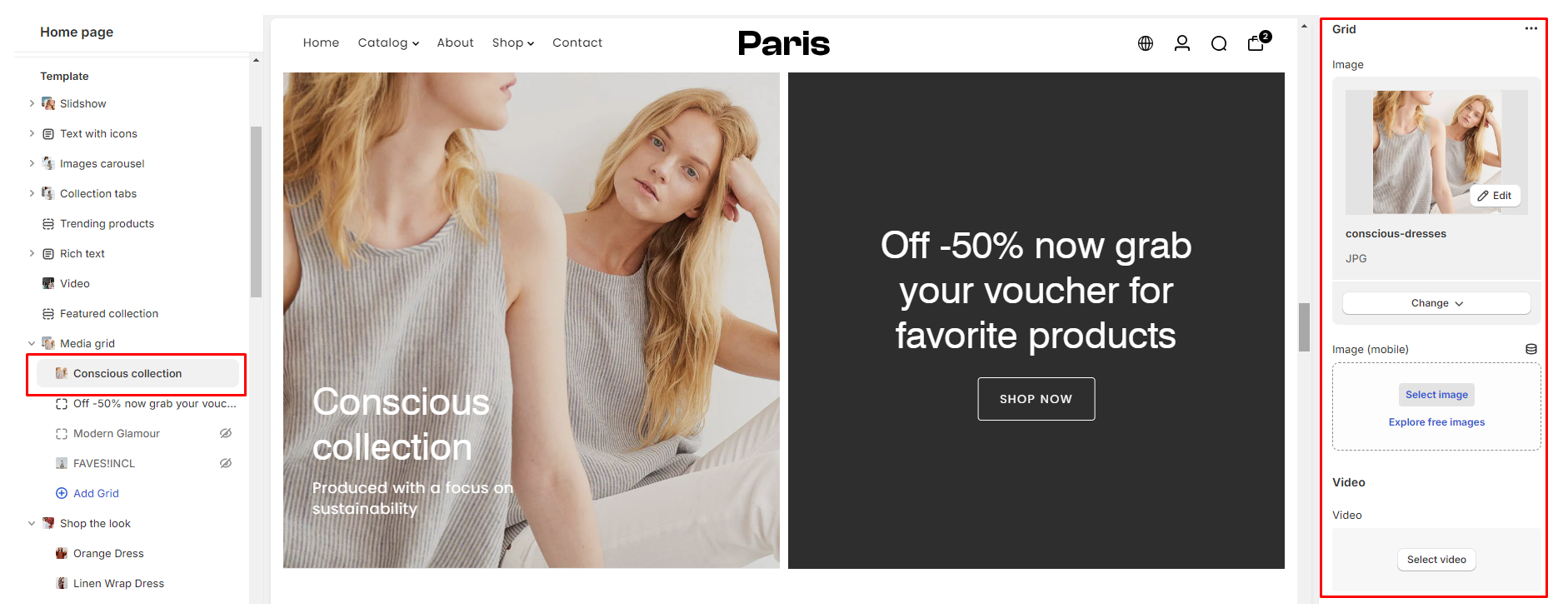
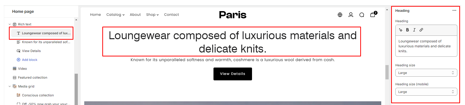
Using the Media Grid Section
The Media Grid Section in our Paris theme allows you to showcase a visually appealing grid layout consisting of images and videos. This documentation will guide you through the settings available for customizing this section to suit your needs.
Configuring the Media Grid section
- Image Upload: Upload images for both desktop and mobile devices.
- Video: Select a video for autoplay within the grid.
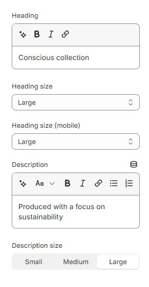
- Heading: Add a heading to the section.
- Heading Size: Adjust the font size of the heading for desktop and mobile devices.
- Description: Add a description to accompany the media grid.
- Description Size: Change the font size of the description. Options include Small, Medium, and Large.
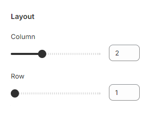
- Layout: Configure the number of columns and rows in the grid layout.
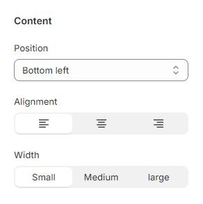
- Content: Customize the appearance of captions associated with the media items
- Position: Change the caption position.
- Alignment: Adjust the alignment of the caption text (Left, Center, Right).
- Width: Select from Small, Medium, or Large width for the caption container.
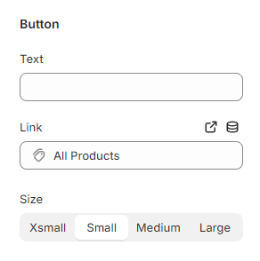
- Button: Add a button to the section with customizable text, link, and size.
- Button Text: Specify the text to be displayed on the button.
- Link: Define the URL the button will link to.
- Size: Choose from Xsmall, Small, Medium, or Large for the button size.
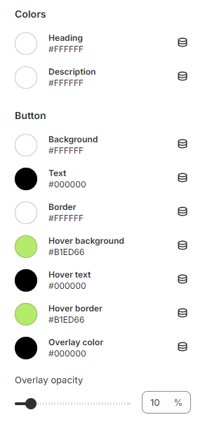
- Color Styling: Configure the color styling for the section, including background, text, and button colors.
Configuring the Media grid block
- Styling Settings:
- Color: Color Scheme: Configurable via "Theme settings > Color"
- Overlay Settings: Change the color of the overlaying heading or text color
- Section Spacing: Adjust spacing across desktop and mobile platforms
Using the Rich Text Section
The Rich Text section allows you to add customizable text content to your store's pages with various layout and styling options.
Configuring the Rich Text Section
1. Enable Full-Width Layout Checkbox
This option allows you to enable or disable a full-width layout for the Rich Text section. When enabled, the text content will span the entire width of the page.
2. Width
You can select the width of the Rich Text section from three available options:
- Small: Suitable for narrow content areas or sidebars.
- Medium: Balanced width for standard content areas.
- Large: Ideal for wider content areas or featured sections.
3. Position
Choose the position of the Rich Text section relative to other content on the page:
- Left: Aligns the Rich Text section to the left side of the page.
- Center: Aligns the Rich Text section to the right side of the page.
- Right: Aligns the Rich Text section to the right side of the page.
4. Alignment
Specify the alignment of the text content within the Rich Text section:
- Left: Aligns the text to the left edge of the section.
- Center: Centers the text within the section.
- Right: Aligns the text to the right edge of the section.
- Styling Settings:
- Color: Color Scheme: Configurable via "Theme settings > Color".
- Section Spacing: Adjust spacing across desktop and mobile platforms
- Color: Color Scheme: Configurable via "Theme settings > Color".
Customizing the Rich Text blocks
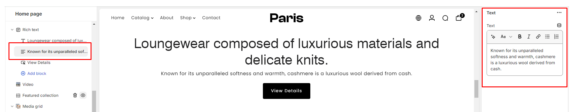
The Rich Text section offers customization options for headings, text blocks, and buttons.
- Heading: The Heading block allows you to add a prominent title to your section.
Heading Field: Enter the desired heading text.Heading Size: Adjust the size of the heading for both desktop and mobile views.
- Text: The Text block enables you to add descriptive content to your section.
Text Area: Enter the desired text content.
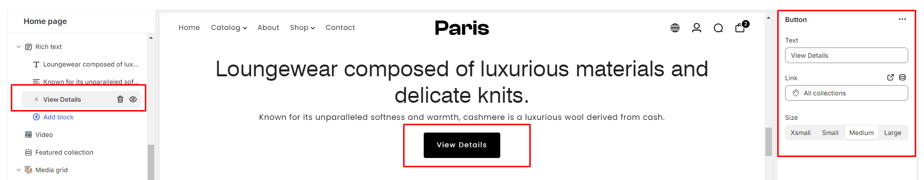
- Button: The Button block allows you to insert a call-to-action button within your section.
Text: Enter the label for the button.Link: Specify the URL to which the button should link.Size: Select the size of the button from options including Xsmall, Small, Medium, and Large.
Using the Scrolling Banner Section
Configuring the Scrolling Banner Section
- Background Image: Set the stage with a backdrop that enhances your content's impact.
- Height: Tailor the section's height to fit seamlessly into your webpage layout, ensuring a polished look.
- Heading Font Size: Adjust the font size of the heading for both desktop and mobile views.
- Speed: Control the pace of your banner's movement to captivate attention and engage visitors.
- Direction: Choose the direction of motion for your banner, whether it's a classic left-to-right flow or an intriguing right-to-left movement.
- Space Between Items: Fine-tune spacing between the blocks
- Font: Select from body and heading fonts to maintain consistency or add emphasis where needed.
- Color: Customize the styling of the overlay text and background overlay to complement the scrolling banner. Choose the desired text color and background overlay color to achieve the desired visual effect.
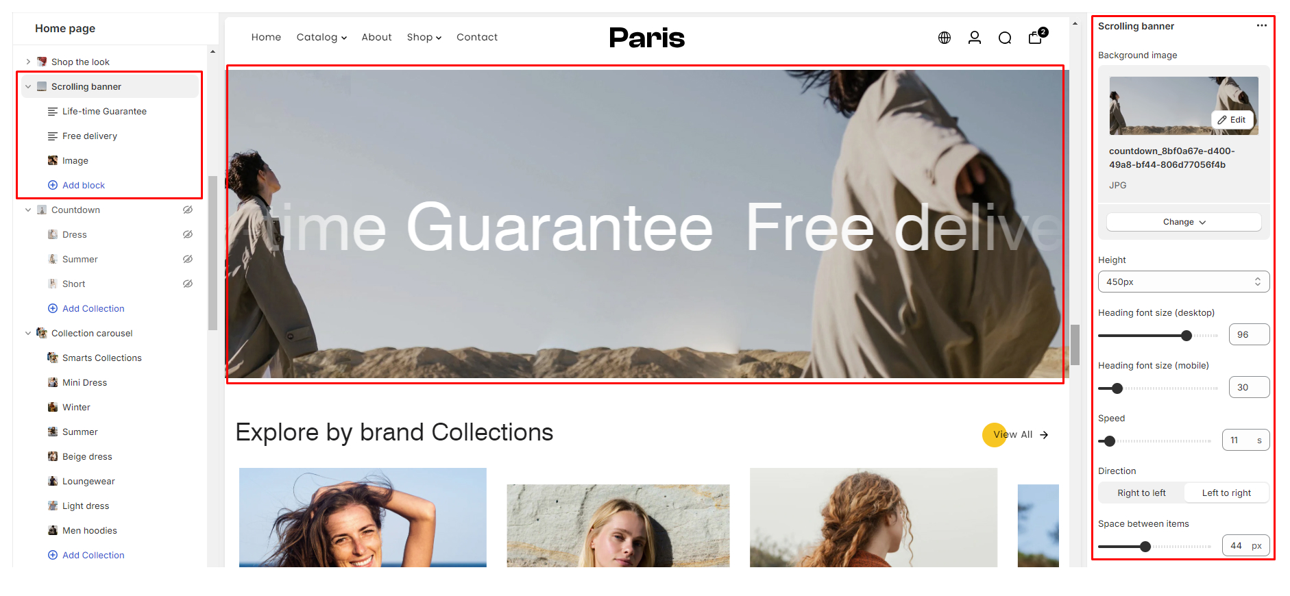
- Color: Color Scheme: Configurable via "Theme settings > Color".
- Section Spacing: Customize spacing to integrate the scrolling banner
Configuring the Scrolling Banner blocks
The Scrolling Banner section comes equipped with 4 blocks which include Marquee text, Icon, Image & Button.
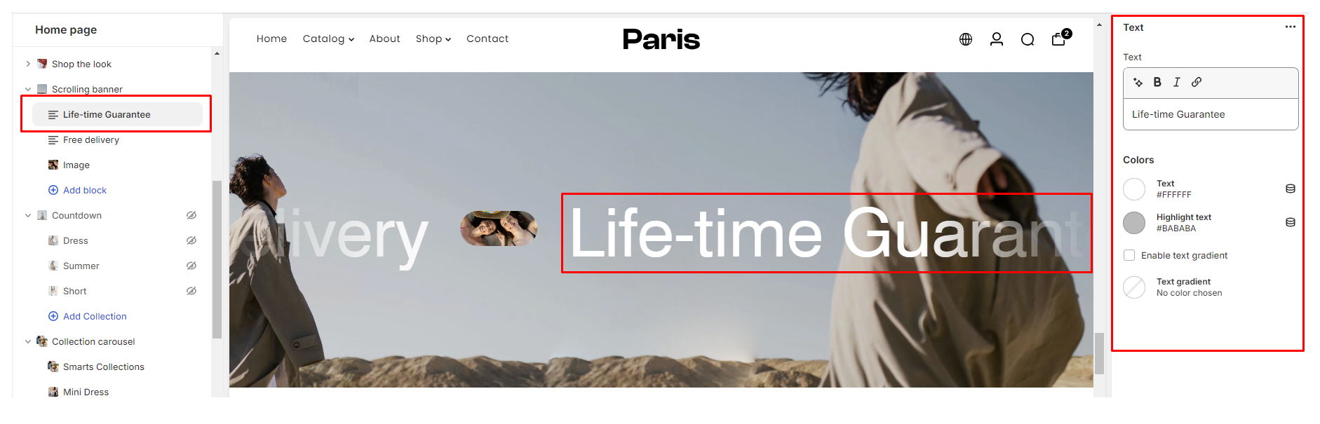
Marquee text
The Marquee Text block offers the following setting options:
- Text: Enter the desired text content to be displayed within the marquee.
- Color:
Text: Choose the color of the text.Highlight Text Color: Specify the color of the highlighted text.Enable Text Gradient Checkbox: Toggle to enable/disable text gradient effect.Text Gradient Color Selector: Select colors for the gradient effect of the text.
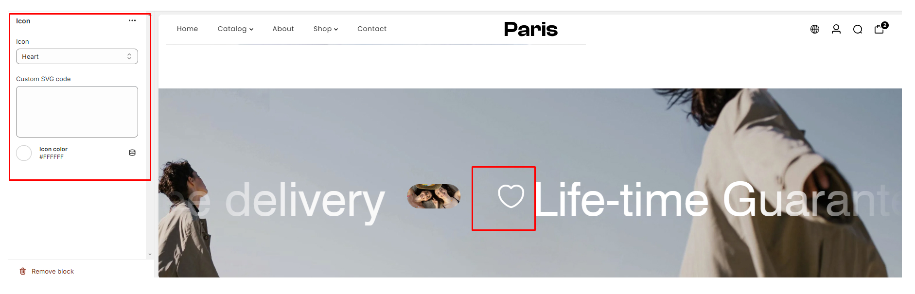
Icon Block
The Icon block offers the following setting options:
- Icon Selector: Choose from a variety of available icons.
- Custom SVG Code: If desired, you can input a custom SVG code for a personalized icon.
- Icon Color: Adjust the color of the selected or custom icon.
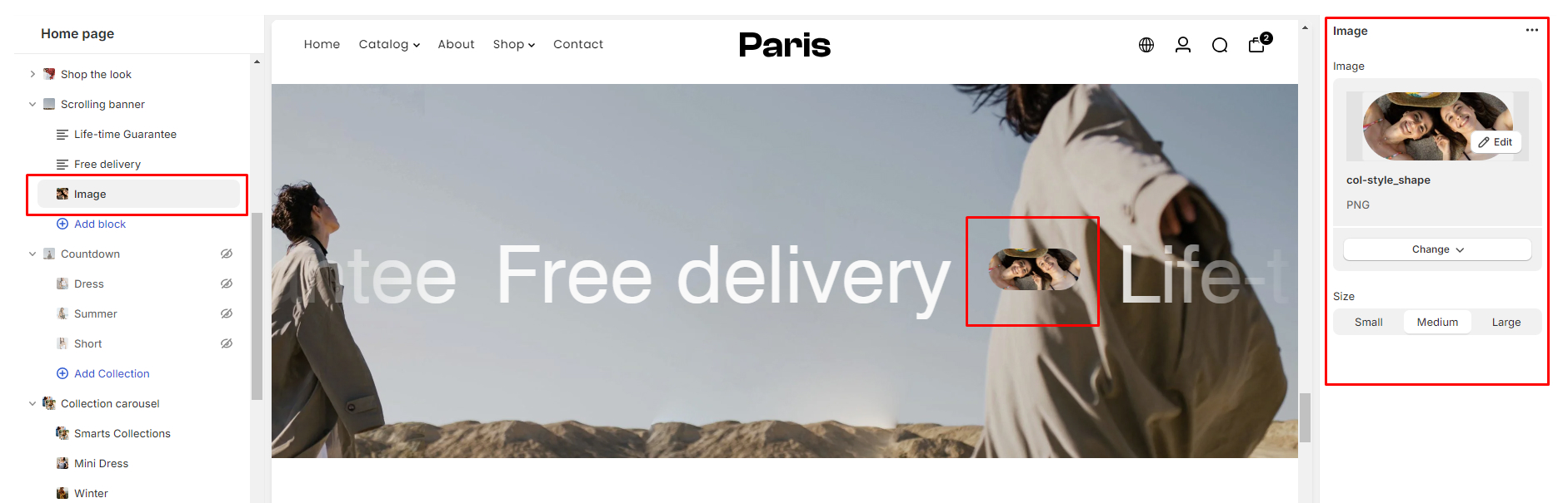
Image Block
The Image block in the Scrolling Banner section offers the following settings:
- Image Upload: Upload the desired image to be displayed in the block.
- Size: Select the preferred size for the image from options such as Small, Medium, or Large.
Button Block
The Button block within the Scrolling Banner section provides the following settings:
- Text: Enter the desired text to be displayed on the button.
- Link: Specify the URL or destination the button should link to.
- Size: Adjust the size of the button by selecting from options such as Xsmall, Small, Medium, or Large.
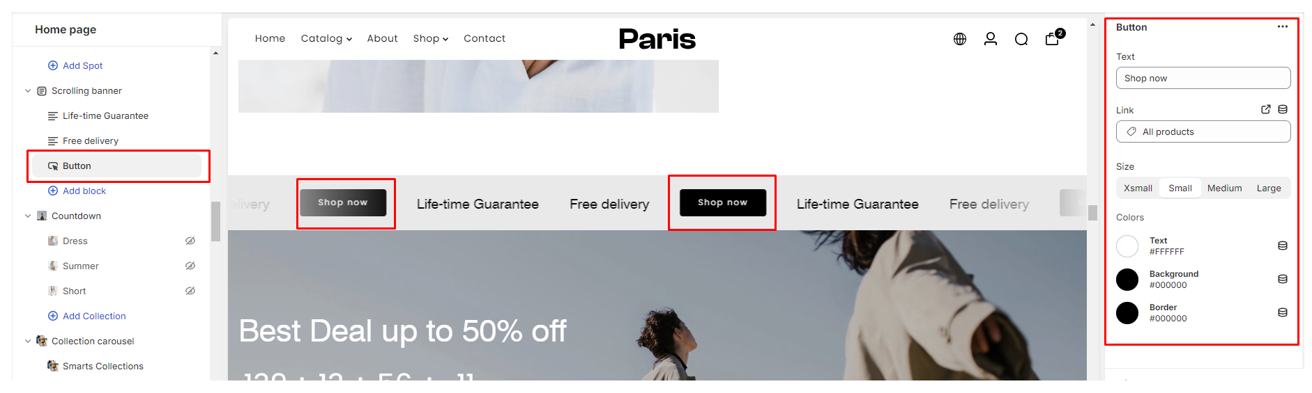
Color
- Button Text: Customize the color of the text displayed on the button.
- Background Color: Choose the background color of the button.
- Border Color: Define the color of the button's border for added customization.
Using the Shop the Look Section
The Shop the Look section is a powerful tool in our theme that allows you to feature products alongside captivating images. This guide will walk you through utilizing the different settings available to create visually appealing and engaging sections on your store.
Image Selection
- Main Image: Choose a high-quality image that effectively showcases the products you want to feature. This image should be visually appealing and relevant to the products you're promoting.
Heading
- Section Heading: Craft a compelling heading that grabs the attention of your visitors.
Heading Size
- Font Size: Adjust the font size to ensure readability and visual hierarchy on both desktop and mobile devices.
Description
- Brief Description: Provide a brief description that complements the heading and gives context to the featured products.
Content Alignment
- Alignment Options: Choose the alignment that best suits the layout and design of your store.
Left: Aligns the content to the left side of the section.Center: Centers the content within the section, creating a balanced look.Right: Aligns the content to the right side of the section.
- Styling Settings:
- Color: Color Scheme: Configurable via "Theme settings > Color".
- Section Spacing: Adjust spacing across desktop and mobile platforms
- Color: Color Scheme: Configurable via "Theme settings > Color".
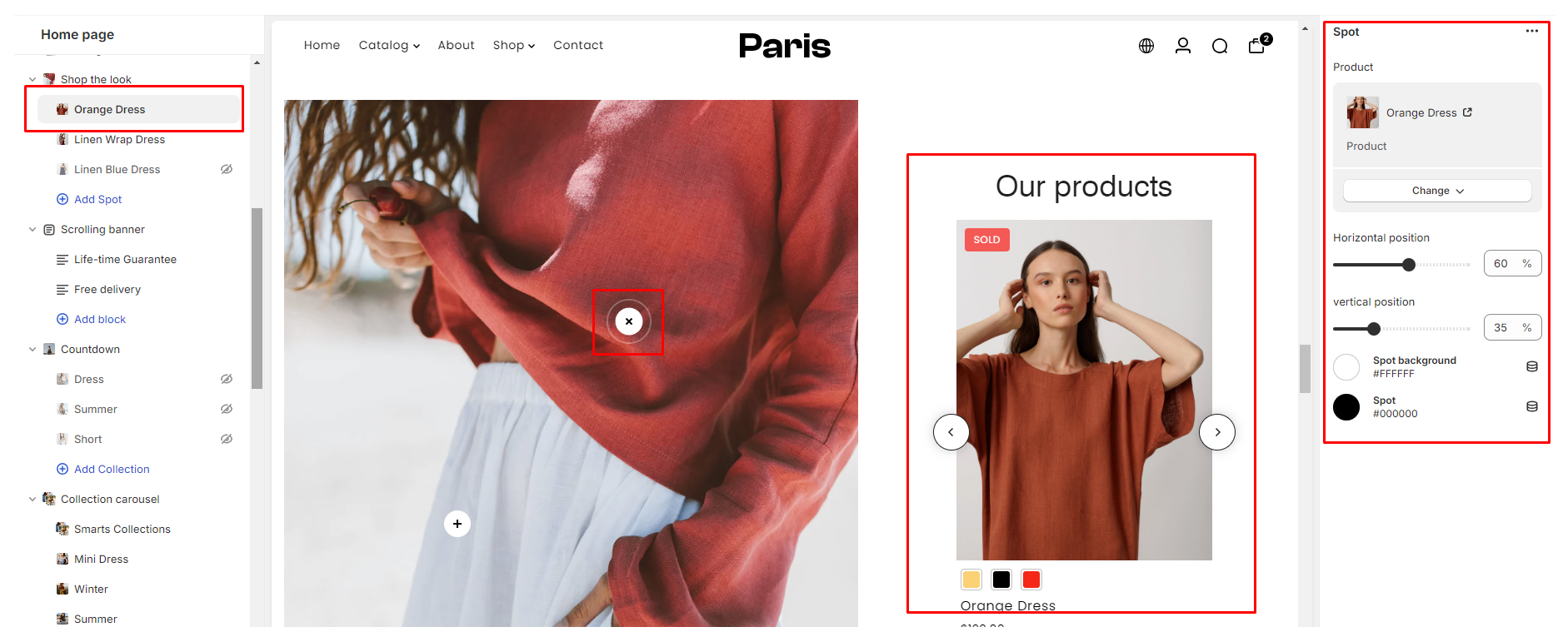
Configuring the Shop the Look block
The Spot block within the Shop the Look section allows you to highlight specific products or features with an eye-catching spot icon.
- Select Featured Product: Choose the product you want to highlight within the Spot block.
- Horizontal & Vertical Position: Determine the precise placement of the Spot icon on the main image. Experiment with different positions to find the optimal placement that draws attention to the featured product without obstructing the overall design.
- Spot Background Color: Choose a background color for the Spot icon that complements the overall color scheme of your store. Consider using contrasting colors to make the spot stand out against the main image.
- Spot Color: Select a color for the Spot icon itself. Ensure that the chosen color provides sufficient contrast with the background color for maximum visibility.
Tips for Effective Use:
- Consistency: Maintain consistency in your branding and design elements across all sections of your store.
- High-Quality Images: Use high-resolution images that showcase your products in the best possible light.
- Mobile Optimization: Ensure that your Shop the Look section is optimized for mobile devices to provide a seamless browsing experience for users on smartphones and tablets.
- Regular Updates: Keep your Shop the Look section fresh by regularly updating the featured products and images to entice repeat visitors.
Using the Text with Icons section
The Text with Icons section in your Shopify theme allows you to showcase content with accompanying icons, here's how you can utilize its settings effectively:
Configuring the Text with Icons Section
- Number of Columns on Desktop: This setting allows you to choose the number of columns per row.
- Icon:
Position: Choose between Top or Left- Select whether you want the icon to appear on the top or left side of the content.Size: Change between small, medium, and large: Determine the size of the icons based on your design and visual hierarchy.
- Enable Icon Background: Toggle this setting to enable or disable the background behind the icon.
- Color Customization: Customize the styling of various elements including column background color, icon background, icon, heading, and text color.
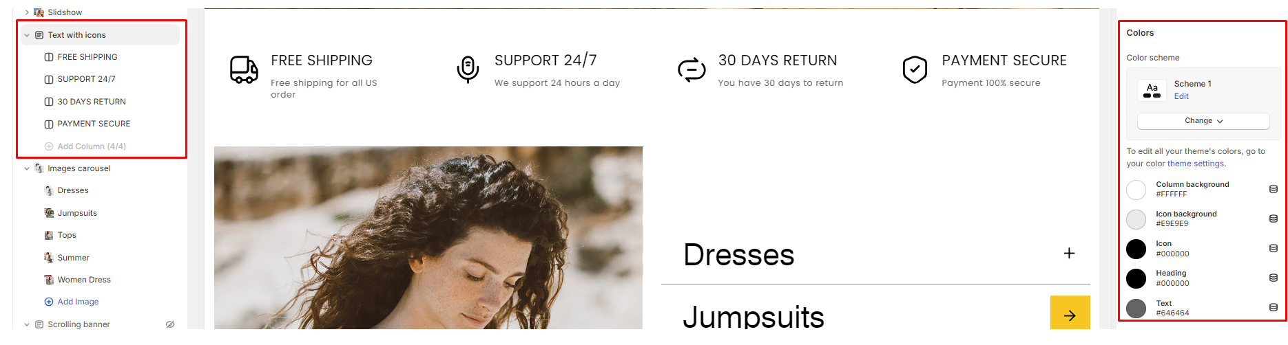
- Section Spacing: Adjust spacing across desktop and mobile platforms
Configuring the Icons blocks
- Icon: Choose from a variety of pre-defined icons provided by the theme.
- Custom SVG: If you prefer to use custom icons, you can add the SVG code for your own designs. Ensure that custom SVGs are properly formatted and optimized for web use.
- Image Icon: Alternatively, you can upload a PNG image as the icon. Use high-quality images that are clear and recognizable even at smaller sizes.
- Heading: Provide a clear and concise heading for the icon block.
- Description: Write a brief description that elaborates on the content or action associated with the block.
- Button:
Text: Specify the text to be displayed on the button.Link: Provide the URL destination for the button.Size: Select the size of the button (e.g., small, medium, large).
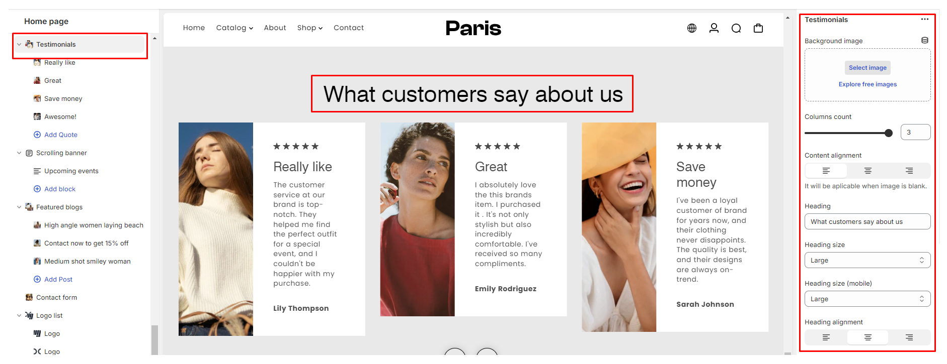
Using the Testimonial Section
Creating an engaging testimonial section on your store is essential for building trust and credibility with potential customers. We have a number of section settings that provide adjustments for flexibility in design and presentation, ensuring that your testimonials captivate visitors and drive conversions.
Configuring the Testimonial Section
- Background Image: Enhance the visual appeal by adding a background image to your testimonial section.
- Column Count: Customize the layout of your testimonials by choosing the number of columns to display you can have up to 3 columns.
- Content Alignment: Adjust the alignment of testimonial content to match your design preferences, you can change from left, center, or right-aligned, this settings take effect if there’s no background image is used.
- Heading: Craft a compelling heading to introduce your testimonial section, capturing visitors' attention and setting the tone for their browsing experience.
- Heading Size: Optimize the readability of your heading by adjusting its size for both desktop and mobile views.
- Heading Alignment: Ensure consistency and visual harmony by aligning your heading text according to your design preferences.
-
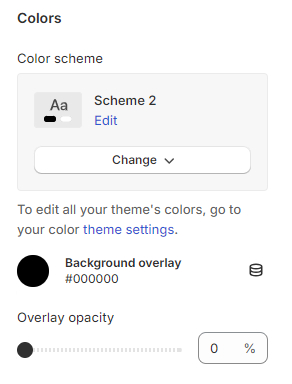
Styling Settings:
Color: - Color Scheme: Configurable via "Theme settings > Color"Overlay Settings: Change the color of the overlaying heading or text color
- Section Spacing: Adjust spacing across desktop and mobile platforms
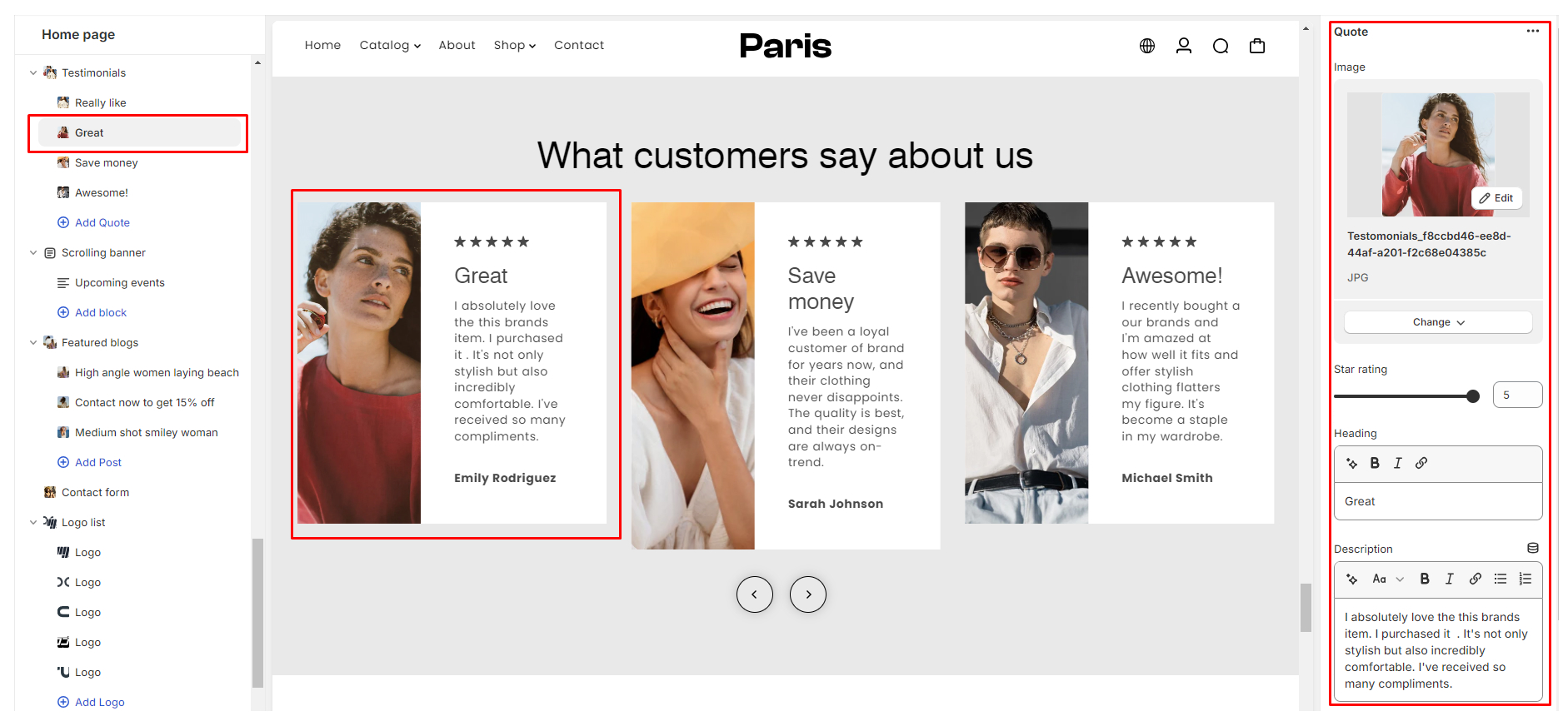
Configuring the Testimonial blocks
- Image Upload: Upload a relevant image associated with the testimonial.
- Star Rating: Adjust the slider to select the appropriate star rating.
- Heading: Input a concise and descriptive heading for the testimonial.
- Description: Provide the testimonial content or description.
- Author Name: Enter the name of the author or customer providing the testimonial.
Adding Video Section
The Video section is designed to elevate your online store's visual storytelling. With versatile rendering options including On Click, Autoplay, or On Scroll, you have the freedom to engage your audience in the way that suits your content best.
Configuring the video section
- Style:Options
On Click: Engage users with interactive video playback, activated by clicking on the video.Autoplay: Seamlessly play videos automatically upon page load for effortless viewing.
- Desktop Height & Mobile Height: Customize the height of the video section for desktop and mobile devices separately, ensuring optimal viewing experiences across all screen sizes.
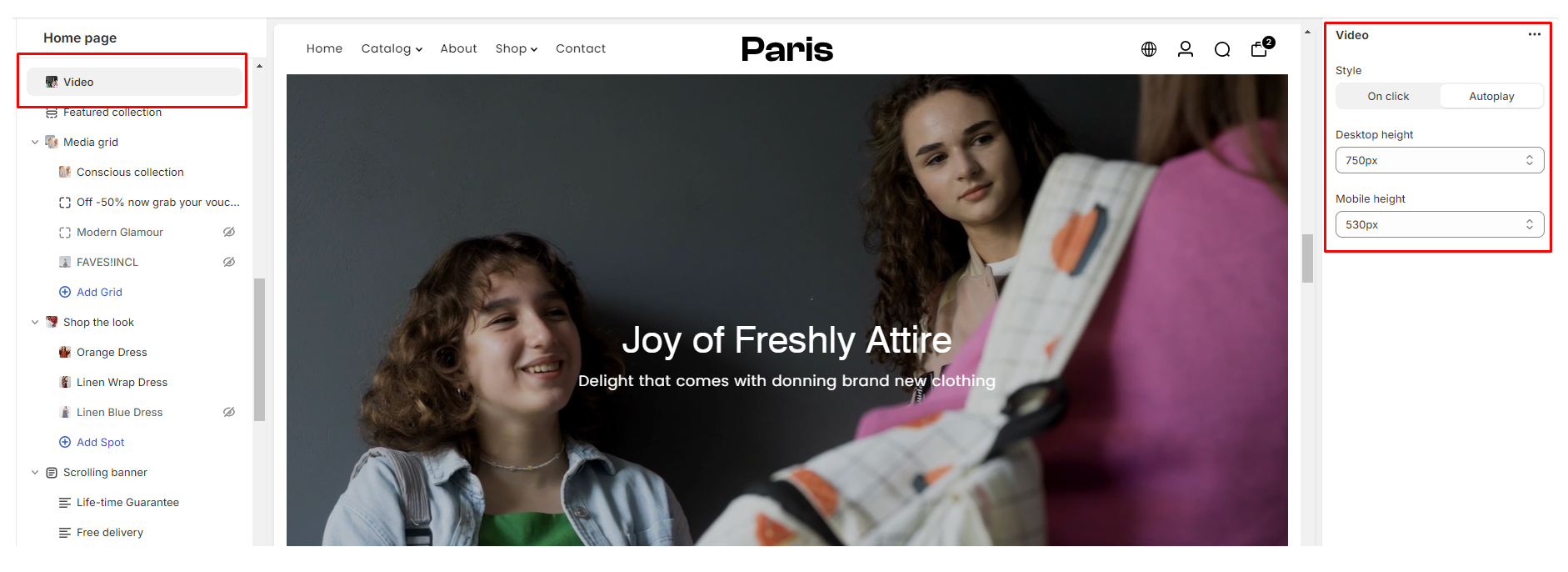
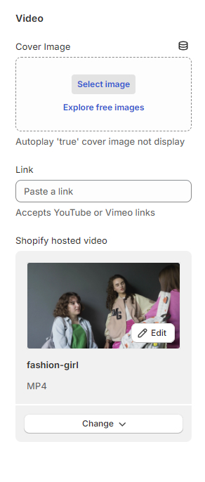
- Video Cover Image: Allows users to set a cover image for the video, the image is not displayed if the style option is set to Autoplay
- Link: Video URL: Accepts YouTube and Vimeo links
- Shopify Hosted Video: Accepts mp4 videos hosted on Shopify
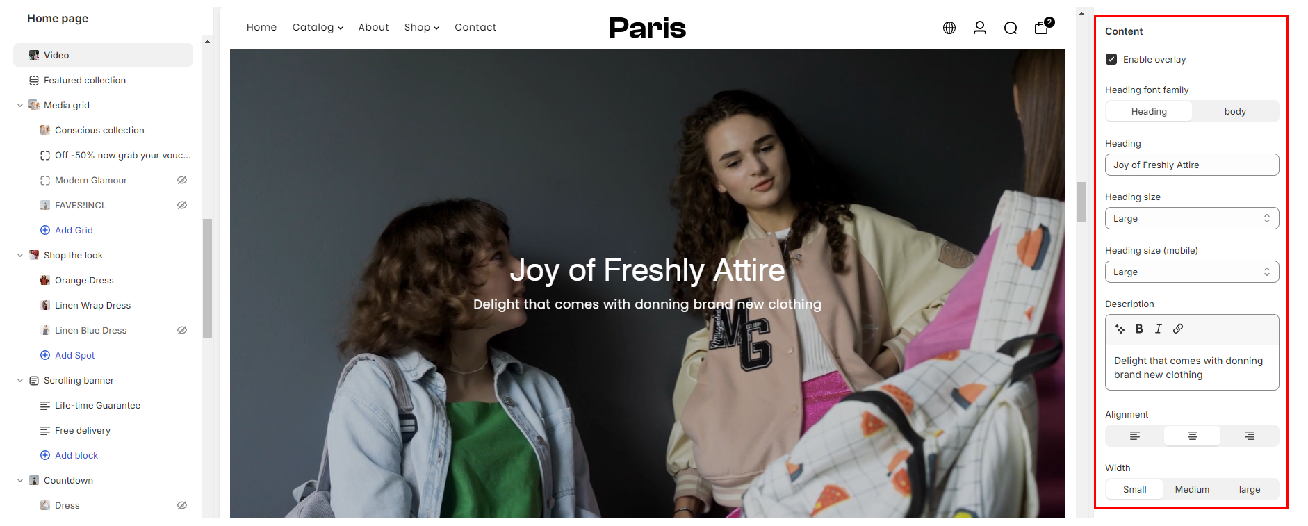
Content Settings:
- Text Overlay: Option to enable or disable text overlay on the video
- Video Heading: Add the video title
- Heading size: Customize heading size for mobile and desktop
- Heading Font Family: Choose between Heading and Body font for the video title
- Description: Add a description for the video
- Alignment: Change the position of the video caption
- Width: Adjust the width of the caption
- Styling Settings:
- Color: Color Scheme: Configurable via "Theme settings > Color".
- Overlay Settings: Change the color of the overlaying heading or text color
- Section Spacing: Adjust spacing across desktop and mobile platforms
- Color: Color Scheme: Configurable via "Theme settings > Color".
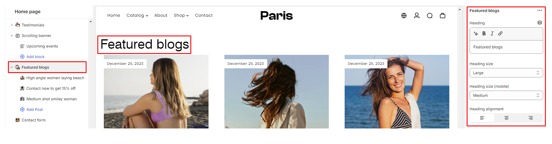
Using the Featured Blogs section
The Feature Blogs section is used to showcase your blog content effectively. Whether you're looking to highlight your latest posts, engage visitors with compelling summaries, or drive traffic to specific articles.
Configuring the Featured Blogs section
- Heading: This is where you input the title or section heading for your Feature Blogs section. Make it descriptive and engaging to attract readers.
- Heading Size: Adjust the size of the heading for better readability on both desktop and mobile devices. Experiment with different sizes to find what works best for your website's design.
- Heading Alignment: Choose the alignment of the section heading according to your design preferences.
- Blog: Select the Desired Featured Blog: Choose which blog posts you want to feature in this section
- Number of Articles: Select the Number of Posts to Be Displayed. Determine how many blog posts you want to display in this section. Consider the space available on your webpage and how many posts you want to showcase at once.
- Show Date: Enable this checkbox if you want the publication date of each featured blog post to be displayed. This can provide visitors with context about when the post was written.
- Show Author: Enable this option if you want the author's name to be displayed alongside each featured blog post. This adds credibility and allows readers to identify the author.
- Show Excerpt: Quick Summary on Individual Post; Check this box if you want a brief summary or excerpt of each featured blog post to be displayed. Excerpts can provide readers with a preview of the content, enticing them to click and read more.
- Button: Text and Link: Customize the text and link of the button associated with each featured blog post. This button can be used to direct readers to the full article or to take a specific action, such as subscribing to your newsletter or exploring related content.
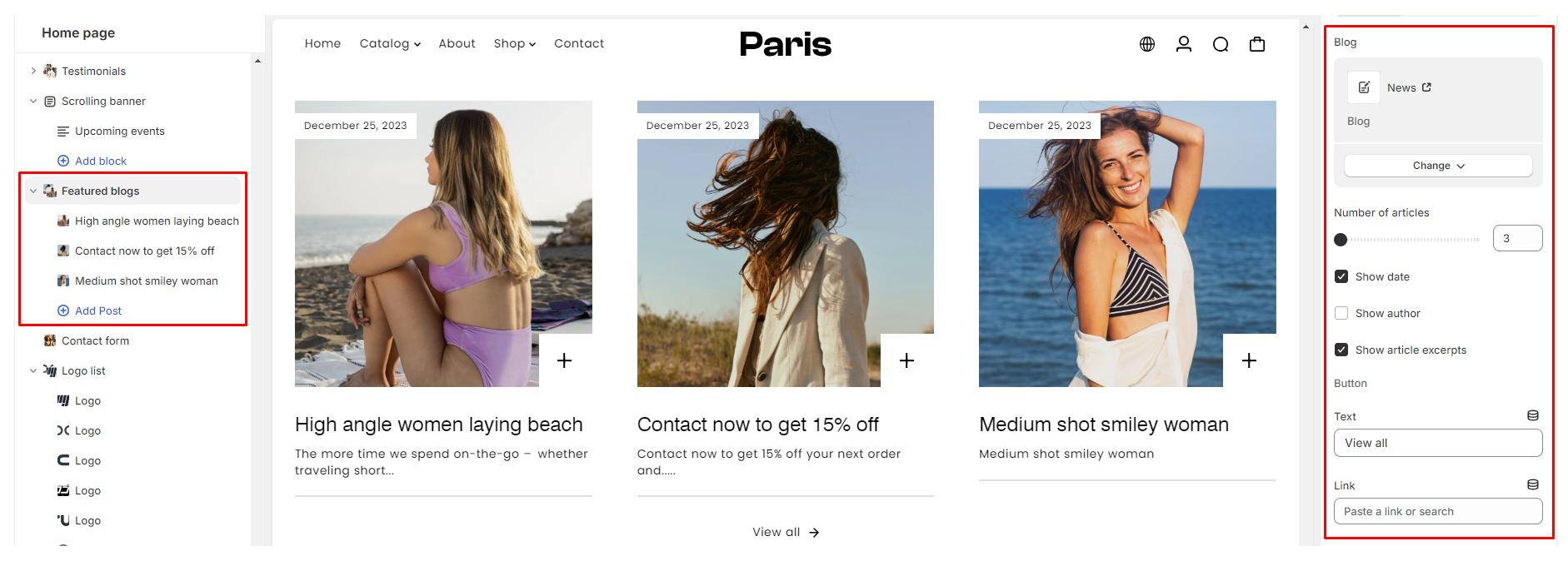
- Styling Settings:
- Color: Color Scheme: Configurable via "Theme settings > Color"
- Overlay Settings: Change the color of the overlaying heading or text color

- Section Spacing: Adjust spacing across desktop and mobile platforms
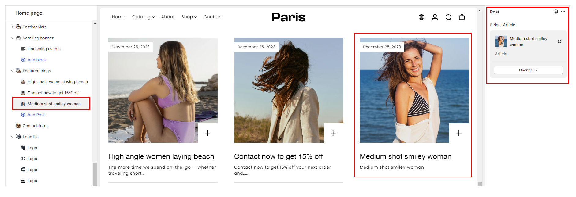
Configuring the Featured Blogs block
Using the Post block, choose the blog post you want to highlight in this particular block. This could be a recent article, an evergreen piece, or content relevant to a current topic or promotion.
Using the Trending Products section
This section is designed to showcase selected products and capture the attention of your customers. Below are detailed instructions on how to effectively configure and utilize each setting within this section.
Configuring the Featured Blogs section
- Heading: The "Heading" setting allows you to define the title of your Trending Products section.
- Heading Size: With the "Heading Size" setting, you can adjust the font size of the heading text for both mobile and desktop devices separately.
- Heading Alignment: Choose the alignment of your section heading from options such as Left, Center, or Right. This allows you to customize the layout of your section title according to your design preferences.
- Product: In the "Products" field, you can select the specific products that you want to feature within the Trending Products section. Choose carefully to highlight your best-selling or most relevant items to attract customer attention.
- Enable Product Title Animation: Activate the "Enable Product Title Animation" setting to add dynamic animation effects to the product titles within the section.
- Scrolling Speed: When the title animation is enabled, you can adjust the "Scrolling Speed" setting to control the pace at which the product titles scroll across the screen. Find the right balance to ensure smooth and captivating animation effects.
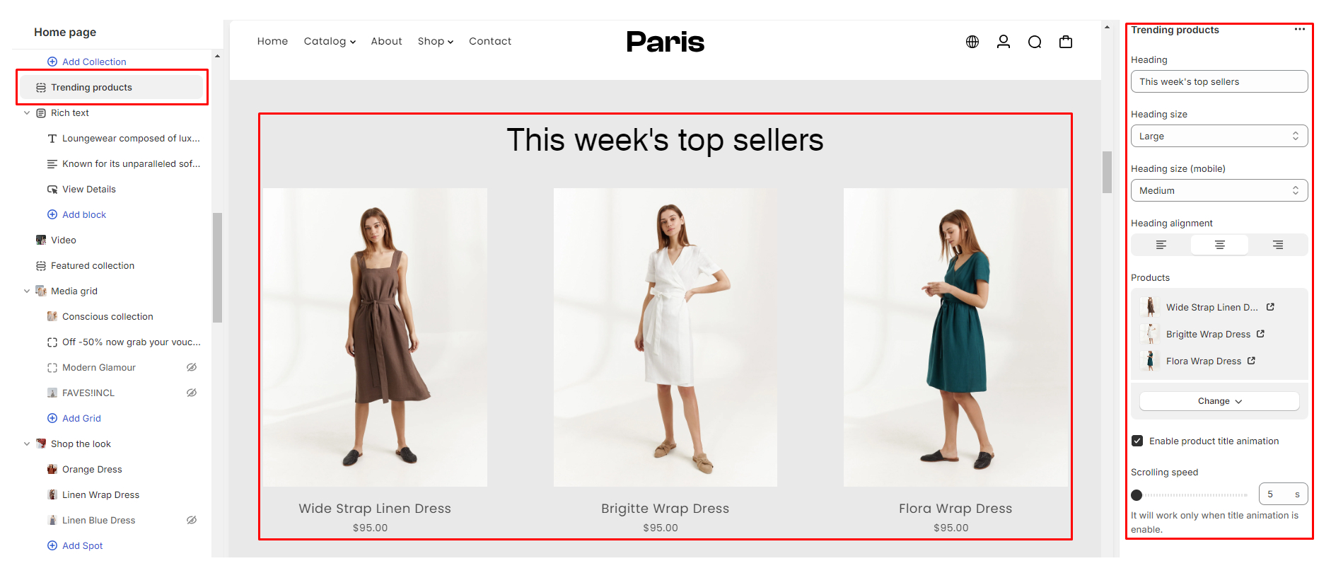
- Styling Settings:
- Color: Color Scheme: Configurable via "Theme settings > Color"
- Section Spacing: Adjust spacing across desktop and mobile platforms
- Color: Color Scheme: Configurable via "Theme settings > Color"
Using the Contact Form section
The Contact Form section in our theme allows you to easily integrate a contact form into your store's pages. This documentation will guide you through the available settings and how to utilize them effectively.
- Image Upload: You can upload an image to be displayed next to the contact form. This feature adds visual appeal to your contact form section.
- Image Position: Choose the position of the image relative to the contact form. You can set it to appear either on the Right or Left side.
- Heading: Customize the heading for your contact form section to fit your store's branding. This heading typically introduces the purpose of the contact form.
- Heading Size: In the "Products" field, you can select the specific products that you want to feature within the Trending Products section. Choose carefully to highlight your best-selling or most relevant items to attract customer attention.
- Description: Provide a brief description to accompany your contact form. This description can provide additional context or instructions for users filling out the form.
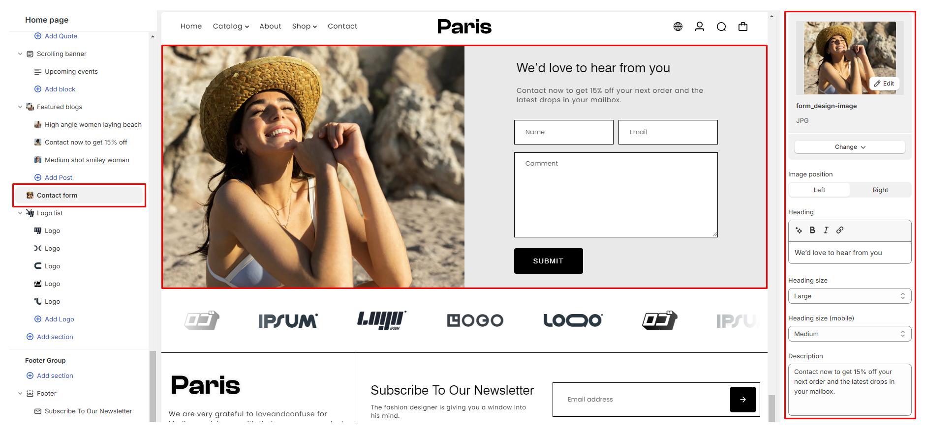
- Content Alignment: Align the content within the contact form section according to your design layout. You can choose between left, center, or right alignment for the contact form and its associated content.
- Styling Settings:
- Color: Color Scheme: Configurable via "Theme settings > Color"
- Section Spacing: Adjust spacing across desktop and mobile platforms
- Color: Color Scheme: Configurable via "Theme settings > Color"
Footer section
The footer section of your Shopify theme plays a crucial role in providing essential information, navigation links, and branding elements to your customers. Configuring this section effectively can enhance the user experience and reinforce your brand identity.
Utilizing the Footer section
- Navigate to Customize Theme editor: From the “Online Store” click on "Themes", locate our Paris theme, and click on the Customize button:
- On the Section settings on the left side-bar locate the Footer section
Configure the Footer section
- Footer Image Upload: Upload an image to be displayed in the footer section by clicking on the "Image Upload" option. Select an image from your computer and upload it.
- Adjusting Logo Width Use the "Logo Width" setting to change the width of your logo. Drag the slider or input a specific width value to adjust.
- Adding Description: Enter a description for your footer section in the provided text box under "Description."
- Enabling Social Icons: Check the box labeled "Enable Social Icons" to display social media icons in the footer. Ensure you have configured your social media links in the Theme Settings > Social Media settings.
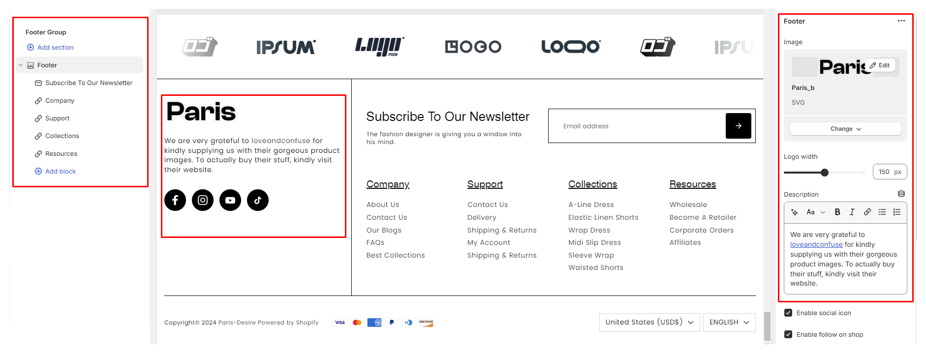
- Enabling Follow on Shop Button: Enable the "Follow on Shop" option to include a link for customers to follow your Shopify shop.
- Mobile Menu Configuration: Toggle the "Mobile Menu" settings to choose whether to open the menu by default in an accordion view on mobile devices.
- Language Selector: Enable Shopify’s Multi-language selector directly on the header, providing visitors with the option to view your store in their preferred language.
- Currency Selector: Enable Shopify’s Multi-currency selector, allowing visitors to easily switch between different currencies to view prices in their preferred currency.
- Displaying Payment Methods: Enable the "Payment Methods" option to display icons of accepted payment methods in the footer.
- Hiding Copyright Content: Toggle the "Copyright" setting to hide the copyright content in the footer if desired.
- Adding Custom Content: Enter any custom descriptions or content you want to include in the footer in the provided text box under Custom Content.
Configure the Footer Section blocks
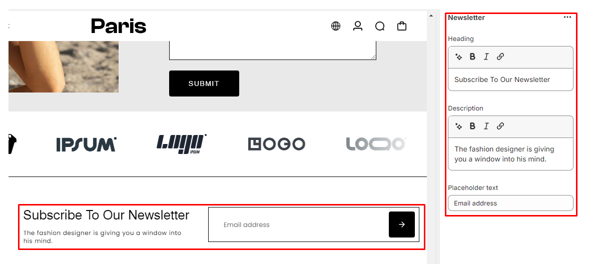
In addition to the main settings of your footer section, you can further enhance its functionality by configuring specific blocks within it. The theme has 2 common blocks the "Newsletter" block and the "Quick Links" block.
Newsletter Block:- Heading:
- Enter a heading for your newsletter block
- Description:
- Provide a brief description or introductory text for your newsletter block. This description can encourage visitors to subscribe to your newsletter.
- Placeholder:
- Specify a placeholder text for the email input field. Placeholder text serves as a hint or example of the type of information expected in the field.
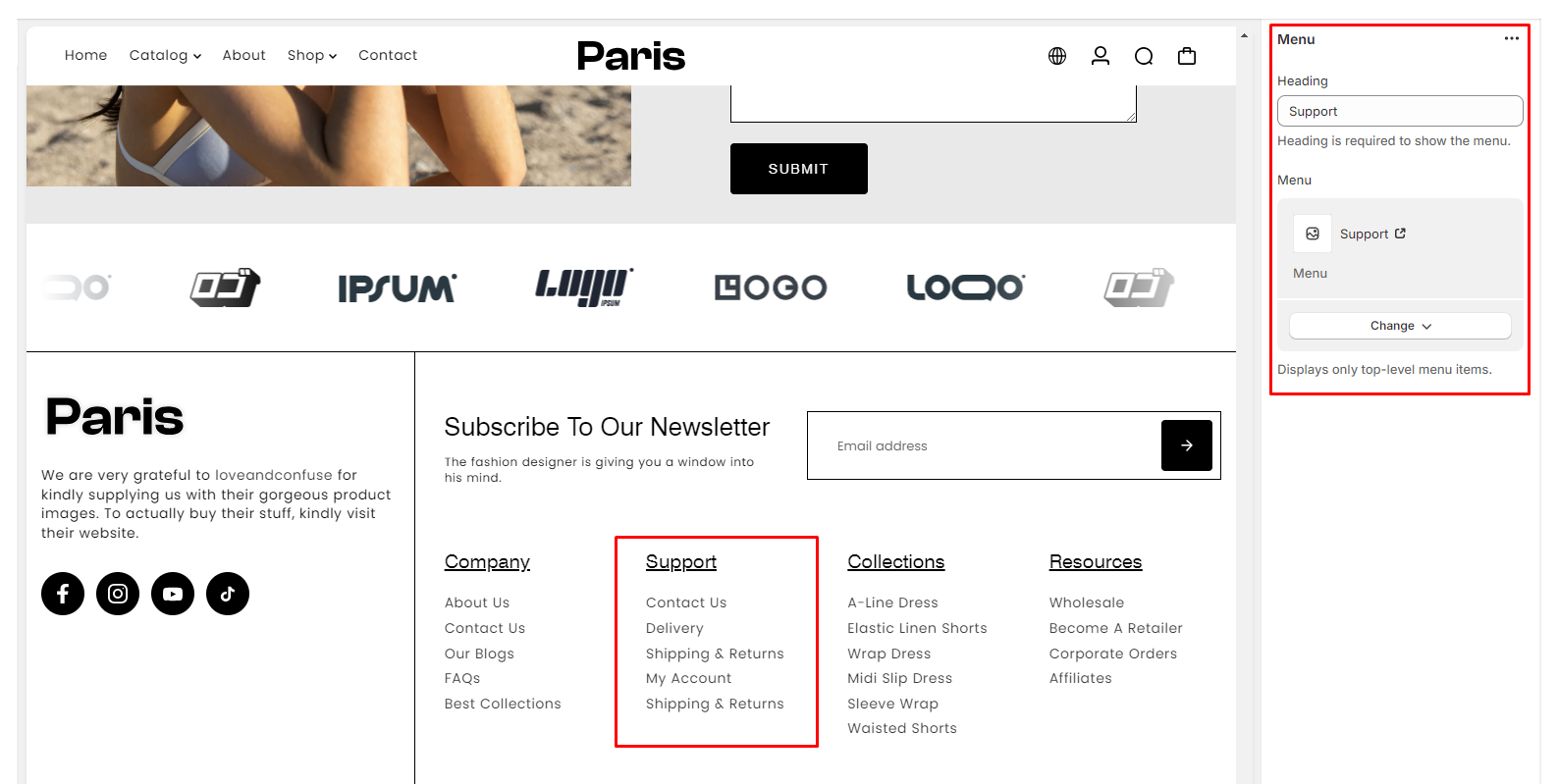
Quick Links Block:
- Heading:
- Define a heading for your quick links block. This heading helps organize and categorize the links you're about to add.
- Menu Select Field:
- Choose a menu from your existing navigation menus to be displayed as quick links in this block. Select the appropriate menu from the dropdown list.