Announcement Bar
The Announcement Bar is a versatile feature in the Desert theme that allows you to display important messages, promotions, or updates at the top of your store. Below are the customization options based on the provided settings:
Visibility Options
- Show on Home Page Only:
- Disabled: The announcement bar will appear across all pages of your store.
- Enabled: The announcement bar will only be visible on the home page.
Slide Behavior
- Auto-Rotate Slides:
- Toggle: This option to automatically cycle through multiple announcements.
- Enabled: The slides will rotate automatically.
- Disabled: Slides remain static until the user manually interacts with them.
- Change Slides Every [X seconds]:
- Duration : Set the duration (in seconds) for how long each slide is displayed before transitioning. (Default: 3 seconds)
- Number of Slides:
- Specify : The total number of announcement slides to include. (Default: 1 slide)
Contact Information
- Show Info:
- Enabled: Displays contact details alongside the announcement.
- Disabled: Contact information will not appear on the announcement bar.
- Need Help:
- Enter a short message (maximum of 10 characters) for quick support communication.
- Email:
- Add an email address to provide customers with a direct contact method.
Language Selector
- Enable Language Selector:
- Toggle this to allow customers to choose their preferred language.
- To add languages, navigate to the Language Settings in your Shopify admin.
Currency Selector
- Enable Currency Selector:
- Toggle this to allow customers to select their preferred currency.
- To add a country/region, go to Payment Settings in your Shopify admin.
Design Customization
- Background Style (Left Side):
- Choose between a Solid color or Gradient background for the announcement bar:
- Solid Color: Select a single background color.
- Gradient: Choose a gradient effect for a dynamic background.
- To add a country/region, go to Payment Settings in your Shopify admin.
- Choose between a Solid color or Gradient background for the announcement bar:
- Text Color:
- Customize the color of the announcement bar text.
- Link Color:
- Set the color for any links included in the announcement.
- Hover Color:
- Define the hover effect color for links. (Default: #FFFFFF, white)
Header Settings
The Header section in the Desert Shopify Theme allows customization of the top navigation area, which includes logo settings, navigation menu, icons, mobile drawer, search functionality, and additional options to enhance branding and usability.
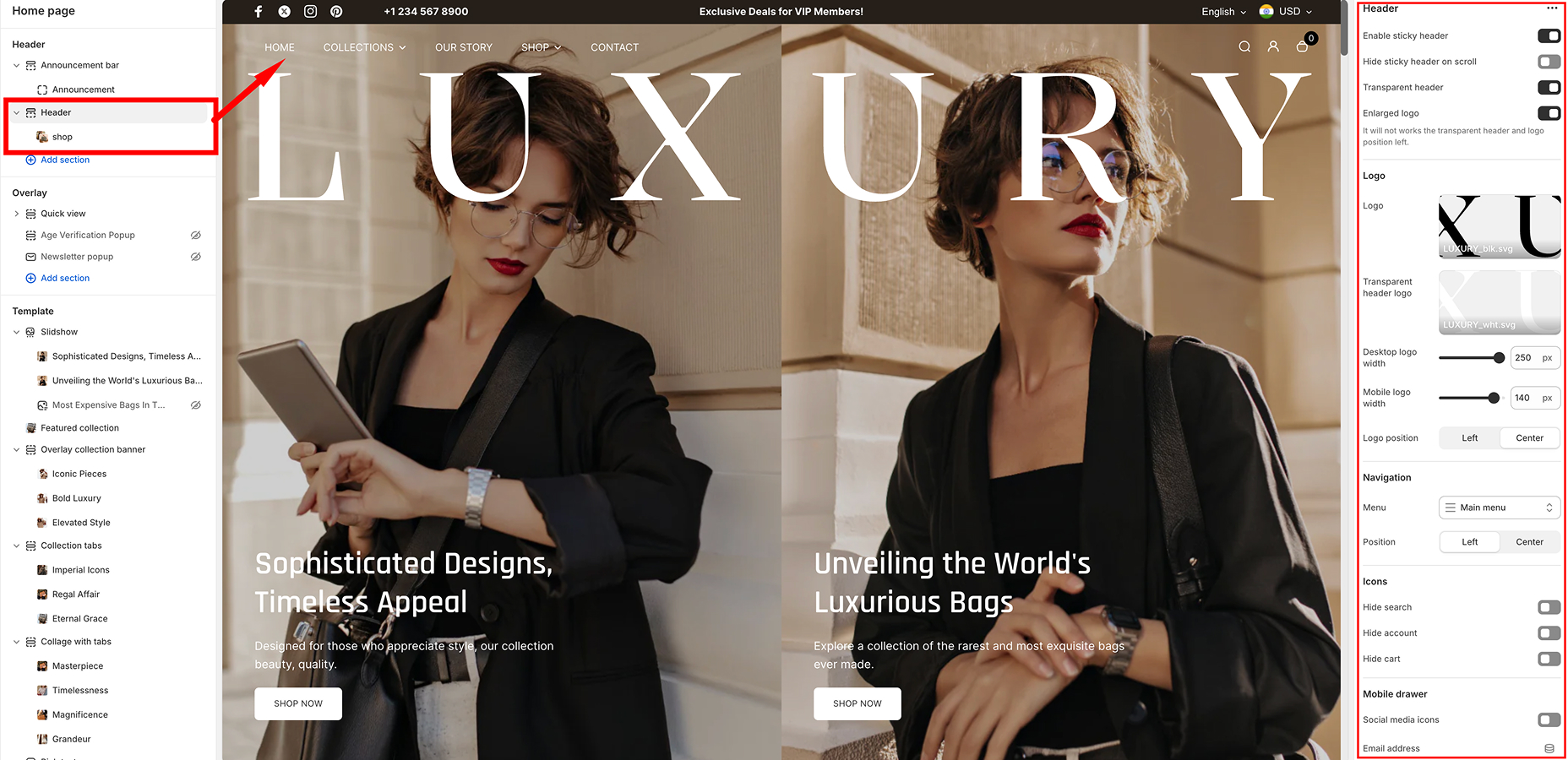
Customization Options
Sticky & Transparent Header
- Enable Sticky Header – Keeps the header visible while scrolling.
- Hide Sticky Header on Scroll – Hides the sticky header when scrolling down and shows it again when scrolling up.
- Transparent Header – Makes the header background transparent.
- Enlarged Logo – Increases the logo size for better visibility. (Note: Does not work with transparent header if the logo position is set to left.)
Logo Settings
- Left (Aligned to the left side)
- Center (Centered in the header)
Navigation Menu
- Menu Selection – Choose the primary menu to display in the header.
- Position – Align the menu either Left or Center.
Icons (Search, Account, Cart)
- Hide Search – Removes the search icon from the header.
- Hide Account – Hides the customer account login/register icon.
- Hide Cart – Removes the cart icon from the header.
Mobile Drawer
- Social Media Icons – Display social media links inside the mobile navigation drawer.
- Email Address – Add an email contact in the mobile drawer.
Contact Information
- Phone Number – Add a phone number to be displayed in the header or mobile drawer.
Language & Currency Selectors
- Enable Language Selector – Allows customers to switch languages. (Requires setup in Language Settings.)
- Enable Currency Selector – Enables customers to change currencies. (Requires setup in Market Settings.)
Search Drawer
- Position – Choose where the search drawer appears:
- Bottom – Displays below the search bar.
- Suggestions – Add custom search suggestions (e.g., "Handbag, Leather, Style, Elegant").
- Products – Display suggested products in search results. Click Change to modify product recommendations.
Custom CSS
- Add custom CSS to modify the header styling beyond built-in settings.
How to Customize the Header
- Go to Shopify Admin → Online Store → Themes → Customize.
- Select the Header section from the left sidebar.
- Adjust settings according to your preferences.
- Click Save to apply changes.
Configurable Blocks in the Header Section
The Desert Shopify theme allows further customization of the header with configurable blocks to enhance functionality and visual appeal. Below is an overview of the available block and its settings:
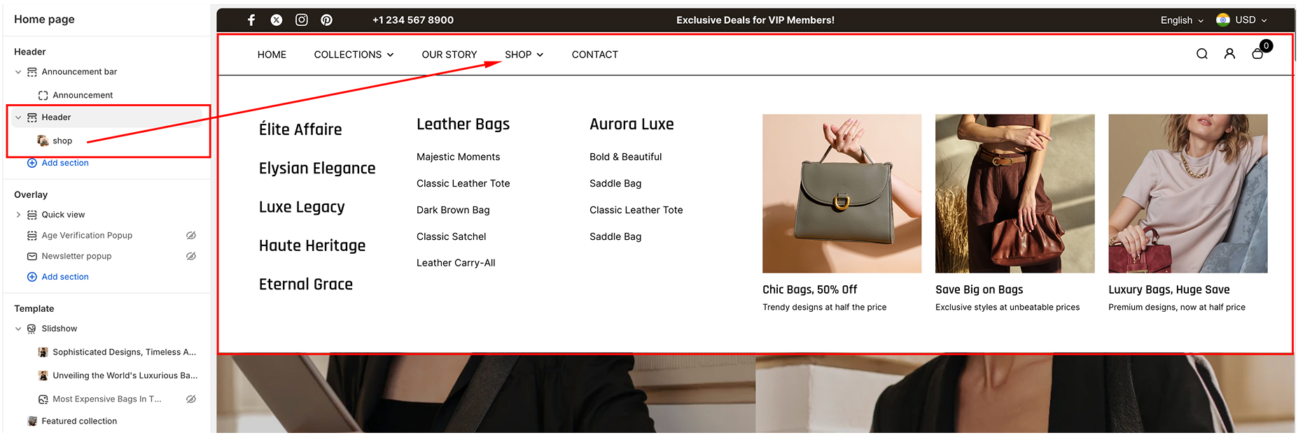
C1. Mega Menu Block
The Mega Menu Block is designed to create an expanded navigation menu with additional content and featured collections, making it ideal for stores with multiple product categories or promotional content. It includes the following settings:
- Menu Label
- Description: Specify the menu item (e.g., "Shop") to which the mega menu will apply. This serves as a selector to attach the mega menu content to a specific item in the main navigation menu.
- Collections
- Description: Specify the menu item (e.g., "Shop") to which the mega menu will apply. This serves as a selector to attach the mega menu content to a specific item in the main navigation menu.
- Content
You can add up to some configurable content blocks to the mega menu. Each content block contains the following settings:
- Image
- Upload a featured image to display within the mega menu.
- Ideal for promotional banners or showcasing a product category.
- Heading
- Add a prominent heading to the content (e.g., "50% OFF ON ALL ITEMS")
- This heading serves as a primary call-to-action or category title.
- Subheading
- Add a supporting subheading to provide more details (e.g., "Limited-time offer on winter collections").
- Link
- Assign a clickable link to the content block.
- Example: Link to a collection page such as /collections/winter-sale or an external URL for promotions.
- Image
Age Verification popup
The Age Verification Popup feature in the Desert theme helps ensure that only users meeting specific age requirements can access your store. Below is a detailed guide to configuring and customizing this popup based on the provided settings:
Enabling the Age Verification Popup
- Age Verification Popup Toggle:
- Disabled: Deactivates the age verification feature.
- Enabled: Activates the popup to verify users' age before granting access to the store.
Logo Customization
- Logo Image
- Add a custom logo to the popup for branding purposes.
- Use the "Select" button to upload or choose an image from your store's library.
Heading and Description
- Popup Heading
- Customize the title text that appears at the top of the popup
- Example: "Confirm your age"
- Popup Description
- Add a description to explain the age requirement to users.
- Example: "Are you 18 years old or older?"
Button Text Customization
- Decline Button Text
- Customize the text for the button users click if they do not meet the age requirement.
- Example: "No, I’m not"
- Approve Button Text
- Customize the text for the button users click if they confirm their age.
- Example: "Yes, I am"
Under-18 Content
- Under-18 Title
- Specify the title displayed if a user does not meet the age requirement.
- Example: "Come back when you’re older"
- Under-18 Description
- Add a message explaining why the content is restricted to younger users.
- Example: "Sorry, the content of this store can’t be seen by a younger audience. Come back when you’re older."
- Decline Button Text
- Customize the button text for users who need to re-enter their age.
- Example: "Oops, I entered incorrectly"
Popup Frequency
- Frequency (Number of Days):
- Specify the number of days before the dismissed popup reappears.
Color Scheme
- Color Scheme Selection:
- Choose from predefined color schemes to match your store’s theme and branding.
Overlay: Quick view
The Quick view Overlay Section in the Desert theme allows users to access essential product details and actions in a convenient overlay block, enhancing the shopping experience without leaving the current page. This document provides a guide to understanding, configuring, and utilizing this feature effectively.
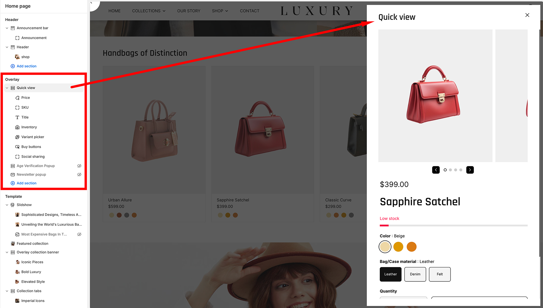
Overview of the Quickview Section
The Quickview Section is a highly customizable overlay that displays a product's:
- Title
- Price
- Inventory Status
- Variant Selector
- Buy Buttons
- Additional content blocks such as text or other custom HTML (if configured).
Components of the Overlay Block
-
Title
- Displays the product name dynamically.
- Pulled directly from the product metadata.
-
Price
- Displays the product price, including any discount or sale pricing.
-
Inventory
- Indicates whether the product is in stock or out of stock.
-
Variant Selector
- Allows users to choose between different variants of the product (e.g., size, color).
-
Buy Buttons
- Includes a "Buy Now"<.strong> button or "Add to Cart" button, depending on configuration.
-
Text
- An optional block to display additional information or a custom message.
How to Configure the Quickview Section
To enable and customize the Quickview Section in the Overlay Block:
-
Access the Theme Editor
- Navigate to Online Store > Themes > Customize.
-
Find the Quickview Section
- Select the Overlay Block from the section list (as shown in the left-hand panel of the attached image).
-
Customize the Content
- Adjust the title, price, and text by modifying the respective blocks.
- Enable or disable the inventory status using the toggle option.
- Add or rearrange the Variant Picker and Buy Buttons by dragging and dropping in the block editor.
-
Customize Text Block
- If the optional Text block is added, you can input custom text in the provided field.
- Useful for marketing messages or additional product information.
Collection Carousel
The Collection Carousel section in the Desert theme allows you to showcase a selection of product collections in a sleek, rotating carousel. You can customize how many items are displayed, their layout, and the content shown in the carousel.
General Settings
-
Enable Full Width
- Toggle Option: Enabled/Disabled The carousel will stretch across the full width of the page.
-
Enable Slider:
- Toggle Option: Enabled/Disable Activates the slider functionality, allowing users to swipe through collections.
-
Show Next Half Slide
- Toggle Option: Enabled/Disable Displays half of the next collection item to indicate more content is available.
-
Number of Items per Row
- Slider: Enabled/Disable Adjust the number of items displayed per row.
-
Gap Between Columns
- Slider Adjust the gap between each item in the carousel.
-
Image Ratio
- Dropdown:
- Adapt to Image: Automatically adjusts the image dimensions to fit the aspect ratio of each image in the carousel.
- Fixed Ratio: Fixes the aspect ratio to a set proportion.
- Dropdown:
Content Settings
-
Heading:
- Text Enter the heading text that will appear above the carousel.
-
Heading Size
- Dropdown:
- Large: Displays a large heading.
- Small: Displays a smaller heading.
- Dropdown:
-
Button
- Text:
- Enter the button text that will appear below the carousel.
- Link:
- Paste the URL link that the button will direct to when clicked.
- Text:
-
Block Content
- Enable Content Background:
- Enabled: Adds a background color or image behind the content.
- Disabled: No background is applied
- Content Style:
- Content on hover: Content on hover: Shows content (like text or button) when the user hovers over an item in the carousel.
- Content always visible: Keeps the content visible at all times, even when not hovering.
- Enable Content Background:
-
Mobile Content
- Number of Columns on Mobile:
- Choose how many items will be shown in a row on mobile devices.
- Enable Swipe on Mobile:
- Enabled/Disabled: Allows users to swipe through the carousel on mobile devices.
- Number of Columns on Mobile:
Visual Settings
-
Color Scheme:
- Dropdown Choose a predefined color scheme for the carousel section.
-
Section Spacing
- Desktop Spacing:
- Top Spacing: Adjust the space above the section. Example: 0 px.
- Bottom Spacing: Adjust the space below the section. Example: 90 px.
- Mobile Spacing:
- Top Spacing: Adjust the space above the section. Example: 0 px.
- Bottom Spacing: Adjust the space below the section. Example: 40 px.
- Desktop Spacing:
Configure individual Collection blocks
The Collection Carousel section includes a configurable Collection Block that allows for dynamic and visually appealing displays. Below are the configurable settings for the Collection Block:
- Color Scheme: Choose the desired color scheme for the block.
- Collection: Select a specific collection to display within the block.
- Image: Upload or select an image to represent the collection.
- Subheading: Add a short, optional subtitle to provide additional context to the block.
- Heading: Enter the main title for the collection block.
- Description: Write a detailed description or supporting text for the collection.
- Colors:
Overlay Color - Select the color overlay to enhance image visibility or align with branding.
Overlay Opacity: Adjust the transparency level of the overlay.
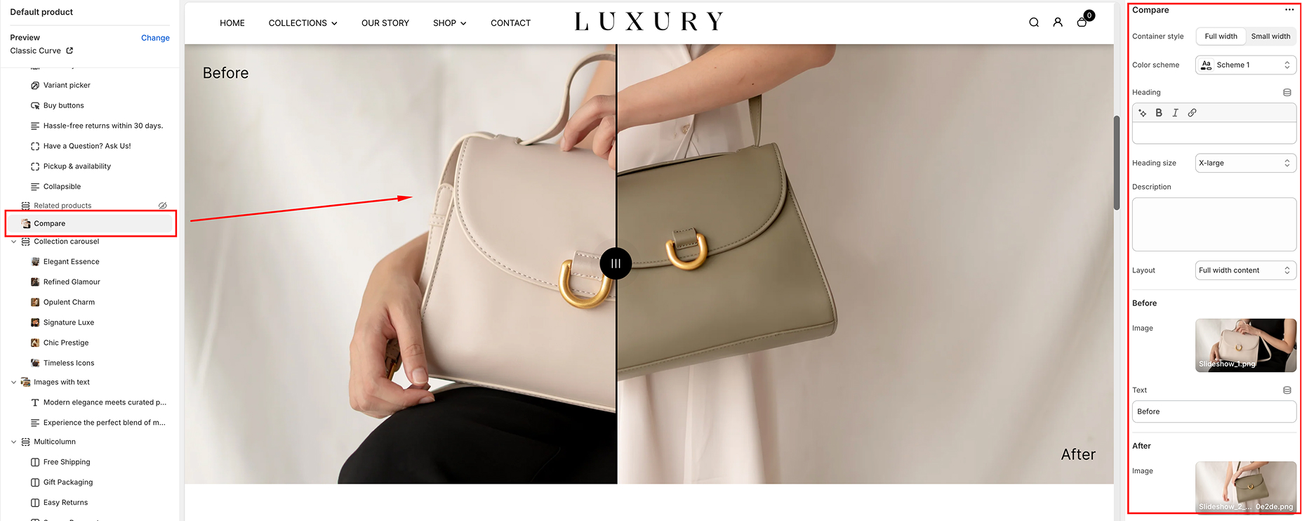
Compare
The Compare Section in the Desert theme is an interactive feature that allows you to showcase a "Before and After" comparison of two images. This section is ideal for displaying transformations, product improvements, or any visual comparison that adds value to your store.
Step-by-Step Guide to Set Up the Compare Section
-
Access the Theme Editor
- From your Shopify Admin, go to Online Store > Themes.
- Find the Desert theme and click Customize.
-
Add the Compare Section
- In the theme editor, click Add Section from the left-hand panel.
- Search for Compare and select it.
- The section will appear at the bottom of your homepage. Drag it to your desired position on the page.
Customize the Compare Section
Once the section is added, you can adjust the settings to match your branding and content requirements.
- In the theme editor, click Add Section from the left-hand panel.
- Search for Compare and select it.
- The section will appear at the bottom of your homepage. Drag it to your desired position on the page.
General Settings
- Container Style: Choose between Full Width or Contained.
- Full Width stretches the section across the entire screen width.
- Contained restricts the section within the page margins for a cleaner look.
- Color Scheme: Select a color scheme (e.g., Default, Scheme 1, Scheme 2) to match your store's theme.
- Heading: Add a title for your section (e.g., "Compare Before and After"). Customize the font size using the Heading Size dropdown (Small, Medium, Large, X-Large).
- Description: Provide a brief explanation about the comparison to engage your customers.
Before & After Image Setup
-
Before Image
- Click the Select button under the Before Image section to upload your "Before" image.
- Add text for the "Before" image label (e.g., "Before Treatment").
-
After Image
- Click the Select button under the Afte Image section to upload your "Afte" image.
- Add text for the "After" image label (e.g., "After Treatment").
Layout Settings
-
Layout Choose how the content aligns with the images:
- Full Width Content Spreads the heading and description across the entire width.
- Contained Content Aligns the heading and description with the image alignment.
Spacing Options
-
Section Spacing Choose how the content aligns with the images:
- Adjust the Top Spacing and Bottom Spacing for both desktop and mobile views using the pixel sliders. This allows you to add or reduce space above and below the section for a balanced layout.
Save Your Changes
- Once you’ve configured the section, click the Save button at the top-right corner.
- Test the slider functionality in both desktop and mobile views to ensure proper responsiveness.
Best Practices for Using the Compare Section
- High-Quality Images: Use clear and high-resolution images to make the comparison impactful.
- Highlight Key Differences: Ensure the "Before" and "After" images showcase a noticeable transformation (e.g., product use, cleaning, etc.).
- Engaging Headline: Use a compelling heading that grabs attention, such as "See the Difference!".
- Keep It Simple: Avoid overcrowding the section with too much text or unnecessary visuals.
Common Use Cases
- Product Demonstrations: Show how your product improves or changes the customer's experience.
- Service Results: Highlight the results of a service (e.g., home cleaning, fitness programs).
- Before & After Comparisons: Compare states like "Before Wearing" and "After Wearing" for apparel stores.
Featured Collection
The Featured Collection section in the Desert theme allows you to highlight a specific collection of products in a visually appealing grid layout. This section is ideal for showcasing your best-selling, new, or curated items to grab your customers' attention.
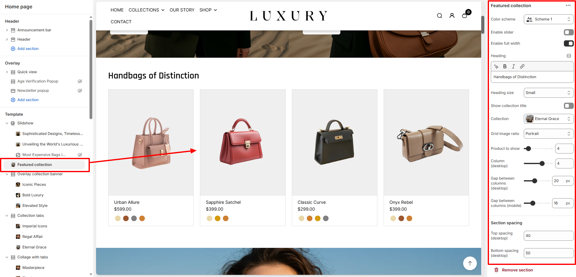
General Settings
-
Color Scheme
Dropdown: Choose the color scheme for this section to match your store's branding. Example: Scheme 3.
Enable Slider
- Toggle Option
- Disabled: Displays the products in a static grid layout.
- Enabled: Activates a slider to display products in a carousel format.
Enable Full Width
- Toggle Option
- Disabled: Limits the section to the default container width.
- Enabled: Expands the section to fill the entire screen width.
Heading Settings
-
Heading
Text Enter the heading text that will appear above the featured collection.
Example: "Most Loved by You."
-
Heading Size
Dropdown Choose the heading size for better visual hierarchy.
Options: Small, Medium, Large.
-
Show Collection Title
Toggle Option Enabled/Disabled: Displays the collection name as the title.
Collection and Grid Settings
-
Collection
Dropdown Select the collection you want to display in this section.
-
Grid Image Ratio
Dropdown Choose how the product images should be displayed:
■ Auto: Retains the original image aspect ratio.
■ Square: Crops images into a square for consistency.
■ Portrait: Displays images in a vertical format.
■ Landscape: Displays images in a horizontal format.
-
Products to Show
Slider Adjust the number of products displayed in this section.
Example: 8 products.
-
Gap Between Columns
Desktop Adjust the space between product columns on desktop.
Example: 4 px.
Mobile Adjust the space between product columns on mobile devices.Example: 2 px.
Section Spacing
-
- Desktop Spacing:
- Top Spacing: Adjust the space above the section. Example: 0 px.
- Bottom Spacing: Adjust the space below the section. Example: 90 px.
- Mobile Spacing:
- Top Spacing: Adjust the space above the section. Example: 0 px.
- Bottom Spacing: Adjust the space below the section. Example: 40 px.
- Desktop Spacing:
Theme Settings
- Color Options Name
- Text Field:
- Enter the label for color swatches displayed for product variants. Example: Color, Colour.
- Text Field:
- Show Variant Image as Color
- Toggle Option
- Enabled/Disabled: Displays the variant images as color swatches for the products.
- Toggle Option
- Enable Card Border
- Toggle Option
- Enabled/Disabled: Adds a border around each product card.
- Toggle Option
- Grid Style
- Dropdown
- Choose how the product grid is styled:
-
■ Standard: Default layout without special styling.
■ Card: Applies a card layout for each product.
- Dropdown
- Hide Color Swatch
- Toggle Option
- Enabled Hides the color swatch display.
- Disabled Shows the color swatches for product variants.
- Toggle Option
Image with Text
The Image with Text section is a highly customizable feature in the Desert theme, designed to display an image alongside descriptive text. This section is ideal for showcasing product highlights, promotions, or storytelling to enhance the customer experience.
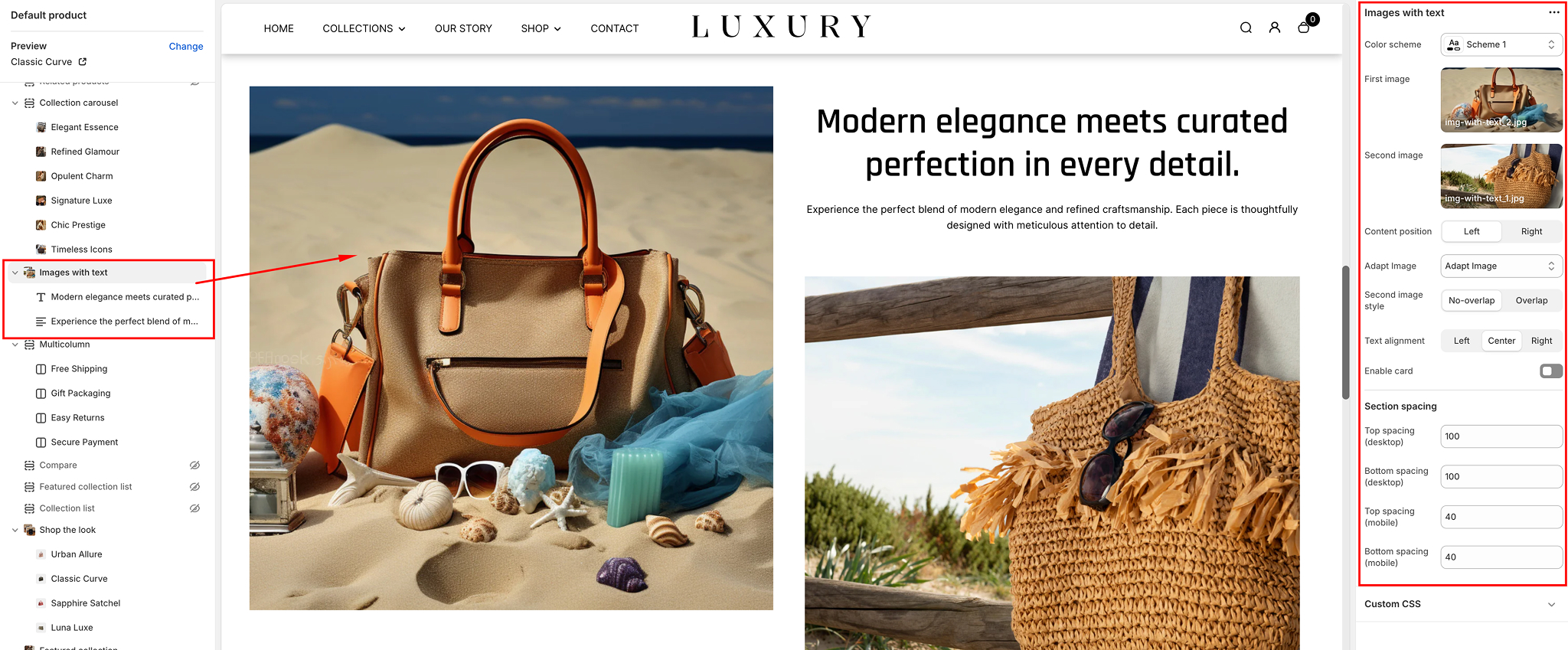
Section Overview
The Image with Text section includes:
- Images: Display up to two images (primary and secondary) with customizable layout options.
- Text: Add a title, description, and optional call-to-action (CTA) buttons.
- Customization Options: Flexible content positioning, styling, spacing, and alignment.
Settings
Here’s a breakdown of the available settings for the Image with Text section:
Color Scheme
- Purpose: Choose the color palette for the section's background, text, and button styling.
- Options: Default schemes defined in your theme.
First Image
- Purpose: Select the primary image for the section.
- Options:
○ Upload a custom image○ Recommended dimensions: 1000px x 800px for optimal clarity.
Second Image
- Purpose: Add a secondary image (optional). This image can overlap or align next to the first image.
- Options:
○ Upload or replace with a new image
- Second Image Style:
■ No-overlap: Displays images side by side.■ Overlap: Adds a layered design with the second image partially overlapping the first.
Content Position
- Purpose: Adjust where the text content appears relative to the images.
- Options:
Left: Places the text on the left and images on the right.Right: Places the text on the right and images on the left.
Adapt Image
- Purpose: Automatically crop or scale the images to fit within the layout.
- Options:
Adapt Image: Ensures images fit without distortion.Right: Places the text on the right and images on the left.
Text Alignment
- Purpose: Align text content (title, description, and buttons).
- Options:
Left, Center, Right.
Enable Card
- Purpose: Adds a card-like container with padding around the text.
- Options:
Toggle On/Off.
Section Spacing
- Purpose: Adjust the padding for both desktop and mobile devices.
- Options:
○ Top Spacing (desktop)○ Bottom Spacing (desktop)○ Top Spacing (mobile)○ Bottom Spacing (mobile)
Configuring the section Blocks
Within the Image with Text section, you can add various content blocks to enhance functionality.
Available Blocks
- Text:
○ Purpose: Add additional content below the main title and description.
- Options:
○ Editable text field for headings or paragraphs.
Button
- Text: Add a call-to-action (CTA) button for links.
- Settings:
Button Text: Customizable label for the button.Link: Specify the destination URL.Button Style: Matches theme styling.
Multicolumn
The Multicolumn Section in the Desert theme is a versatile and customizable component that allows you to display text, icons, or images in a grid layout, making it ideal for showcasing features, benefits, or collections in a visually appealing manner.
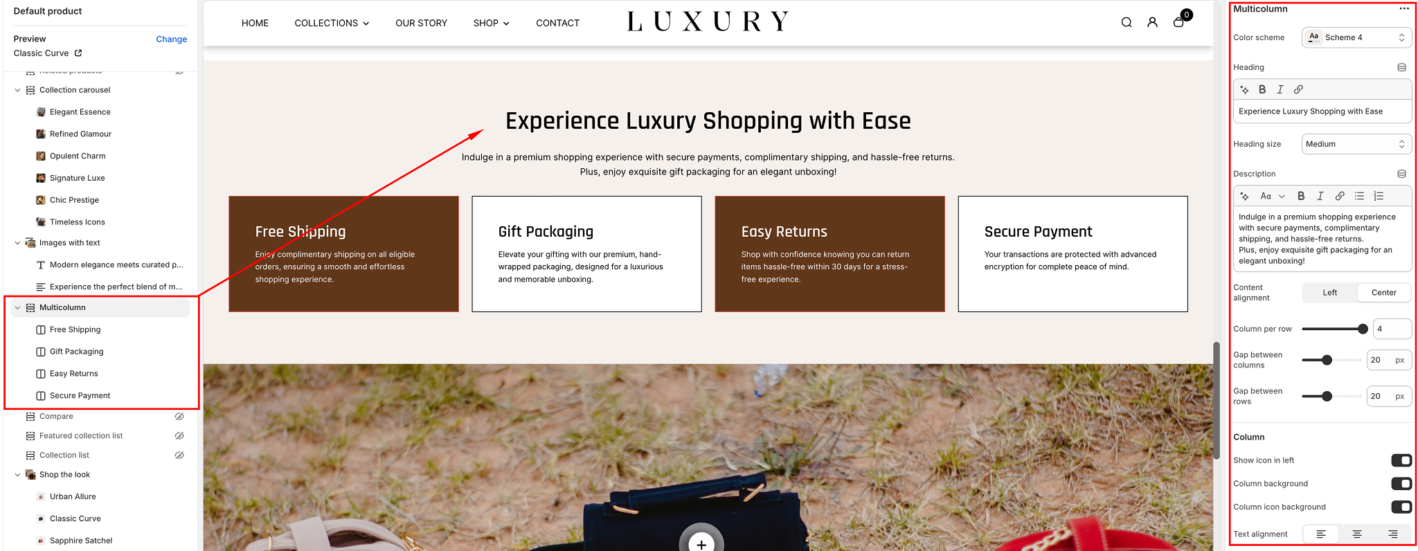
Step-by-Step Guide to Set Up the Multicolumn Section
Access the Theme Editor- Go to your Shopify Admin.
- Navigate to Online Store > Themes.
- Find the Desert theme and click Customize.
Add the Multicolumn Section
- In the left-hand sidebar, click Add Section.
- Search for Multicolumn and select it.
- The section will appear at the bottom of your homepage. Drag it to your desired position.
Customize the Multicolumn Section
Once added, the section offers several customization options. Here's how to configure each setting:
General Settings
- Heading: Add a title for your section (e.g., "Why Choose Us"). You can adjust the heading size (Small, Medium, Large, X-Large) using the dropdown.
- Description: Add a short description below the heading to provide more context to your visitors.
- Content Alignment: Align the text to the left, center, or right.
Column Settings
- Columns Per Row: Choose the number of columns to display per row (1 to 5).
- Gap Between Columns: Adjust the spacing between columns (in pixels).
- Gap Between Rows: Adjust the spacing between rows (in pixels).
Individual Column Customization
Each column has the following customizable options:
- Heading: Add a title to describe the column.
- Description: Add a short description for the column content.
- Icon: Enable or disable the icon display. You can upload an icon or select one from the default library.
- Column Background: Add a background color to make the column stand out.
- Column Icon Background: Add a background color for the icon only.
Text Settings
- Text Alignment: Align the column text to the left, center, or right.
- Icon Size: Select the size of the icon (Small, Medium, Large).
- Section Spacing: Adjust the spacing for the top and bottom margins for both desktop and mobile views.
Styling the Section
- Color Scheme: Choose from available theme schemes (e.g., Default, Scheme 1, etc.) to match your branding.
- Custom CSS: Add CSS styles to further customize the look and feel of the section. Use this for advanced design modifications.
Configuring the Column blocks
The column block configuration includes customizable settings for designing sections in a multi-column layout:
- Icon: Add an icon relevant to the content.
- Heading: Add a heading with options to adjust size (Small, Medium, Large).
- Description: Provide supporting text, with adjustable size (Small, Medium, Large).
- Button: Add button text, link, size (Small, Medium, Large), and functionality.
- Background Image: Upload an image for visual enhancement.
- Color Scheme: Select a color scheme to match your design theme.
- Overlay: Add and adjust overlay opacity for the background image.
This setup allows for a flexible and visually appealing multi-column layout.
Save Your Changes
Once you’ve made all the desired changes:
- Click Save in the top-right corner.
- Preview your changes on both desktop and mobile devices to ensure it looks great on all screen sizes.
Tips for Using the Multicolumn Section
Once you’ve made all the desired changes:
- Use Consistent Icons and Text: Ensure all columns have a uniform style for a polished appearance.
- Leverage the Section for Branding: Use this section to highlight unique selling points, features, or promotional offers.
- Keep It Simple: Avoid overcrowding the columns with too much text or overly complex visuals.
Product Bundle
The Product Bundle Section allows you to create a section that showcases bundled products or collections, offering a curated shopping experience to customers. This feature is ideal for promoting multiple related products together, often at a discount.
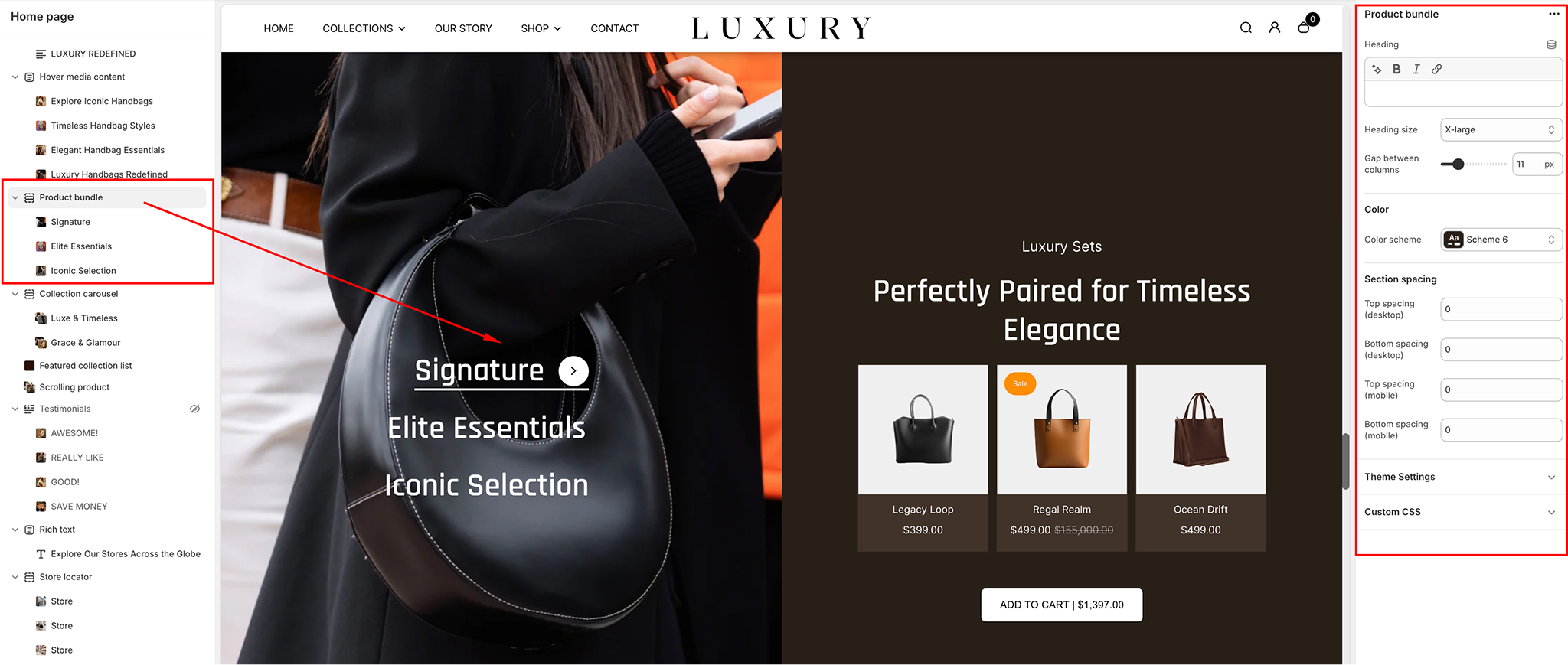
Product Bundle Section Settings
- Heading: Enter a heading for your Product Bundle section.
Example: "Exclusive Product Bundles"
- Heading Size: Choose the heading size for the section. Options include:
SmallMediumLarge (default for impactful visibility).
- Gap Between Columns: Adjust the gap between the columns in the grid layout.
Example: 15 px (default).
- Color Scheme: Select a predefined color scheme for the Product Bundle section to match the overall design of the theme.
Example: Scheme 3.
Configuring the product block settings
Product Block Settings- Heading: Add a heading for the product block. This is useful if you want to distinguish it from other blocks on the page.
Example: "Best-Selling Bundles"
- Image: Upload an image that represents the product bundle. It can be a promotional image or a visual representation of the products in the bundle.
- Products: Select the specific products that will be part of this product bundle. Choose from available products in your store.
- Grid Image Ratio: Choose the grid image ratio for the products in the bundle.
Options include:
Square (default)
Landscape
Portrait
- Bundle Products Heading: Add a heading for the individual product items within the bundle. This text appears above each product image in the grid.
Example: "Included Items."
Collection Block Settings
- Collection: Select a collection to feature as part of the product bundle. You can highlight related products or a specific category.
- Grid Image Ratio: Choose the grid image ratio for the items in the collection.
Options include:
Square (default)
Landscape
Portrait
- Heading: Add a heading for the collection block, which will display above the collection items.
Example: "Our Top Picks"
- Image: Upload an image for the collection block. This could represent the collection visually, such as a thematic image for seasonal items or a curated group of products.
- Bundle Products Heading: Add a heading for the individual products within the collection in the bundle. This text will be displayed above each product image.
Example: "Shop These Bestsellers."
- Bundle Products Subheading: Add a subheading for the bundle. This field allows you to provide additional context or details about the products in the collection.
Example: "Mix and Match Items to Save More!"
Section Spacing
Desktop Spacing- Top Spacing: Adjust the space above the Product Bundle section on desktop.
Example: 0 px (default).
- Bottom Spacing: Adjust the space below the Product Bundle section on desktop.
Example: 0 px (default).
- Top Spacing: Adjust the space above the Product Bundle section on mobile.
Example: 0 px (default).
- Bottom Spacing: Adjust the space below the Product Bundle section on mobile.
Example: 20 px (default).
Tips for Using the Product Bundle Section
- Product Bundles: Choose complementary products that make sense together to increase conversion rates. For example, pair a top with matching pants or shoes with accessories.
- Grid Image Ratio: Use Square for a clean, uniform look across your grid. If you're displaying large images, Landscape or Portrait may work better.
- Bundle Details: Use both Bundle Products Heading and Bundle Products Subheading to clarify what’s included in the bundle and add a compelling sales pitch.
- Spacing: Ensure there's enough space between sections to prevent a cluttered look, especially on mobile devices where users may be viewing multiple sections.
Rich Text
The Rich Text section in the Desert theme allows you to add structured content, such as headings, text, and buttons, to enhance your store’s pages. This section is flexible and provides options to customize alignment, layout, and spacing.
General Settings
Color Scheme- Dropdown: Choose a predefined color scheme for the section.
Example: Scheme 3.
- Alignment:
○ Left Aligns the content to the left.○ Center Centers the content in the section.○ Right Aligns the content to the right.
- Enable Card View
- Toggle Option
Enabled Displays the content inside a bordered card-like structure.Disabled Shows plain text without a card background.
- Toggle Option
- Show Content in Columns
- Toggle Option
Enabled Organizes content into multiple columns for better layout and readability.Disabled Displays content in a single column.
- Toggle Option
Section Spacing
Desktop Spacing- Top Spacing: Adjust the space above the section for desktop views.
Example: 61 px.
- Bottom Spacing: Adjust the space below the section for desktop views.
Example: 60 px.
- Top Spacing: Adjust the space above the section for mobile views.
Example: 40 px
- Bottom Spacing: Adjust the space below the section for mobile views.
Example: 30 px.
Content Blocks
The Rich Text section includes the following content blocks for customization:
- Heading Block: Add a bold, large heading to introduce the section.
Example: "Welcome to Our Store!"
- Text Block: Insert a paragraph or descriptive text for additional context.
Example: "Explore our collection of premium products designed just for you."
- Button Block: Add a clickable button that links to specific pages or products. Customization options for the button include:
Text Example: "Shop Now."Link: Specify the URL to redirect the user when the button is clicked.
- Image: Upload an image to be displayed within the image block.
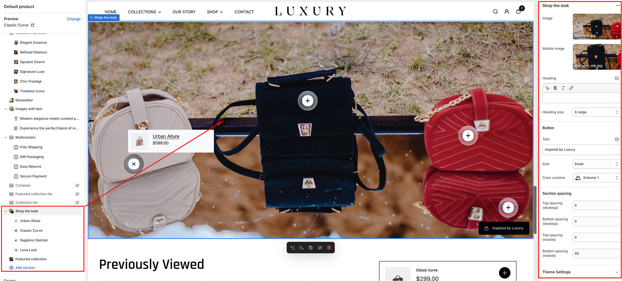
Shop the Look
The Shop the Look Section in the Desert theme allows you to create a visually appealing shopping experience by showcasing a curated look or outfit with a product image overlay. This block is perfect for promoting collections, outfits, or themes with interactive product spots.
General Settings
- Image:
Upload the main image for the "Shop the Look" block. This image should highlight the featured collection, product set, or look that you want to promote.Mobile Image: Upload a separate image optimized for mobile display.
- Heading Add a heading for the section to grab the user’s attention.
Example: "Complete the Look."
- Choose a heading size from the available options:
SmallMediumLarge (default for impactful visibility).
- Button
- Text: Enter the text for the button in this field.
Example: "Shop Now"
- Button Size: Select the button size. Options include:
SmallMediumLarge (default for impactful visibility).
- Text: Enter the text for the button in this field.
- Color Scheme: Choose a predefined color scheme for the button text and background.
Example: Scheme 1.
Section Spacing
Desktop Spacing- Top Spacing: Adjust the space above the "Shop the Look" section on desktop.
Example: 0 px (default).
- Bottom Spacing: Adjust the space below the "Shop the Look" section on desktop.
Example: 0 px (default).
- Top Spacing: Adjust the space above the "Shop the Look" section on mobile.
Example: 40 px (default).
- Bottom Spacing: Adjust the space below the "Shop the Look" section on mobile.
Example: 40 px (default).
Spot Settings
Product- Select a product to display within the "Shop the Look" block. Options include:
Single ProductMultiple ProductsChoose as appropriate for your look.
- Desktop Spot Settings
- Spot Size: Adjust the size of the spot (the product overlay).
Example: 32 px (default).
- Horizontal Position: Adjust the horizontal position of the spot, determining where it appears along the image.
Example: 81% (default setting to position it closer to the right).
- Vertical Position: Adjust the vertical position of the spot, determining its placement on the image.
Example: 56% (default setting).
- Spot Size: Adjust the size of the spot (the product overlay).
- Mobile Spot Settings
- Spot Size: Adjust the size of the product overlay for mobile views.
Example: 40 px (default).
- Horizontal Position: Adjust the horizontal position of the spot on mobile
Example: 10%
- Vertical Position: Adjust the vertical position of the spot on mobile.
Example: 10%.
- Spot Size: Adjust the size of the product overlay for mobile views.
- Desktop Colors
- Spot Background:: Adjust the background color of the spot for desktop.
Example: #282828 (dark gray).
- Spot Color: Choose the color of the product spot (the interactive area where customers can click to shop).
Example: #FFFFFF (white).
- Spot Background:: Adjust the background color of the spot for desktop.
- Mobile Colors
- Spot Background:: Adjust the background color of the spot for mobile.
Example: #282828 (dark gray).
- Spot Color: Choose the color of the product spot for mobile.
Example: #FFFFFF (white).
- Spot Background:: Adjust the background color of the spot for mobile.
Custom CSS
- Field: Add custom CSS to further style and personalize the "Shop the Look" block.
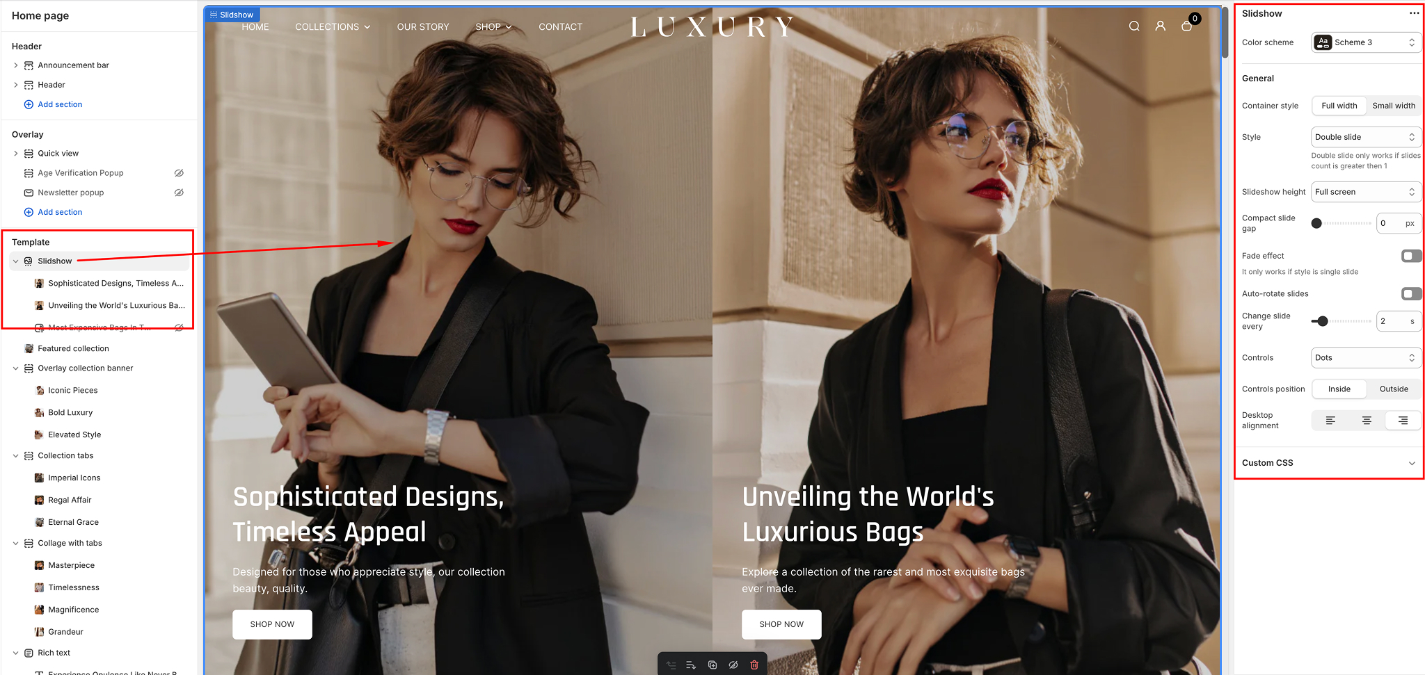
Slideshow
The Slideshow section in the Desert theme offers versatile options to create an engaging visual display for your storefront.
Configuring the section
Configuring the section- Color Scheme Dropdown: Choose a predefined color scheme to match your store’s branding.
Example: "Scheme 3"
- General Settings
- Container Style
Full Width: Expands the slideshow to cover the entire screen width.Small Width: Restrains the slideshow to a smaller, contained area, ideal for emphasizing focus on specific content.
- Container Style
- Style
- Options
Single Slide: Displays one slide at a time.Double Slide: Displays two slides simultaneously (only available if the slide count is greater than one).Compact Style: Minimizes the slideshow layout to display smaller slides, great for highlighting concise information or promotions.
- Options
- Slideshow Height
- Options
Full Screen: Adjusts the slideshow to occupy the entire screen height.Custom Heights: Specify a desired height for the slideshow.
- Options
- Compact Slide Gap
- Slider Control: Adjust the spacing between slides in pixels.
Example: 0 px (no gap).
- Slider Control: Adjust the spacing between slides in pixels.
- Fade Effect
- Toggle Option
Enabled Adds a fade transition between slides (works only with the "Single Slide" style).Disabled Disables the fade effect.
- Toggle Option
- Auto-Rotate Slides
- Toggle Option
Enabled Slides will automatically rotate after a specified interval.Disabled Slides will not rotate automatically.
- Toggle Option
- Change Slide Every (Seconds)
- Slider Control Define the interval (in seconds) for slides to auto-rotate.
Example: 9 seconds.
- Slider Control Define the interval (in seconds) for slides to auto-rotate.
- Controls
- Control Style
- Option
Arrows Only Navigation arrows without indicators.Arrows with Numbers Arrows and numerical indicators for better navigation.Dots Only Circular indicators at the bottom.
- Controls Position
- Options
Inside Navigation controls are placed within the slideshow frame.Outside Navigation controls are positioned outside the slideshow frame.
- Options
Desktop Alignment
- Options:
Left Align Aligns the content on the left side of the slideshow.Center Align Centers the content within the slideshow.Right Align Aligns the content on the right side of the slideshow.
Store Locator
The Store Locator section in the Desert theme enables you to showcase multiple store locations in a visually engaging layout. Each store is added as a block, with customizable details and imagery to provide clear and useful information for customers.
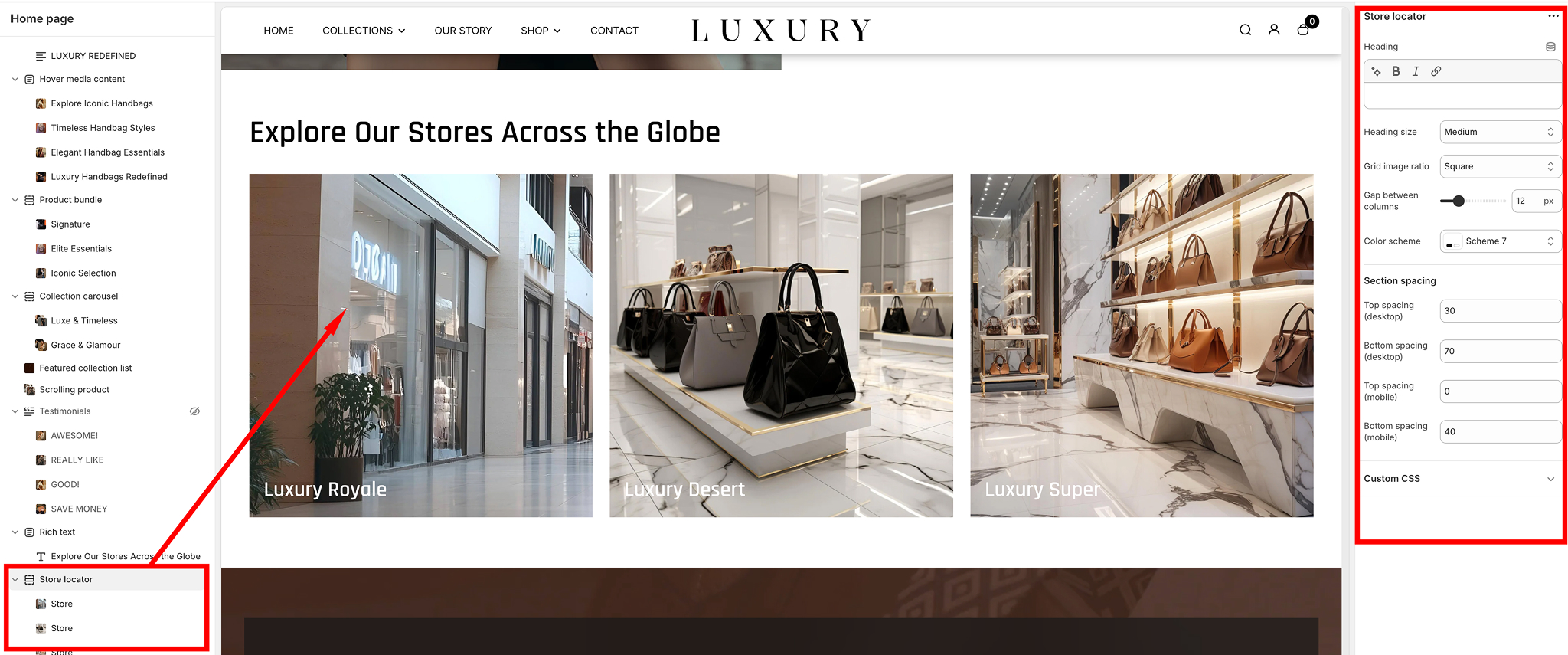
Section Settings
- Heading: Add a title for the section. Example: "Store Locator."
- Layout: Select how the store locations are displayed: Grid or list layout options.
- Color Scheme: Choose a color scheme for the section to match your store’s branding.
Example: Scheme 3.
Section Spacing
Adjust the padding around the section for both desktop and mobile views:
- Top Spacing: Adjust the space above the section.
Example: 60 px.
- Bottom Spacing: Adjust the space below the section
Example: 40 px.
- Top Spacing: Adjust the space above the section
Example: 20 px (default).
- Bottom Spacing: Adjust the space below the section.
Example: 30 px.
Store Block Settings
Each store location is added as a block within the Store Locator section. Below are the fields available for customization:
- Image: Upload an image to visually represent the store. Example: A store exterior photo or a location-specific graphic.
- Store Name: Add the name of the store. Example: "Downtown Branch."
- Location Details: Enter the store’s address or any relevant location information. Example: "123 Main Street, City, State, ZIP."
- Phone Number: Provide the store's contact number. Example: (343)-444-343.
- Time: Specify the operating hours for the store. Example: "Mon-Sat: 11am-6pm, Sun: 12-6pm."
- Map Link: Add a link to the store’s location on Google Maps or another mapping service.
Example: Paste a Google Maps URL.
Adding and Managing Store Blocks
- Add a New Store Block: Click "Add Store" to create a new block for each store location.
- Rearranging Blocks: Drag and drop store blocks to rearrange their order within the section.
- Deleting a Block: Click the three-dot menu in the top-right corner of the block and select "Delete" to remove it.
Tips for Using the Store Locator Section
- Use high-quality images to make the section visually appealing.
- Ensure location details and phone numbers are accurate and up-to-date.
- Add operating hours to improve customer convenience.
- Link directly to Google Maps for easy navigation assistance.
Testimonial
This allows merchants to showcase client reviews and testimonials, providing a visually appealing way to build credibility and trust with their customers. This section is customizable and provides options for styling, layout, and content to match the overall theme of your store.
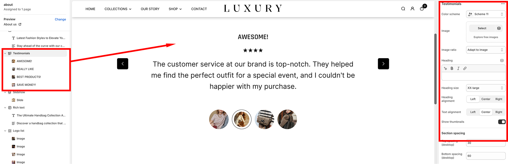
Features of the Testimonial Section
- Heading and Subheading: Add a heading and subheading to introduce the testimonial section.
- Client Reviews: Each testimonial block can include:
Star Ratings (optional).Review text.Author name and description.An optional image for each testimonial (e.g., customer avatar or product).
- Carousel Navigation: Supports multiple testimonials displayed in a carousel slider with navigation arrows for seamless browsing.
- Styling Options: Adjust the appearance of the testimonial section with various customizable settings:
Heading size, alignment, and text alignment.Image ratio for testimonials.Color schemes.
How to Customize the Testimonial Section
Adding the Testimonial Section- In the Shopify Admin, go to Online Store > Themes.
- Click Customize next to the Desert Theme.
- On the left-hand panel, click Add Section
- Search for and select Testimonials
- The section will appear on the page. Drag and drop it to the desired position on your homepage or any other page.
Customizing Section Content
- Select the Testimonial Section from the left-hand panel to open its settings.
- Update the following fields:
- Heading Enter the main heading for the testimonial section.
- Subheading (optional): Provide additional context for the testimonials.
- Add individual testimonial blocks:
- Click Add Quote.
- For each testimonial, customize
- Heading (Author Name): Enter the author's name.
- Text: Add the testimonial content.
- Image: Upload an image for the testimonial (e.g., customer avatar or brand-related visuals).
- Star Rating: Optionally include a star rating to visually display customer satisfaction.
Styling and Layout
- Adjust the styling options in the Settings Panel:
- Color Scheme: Choose from the predefined color schemes to match your store design.
- Image Ratio: Set the ratio to crop or adapt the testimonial images automatically.
- Heading Size: Choose from Small, Medium, Large, or Extra Large to set the size of the heading.
- Text Alignment: Align the text to the left, center, or right.
- Enable or disable thumbnails at the bottom of the slider using the toggle "Show thumbnails".
- Set section spacing for both desktop and mobile:
- Top and Bottom Spacing Adjust the padding above and below the section for proper spacing and layout.
- Subheading ○ Separate values for desktop and mobile ensure responsiveness.
Custom CSS
For advanced customizations, you can add your own CSS:
- Open the Custom CSS field at the bottom of the settings.
- Add CSS rules to further modify the appearance and behavior of the testimonial section.
Preview and Publish
- Use the preview on the right-hand side of the theme editor to see your changes in real-time.
- Once satisfied, click Save in the top-right corner of the editor.
Best Practices
- Use high-quality images for testimonials to make the section visually appealing.
- Keep testimonials concise and authentic for better readability and trustworthiness.
- Display diverse testimonials to represent a broad range of customers and products.
Collection Tabs
The Collection Tabs feature in the Desert theme allows you to display multiple collections under organized tabs, creating an intuitive browsing experience for your customers.
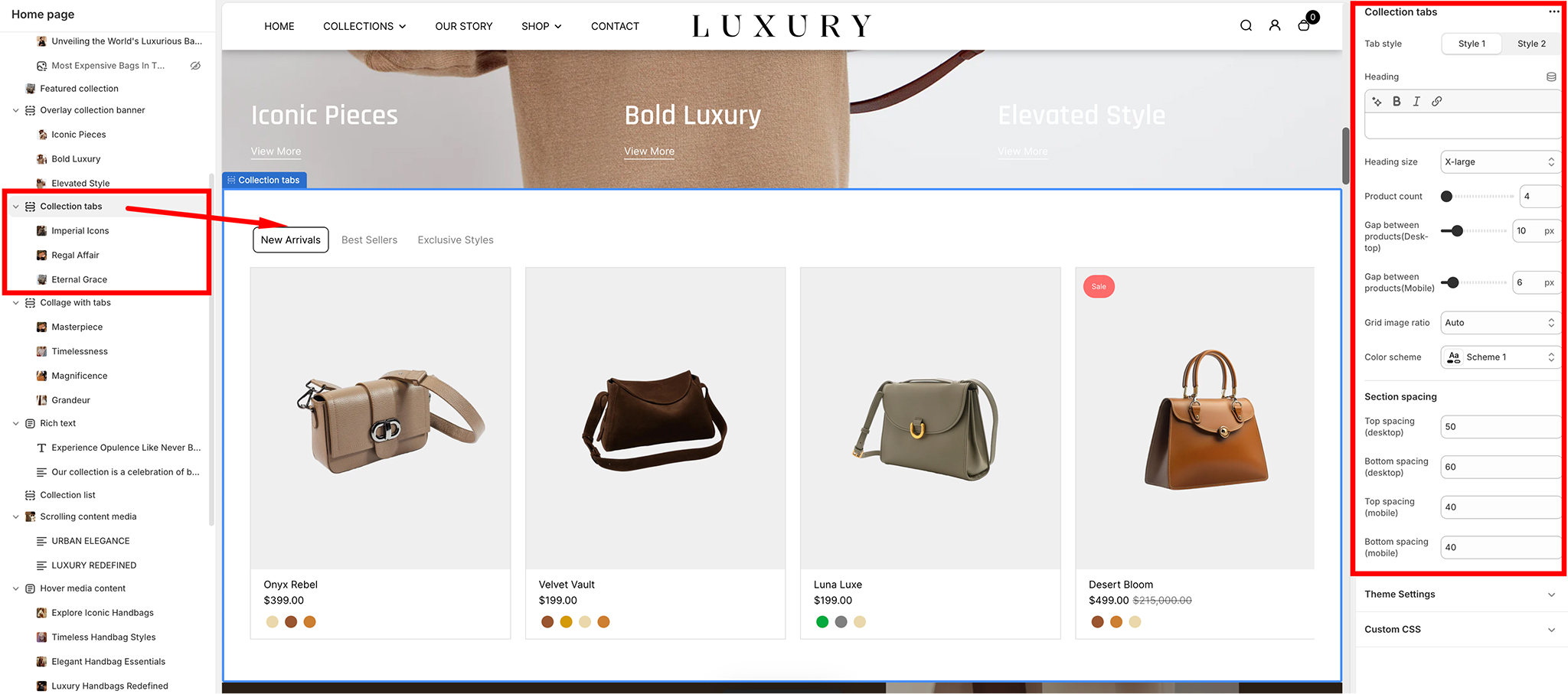
Tab Style
- Option 1: Style 1 Displays tabs in a classic, horizontal layout.
- Option 2: Style 2 Applies a modern style for tabs with a different visual presentation.
Heading
- Add a title for the section to capture the focus of your customers.
Example: "Modern and Classic Pieces."
- Heading Size Adjust the size of the heading for better emphasis. Options include:
SmallMediumLarge (default for bold impact).
- Right: Aligns the Rich Text section to the right side of the page.
Product Display Settings
Product Count- Select the number of products to display under each tab.
Example: 8 products
- Gap Between Products (Desktop and Mobile)
- Desktop Set the spacing between product images on desktop.
Example: 2px.
- Mobile Set the spacing between product images on mobile.
Example: 3px.
- Desktop Set the spacing between product images on desktop.
-
Grid Image Ratio
Adjust the aspect ratio of the product images. Options include:AutoSquarePortrait (default for this setup).Landscape
- Color Scheme
- Choose a predefined color scheme to complement your store’s branding.
Example: Scheme 4.
- Choose a predefined color scheme to complement your store’s branding.
Section Spacing
- Desktop Spacing:
- Top Spacing: Top Spacing: Adjust the space above the section on desktop. Example: 60 px.
- Bottom Spacing: Adjust the space below the section on desktop. Example: 60 px.
- Mobile Spacing:
- Top Spacing: Adjust the space above the section on mobile. Example: 30px.
- Bottom Spacing: Adjust the space below the section on mobile. Example: 10px.
Collection Tabs Block Settings Summary
- Heading Add a title for the collection tab (e.g., "Trending Now").
- Collection Select the collections to display within the tab.
- Button URL Provide a link for the call-to-action button.
- Button Text Define the text for the button (e.g., "Shop Now").
- Size Adjust the tab's display size (options: XSmall, Small, Medium, Large).
This configuration allows for clear organization and user-friendly navigation of collections.
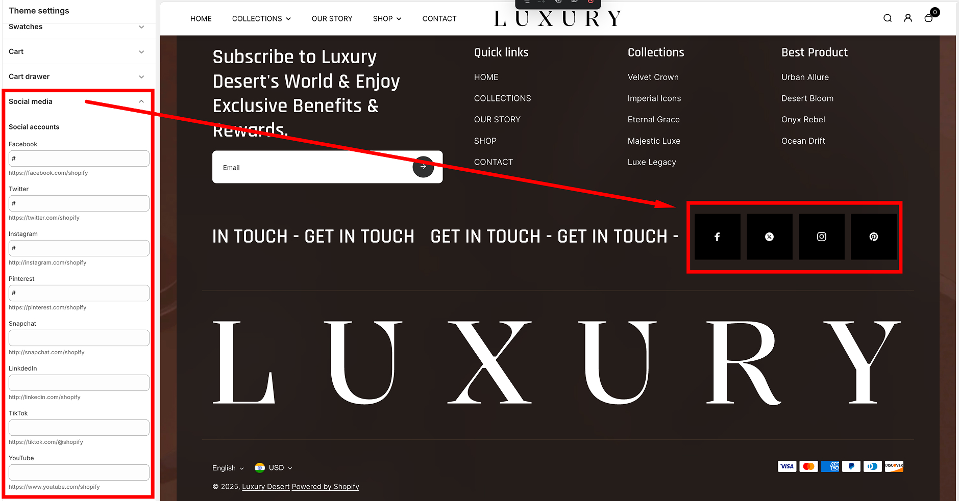
Social media icons
The Social Media settings in the Desert Shopify theme provide a simple way to integrate your social media profiles with your online store. These settings allow you to add links to your social media accounts, which can be displayed in various areas of your storefront, such as the footer or header, depending on your theme configuration.
Social Media Settings Overview
The Social Media section is accessible in the Theme Editor (Online Store > Themes > Customize) under the "Social media" panel. Here, you can input the URLs of your social media accounts for quick and easy linking.
Supported Social Media Platforms
The Desert theme supports links to the following popular social media platforms:
- Facebook
- Input your Facebook page URL (e.g.,
https://facebook.com/yourpage).
- Default: # (placeholder, no link).
- Input your Facebook page URL (e.g.,
- Twitter
- Input your Twitter profile URL (e.g.,
https://twitter.com/yourhandle).
- Default: # (placeholder).
- Input your Twitter profile URL (e.g.,
- Instagram
- Input your Instagram profile URL (e.g.,
https://instagram.com/yourhandle).
- Default: # (placeholder).
- Input your Instagram profile URL (e.g.,
- Pinterest
- Input your Pinterest profile URL (e.g.,
https://pinterest.com/yourprofile).
- Default: # (placeholder).
- Input your Pinterest profile URL (e.g.,
- Snapchat
- Input your Snapchat profile URL (e.g.,
https://snapchat.com/yourprofile).
- Default: # (placeholder).
- Input your Snapchat profile URL (e.g.,
- LinkedIn
- Input your LinkedIn company or personal page URL (e.g.,
https://linkedin.com/in/yourprofile).
- Default: # (placeholder).
- Input your LinkedIn company or personal page URL (e.g.,
- TikTok
- Input your TikTok profile URL (e.g.,
https://tiktok.com/@yourhandle).
- Default: # (placeholder).
- Input your TikTok profile URL (e.g.,
- YouTube
- Input your YouTube channel URL (e.g.,
https://youtube.com/channel/yourchannelID).
- Default: # (placeholder).
- Input your YouTube channel URL (e.g.,
How to Configure
- Go to your Shopify Admin Dashboard.
- Navigate to Online Store > Themes and click Customize on the Desert theme.
- In the theme editor, locate the Social media section.
- Enter the full URL for each social media platform you want to link to.
- Leave the fields blank or with the # symbol if you don't want to display a link for that platform.
- Save your changes.
Collapsible Content
The Collapsible Content section allows you to display interactive, collapsible elements with customizable styles and layouts. Below is a guide to configuring its settings
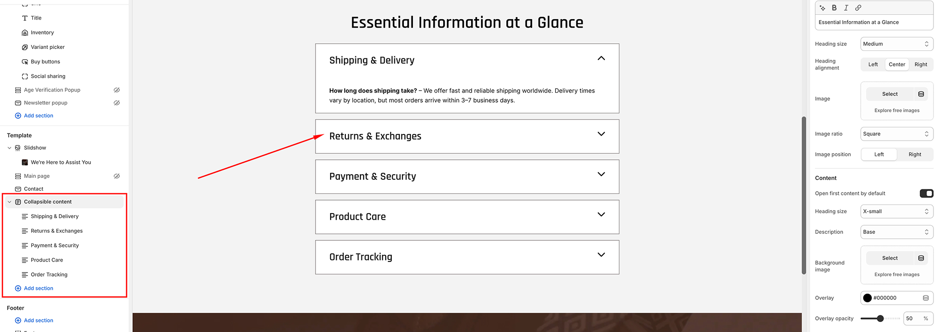
Section Settings
- Color Scheme
- Change the color scheme of the section (e.g., Scheme 1).
- Use this to ensure the section matches your store's design.
- Heading
- Add a heading to the section to provide context or introduce the collapsible content.
- Heading Size
- Select the size of the heading to emphasize or de-emphasize it.
- Heading Alignment
- Align the section heading to the Left, Center, or Right.
- Image
- Upload an image to appear next to the collapsible content.
- This can visually enhance the section.
- Image Ratio
- Adjust the aspect ratio of the image (e.g., square, portrait, landscape).
- Image Position
- Choose whether the image appears on the Left or Right of the collapsible content.
- Content Settings
- Customize the appearance and behavior of the collapsible content.
- Open First Content by Default: Enable this to automatically open the first collapsible tab.
- Heading Size: Choose the size for the collapsible headings (Medium, Small, or X-Small).
- Description Size: Adjust the text size for the collapsible content descriptions.
- Background Image: Add a background image for the entire section to enhance its visual appeal.
- Overlay Color & Overlay Opacity: Define a color overlay and its opacity for the background image.
- Section Spacing
- Modify the spacing around the section for both Mobile and Desktop views to ensure proper alignment and appearance.
Configurable Content Blocks
The section supports configurable blocks for individual collapsible items. Each block includes:
- Heading
- Add a title for the collapsible tab.
- Description
- Add detailed content for the tab (e.g., text, images, or additional HTML).
Best Practices
- Use contrasting color schemes for better visibility.
- Ensure the uploaded image and background image are optimized for web (compressed and high quality).
- Maintain uniformity in heading and description sizes for a polished look.
- Use descriptive tab headings to improve navigation and user engagement.
Countdown
The Countdown section in the Desert theme is designed to create a sense of urgency and excitement for limited-time offers, sales, or product launches. This guide provides a breakdown of the settings available to customize the Countdown section.

Section Settings
General Settings
- Enable Full Width
- Toggle to make the section span the full width of the page.
- Enable Rounded Corner
- Toggle to round the corners of the section for a softer appearance
- Enable Countdown
- Toggle to display the countdown timer
- Enable Countdown Background
- Toggle to add a background image behind the countdown timer.
- Gap Between Grids
- Adjust the spacing between the grid items: Example: 4 px.
Background Image
- Upload an image to use as the background for the countdown section when "Enable Countdown Background" is toggled on.
Countdown Content
- Heading
- Add a heading to describe the offer or announcement. Example: "Get up to 50% off on Trendy Products!".
- Heading Size
- Choose the size of the heading text:
- Small
- Medium
- Large
- Heading Alignment
- Align the heading text to the:
- Left
- Center
- Right
- End Date
- Set the date for when the countdown will end. Use the format YYYY-MM-DD.Example: 2025-09-01.
- Product Display
- Layout
- Choose the layout of the product grid:
- Counter Left
- Counter Right
- Collection
- Select the collection of products to display in the countdown section.
- Products Limi
- Set the maximum number of products to display in the section.
- Example: 4
- Products Limit
- Options
- Choose the aspect ratio for product images in the grid
- Square
- Original.
- Slider Arrow Position
- Options
- Select the position of slider arrows
- Bottom
- With Slider.
- Collection Details
- Collection Subheading
- Add a brief subheading for the collection.Example: "SALE 50% OFF.
- Custom Image
- Upload a custom image to represent the collection.
- Custom Heading
- Add a custom heading to describe the collection in detail. Example: "Weekend Sale: 25% Off Dresses, Jackets, and More!
Color Settings
- Color Scheme
- Choose a color scheme for the section to match your store's branding. Example: Scheme 4.
- Overlay
- Set an overlay color to appear on top of the background image. Example: #000000.
- Overlay Opacity
- Adjust the transparency of the overlay color. Example: 78%
Spacing Settings
- Desktop
- Top Spacing:
- Adjust the space above the countdown section on desktop. Example: 80 px
- Bottom Spacing:
- Adjust the space above the countdown section on desktop. Example: 80 px
- Mobile
<
- Top Spacing:
- Adjust the space above the countdown section on desktop. Example: 20 px
- Bottom Spacing:
- Adjust the space above the countdown section on desktop. Example: 20 px
Theme Settings
- Enable Card Border
- Field:
- Toggle to enable a border around individual product cards in the grid.
- Grid Style
- Options
- Choose between: (Standard: Displays a simple grid.), Card: Adds a card-style layout for products.
Custom CSS
- Add custom CSS to further style the countdown section to fit your needs
Tips for Effective Use
- Use a compelling heading to draw attention to the urgency of the offer.
- High-quality background images can enhance the section’s appeal.
- Ensure the end date is updated for new promotions to maintain relevance.
- Keep the overlay opacity balanced to ensure readability of the text over the background imag.
- This setup ensures that your Countdown section is both visually attractive and functional, driving urgency and encouraging conversions.
This setup ensures that your Countdown section is both visually attractive and functional, driving urgency and encouraging conversions.
- Toggle to make the section span the full width of the page.
- Toggle to round the corners of the section for a softer appearance
- Toggle to display the countdown timer
- Toggle to add a background image behind the countdown timer.
- Adjust the spacing between the grid items: Example: 4 px.
- Add a heading to describe the offer or announcement. Example: "Get up to 50% off on Trendy Products!".
- Choose the size of the heading text:
- Small
- Medium
- Large
- Align the heading text to the:
- Left
- Center
- Right
- Set the date for when the countdown will end. Use the format YYYY-MM-DD.Example: 2025-09-01.
- Layout
- Choose the layout of the product grid:
- Counter Left
- Counter Right
- Select the collection of products to display in the countdown section.
- Set the maximum number of products to display in the section.
- Example: 4
- Options
- Choose the aspect ratio for product images in the grid
- Square
- Original.
- Options
- Select the position of slider arrows
- Bottom
- With Slider.
- Collection Subheading
- Add a brief subheading for the collection.Example: "SALE 50% OFF.
- Upload a custom image to represent the collection.
- Add a custom heading to describe the collection in detail. Example: "Weekend Sale: 25% Off Dresses, Jackets, and More!
Color Settings
- Color Scheme
- Choose a color scheme for the section to match your store's branding. Example: Scheme 4.
- Overlay
- Set an overlay color to appear on top of the background image. Example: #000000.
- Overlay Opacity
- Adjust the transparency of the overlay color. Example: 78%
Spacing Settings
- Desktop
- Top Spacing:
- Adjust the space above the countdown section on desktop. Example: 80 px
- Bottom Spacing:
- Adjust the space above the countdown section on desktop. Example: 80 px
- Mobile
<
- Top Spacing:
- Adjust the space above the countdown section on desktop. Example: 20 px
- Bottom Spacing:
- Adjust the space above the countdown section on desktop. Example: 20 px
Theme Settings
- Enable Card Border
- Field:
- Toggle to enable a border around individual product cards in the grid.
- Grid Style
- Options
- Choose between: (Standard: Displays a simple grid.), Card: Adds a card-style layout for products.
Custom CSS
- Add custom CSS to further style the countdown section to fit your needs
Tips for Effective Use
- Use a compelling heading to draw attention to the urgency of the offer.
- High-quality background images can enhance the section’s appeal.
- Ensure the end date is updated for new promotions to maintain relevance.
- Keep the overlay opacity balanced to ensure readability of the text over the background imag.
- This setup ensures that your Countdown section is both visually attractive and functional, driving urgency and encouraging conversions.
This setup ensures that your Countdown section is both visually attractive and functional, driving urgency and encouraging conversions.
Featured Product
The Featured Products Section allows you to showcase specific products with customizable settings and layouts. Here's how to configure and make the most of this feature.
Settings
- Color Scheme
- Select the color scheme for the section. Options include predefined themes such as Color Scheme 1, ensuring the section aligns with your overall design.
- Heading
- Add a section title to appear prominently at the top of the section. This helps communicate the focus of the featured products.
- Heading Size
- Adjust the size of the section title. Available options include:
- xx-large
- X-large
- Large
- medium
- Small
- x-smal
- Product
- Select the product you want to feature in the section.
- Media Layout
- Customize the arrangement of product images by choosing one of the following layouts:
- Slider
- Grid
- Stacked
- Thumbnail Position
- Define where the product thumbnails appear relative to the main image. Options include:
- Left
- Right
- Bottom
- Overlay
- Section Spacing
- Adjust the spacing around the section for both Mobile and Desktop views to ensure optimal appearance across devices.
Choose the size that best fits your design needs.
Blocks
The Featured Products Section includes individual blocks that can be added and configured to display key product details and functionalities.
- Available Blocks
- Title: Displays the product name.
- Price: Showcases the product price.
- Variant: Allows selection of product variants.
- Quantity Picker: Enables users to choose the quantity they wish to purchase.
- Buy Buttons: Includes "Add to Cart" and other call-to-action buttons.
- Additional blocks can be accessed by clicking the Add block.
- How to Add Blocks
- Click the Add block button within the Featured Products Section.
- Choose the desired block type from the list of available options.
- Configure the block settings as needed.
Logo List
The Logo List section in the Desert Shopify theme is a versatile way to display a collection of brand logos, partner logos, or featured icons. This section is ideal for showcasing affiliations, certifications, or highlighting brands you sell. Below is a step-by-step guide to set up and customize the Logo List section.
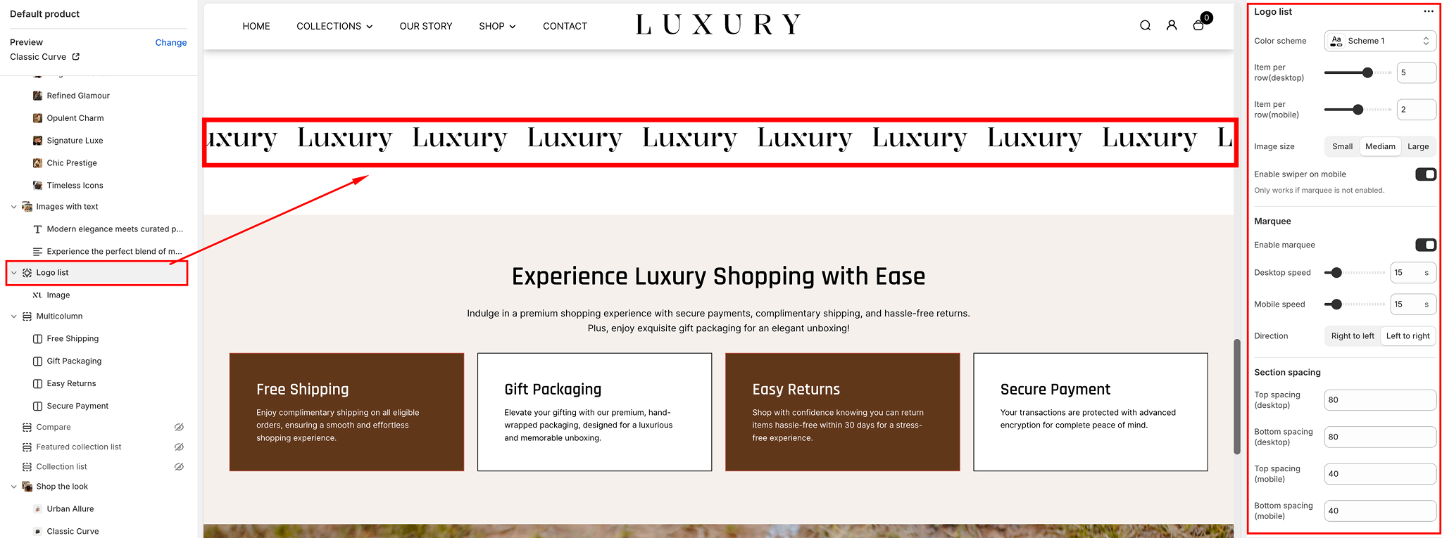
Add the Logo List Section
- Navigate to your Shopify Admin Dashboard.
- Go to Online Store > Themes, and click on Customize.
- In the left-hand sidebar, click Add section.
- Search for Logo list and select it.
- The section will now appear on your page. You can rearrange its position by dragging it in the sidebar.
General Settings
- Color Scheme:
- Use the Color scheme dropdown to select the background and text colors. Choose a preset (e.g., Scheme 1, Scheme 2) that matches your store’s branding.
- Row Gap & Padding
- Adjust the Row gap (desktop/mobile) slider to control the spacing between the rows of logos.
- Set Padding (e.g., top, bottom, left, right) to fine-tune the spacing of the entire section relative to the rest of the page.
- Image Size
- Choose the size for your logos using the Image size dropdown:
- Small: Compact logo display.
- Medium: Balanced size for most use cases.
- Large: Prominent display for larger logos.
- Enable Slider on Mobile
- Toggle this setting to make the logos scrollable horizontally on smaller devices. This is useful for compact layouts
Marquee Settings (Optional)
For a dynamic touch, you can enable a marquee effect to make the logos scroll continuously across the screen
- Enable Marquee
- Toggle the Enable marquee option to activate the scrolling effect.
- Desktop/Speed Settings
- AAdjust Desktop speed and Mobile speed to control how quickly the logos scroll.
- A higher value increases the speed, while a lower value slows it down.
- Direction
- Choose the scrolling direction:
- Left to Right or Right to Left.
Adding Logo Images blocks
The Logo List section allows you to upload multiple logos as individual blocks.
- Add Logo Block:
- In the sidebar under the Logo List section, click Add block.
- Select Image.
- Upload Logo
- Click on the Image field and upload your logo image or select one from your library.
- Use high-resolution images with transparent backgrounds (PNG format recommended) for the best appearance.
- Alt Text
- Provide descriptive alt text for accessibility and SEO benefits. Example: "Brand X Logo".
- Rearrange Logos
- Drag and drop logo blocks to reorder them as desired.
- Remove Logo
- To delete a logo, click on the block and then select Remove block.
Section Spacing and CSS
The Logo List section allows you to upload multiple logos as individual blocks.
- Spacing Options:
- Adjust the following to customize spacing:
- Section Padding: Add vertical spacing above or below the section.
- Button Spacing: Add or reduce gaps between the buttons and other section elements.
- Top/Bottom Spacing: Tweak the vertical margin.
- Custom CSS (Optional)
- If you have specific styling needs, use the Custom CSS field to override the default styles.
Tips for Best Results
The Logo List section allows you to upload multiple logos as individual blocks.
- Consistency: Use logos of similar dimensions for a clean and uniform appearance.
- High-Quality Images: Upload logos in high resolution to avoid pixelation.
- Spacing Balance: Ensure adequate spacing between logos and the rest of the content for better readability.
Newsletter
The Newsletter Section allows you to collect subscribers for your store's updates while maintaining a sleek and luxurious design. Below are the customizable settings available for this section.
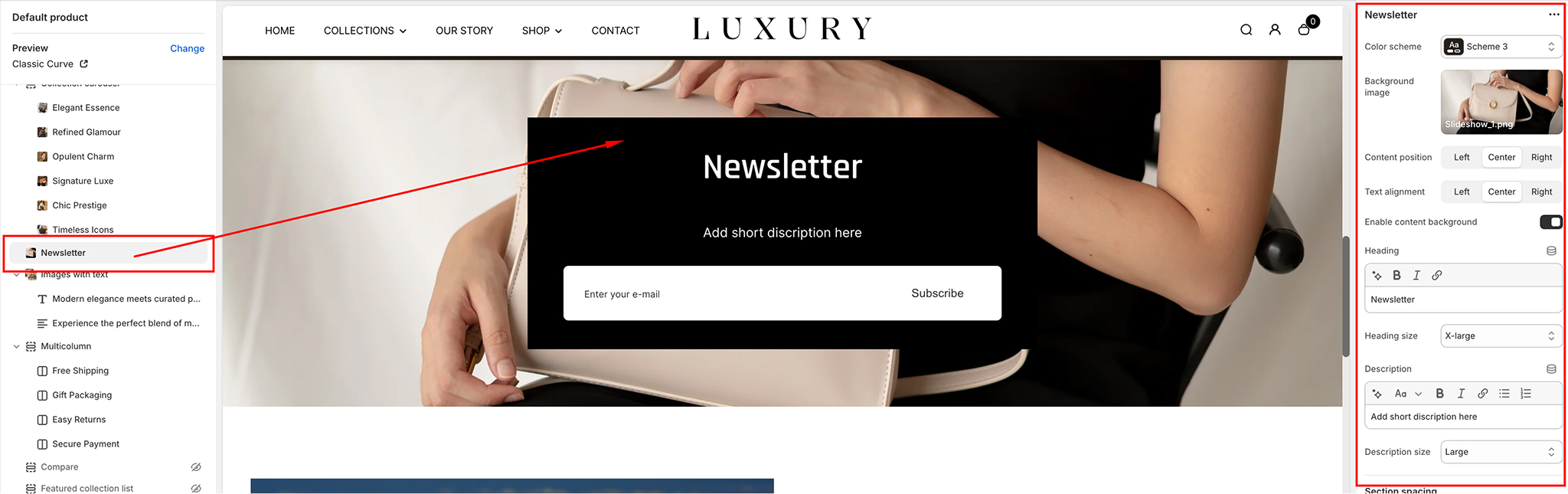
Color Scheme
- Choose from predefined color schemes to match your store's aesthetic.
- Options include Light, Dark, or Custom Colors.
Background Image
- Upload or select a background image from the library to enhance the visual appeal of the section.
- Recommended dimensions: 1920 x 1080 pixels for optimal display on all screen sizes.
Content Position
- Determine where the content (heading, description, and input field) appears:
- Left: Aligns content to the left side of the section.
- Center: Centers the content within the section.
- Right: Aligns content to the right side of the section.
Text Alignment
- Control how the text appears within the content box:
- Left-aligned: Aligns text to the left.
- Center-aligned: Centers the text.
- Right-aligned: Aligns text to the right.
Enable Content Background
- Add a subtle background behind the content for better contrast with the section’s background image or color.
- Options: Enable or Disable.
Heading
- Add a headline to grab the user’s attention.
- Example: "Stay Updated with Exclusive Offers!"
Heading Size
- Adjust the font size of the heading to suit your layout.
- Options: Small, Medium, or Larg
Description
- Provide a brief description or call-to-action for subscribing to your newsletter.
Description Size
- stomize the font size of the description text.
- Options: Small, Medium, or Large.
Section Spacing
Adjust the padding and margin for the section to ensure it looks perfect across devices:
- Desktop Spacing: Adjust spacing around the section for larger screens.
- Mobile Spacing: Customize spacing for smaller screens to ensure readability.
Parallax
The Parallax Section in the Desert Shopify Theme provides a dynamic and visually captivating way to highlight key content on your store. The parallax scrolling effect creates depth and an interactive experience, making your store look modern and professional
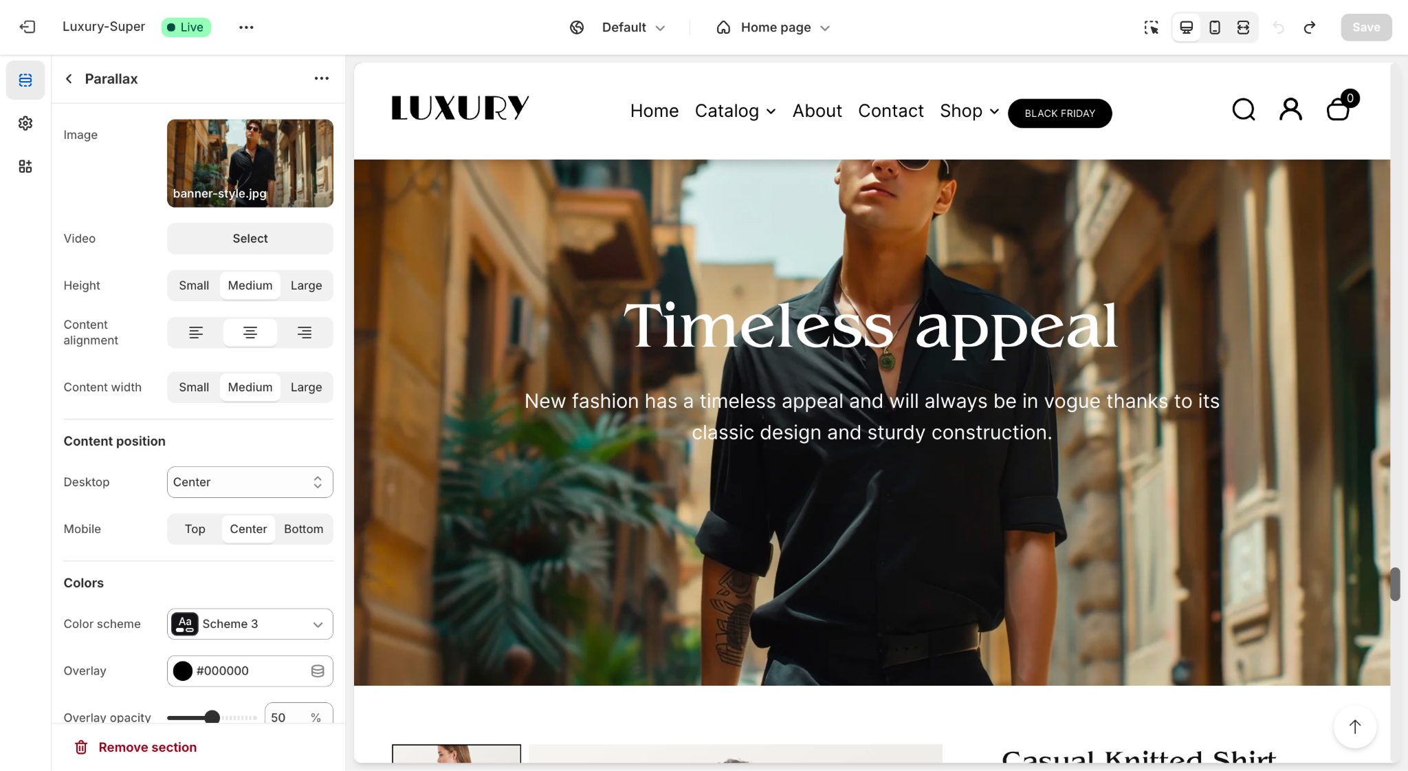
Features of the Parallax Section
- Dynamic Scrolling Effect: Engages customers by making the background image move at a different speed than the foreground content.
- Customizable Content
- Heading and supporting text.
- Option to add a call-to-action button (e.g., "Shop Now").
- Media Options
- Add an image or a video as the parallax background.
- Styling Options
- Set content alignment (left, center, right).
- Adjust content width and position (desktop and mobile settings).
- Overlay color and opacity for better contrast with text.
ow to Customize the Parallax Section
Adding the Parallax Section
- Go to your Shopify Admin and navigate to Online Store > Themes.
- Click Customize next to the Desert Theme.
- In the theme editor, click Add Section in the left-hand panel.
- Select Parallax from the list of available sections.
- Drag and drop the section to position it wherever you'd like on the page.
Configuring the Parallax Section
- Click on the Parallax Section to open its settings.
- Update the following fields
- Image: Upload an image to act as the background.
- Video (optional): If you prefer a video background, upload or link the video file.
- Height: Choose the height of the parallax section (Small, Medium, Large).
- Content Alignment: Select the alignment of text within the section (Left, Center, or Right).
- Content Width: Control the text width (Small, Medium, or Large).
Adding Content
- Heading: Enter the main headline text for the section.
- Text: Add supporting text to provide context or instructions.
- Call-to-Action Button (optional):
- Add a button label (e.g., "Shop Now").
- Link the button to a collection, product, or page.
Styling and Colors
- Content Position:
- Desktop: Choose where the content block should appear (Left, Center, or Right).
- Mobile: Separate alignment for mobile screens.
- Overlay:
- Add an overlay color to improve readability of text over the background.
- Adjust Overlay Opacity to fine-tune the transparency (e.g., 50%).
- Color Scheme: Select a predefined color scheme that complements your theme's design.
Custom CSS
For advanced styling, use the Custom CSS field:
- Scroll down in the settings panel to find the Custom CSS field.
- Add your custom styles to modify the appearance or behavior of the parallax section further.
Best Practices
- Use high-resolution images or videos for a smooth and professional look.
- Ensure text contrast is high enough against the background for readability.
- Keep the heading and text concise for better user engagement.
- Link the call-to-action button to a relevant page to encourage interaction.
Scrolling Content Media
The Scrolling Content Media section in the Desert Shopify theme is designed to display visually appealing media (such as images) in a scrolling layout. It can highlight content, showcase promotional information, or tell a story with supporting text and a call-to-action button.
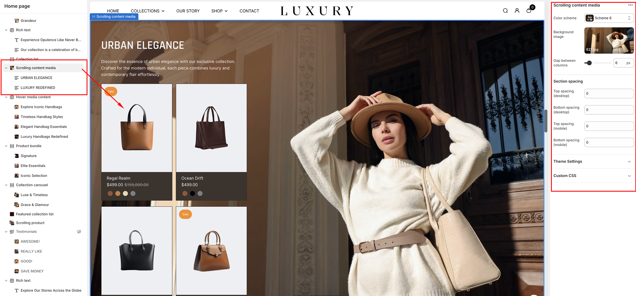
Add the Scrolling Content Media Section
- Navigate to Online Store > Themes in your Shopify Admin.
- Click Customize for your current theme.
- From the left-hand sidebar, click Add section.
- Search for Scrolling content media and click on it.
- The section will be added to your page. You can drag it to the desired location.
Configure Section Settings
- Color Scheme:
- Choose from the available predefined color schemes to style the section. For example:
- Default: Standard theme colors.
- Accent 1/2: Highlighted theme colors.
- Background:
- Click Select to add a custom background image for the section.
- Upload a new image or choose one from your media library.
- Gap Between Content Blocks:
- Use the slider to set the spacing (in pixels) between the content blocks for a clean and organized appearance.
Section Spacing
You can fine-tune the section's layout by adjusting spacing settings:
- Top Spacing: Increase or decrease space above the section.
- Bottom Spacing: Increase or decrease space below the section.
- Top Padding: Add internal space at the top of the section content.
- Bottom Padding: Add internal space at the bottom of the section content.
Customize Content
- Heading and Text:
- Heading:
- Add a title for the section (e.g., "Scrolling Content Media").
- Use the rich text editor to format the heading with bold, italics, or links.
- Adjust the heading size by selecting Small, Medium, or Large from the dropdown.
- Description:
- Provide a brief description or supporting text for the section.
- Button
- Text: Enter the call-to-action text for the button (e.g., "Shop Now").
- Link: Add a URL or select a page, collection, or product to link the button.
- Size: Set the button size: Small, Medium, or Large.
- Product List
- Select products: Select the desired products to be listed in the scroll media.
- Position: Choose where the button will appear: Left or Right.
Save and Preview
- Click the Save button in the top-right corner to apply your changes.
- Preview the section on your storefront to ensure the scrolling media and content are displayed as intended.
Best Practices for the Scrolling Content Media Section
- High-Quality Media: Use sharp, high-resolution images to enhance visual appeal.
- Compelling Text: Keep headings and descriptions concise and engaging to grab user attention.
- Clear CTA: Ensure the call-to-action button directs users to a relevant page or product for a seamless experience.
- Consistent Design: Match the color scheme and layout of this section with your overall theme for a cohesive look.
Wide Media Content
The Wide Media Content section in the Desert Shopify theme is a visually impactful way to display media, such as images, alongside customizable text and call-to-action buttons. This guide will walk you through the setup and customization process for the Wide Media Content section.
Add the Wide Media Content Section
- In the Shopify Admin Dashboard, go to Online Store > Themes, and click on Customize.
- From the left-hand sidebar, click Add section.
- Search for Wide media content and select it.
- The section will be added to your homepage. You can drag it to your preferred position.
General Section Settings
- Color Scheme:
- Use the Color scheme dropdown to select the background and text colors for this section. Options include predefined theme color schemes such as Scheme 1, Scheme 2, etc.
- Heading:
- Add a Heading at the top of the section by typing in the provided field. Example: "Discover Our New Collection".
- Heading Size:
- Select the size for the heading:
- Small: Subtle heading size.
- Medium: Default size for most use cases.
- Large: Bold and prominent.
Section Spacing
Adjust section spacing using the sliders
- Top Spacing and Bottom Spacing: Adds vertical space before and after the section.
- Content Spacing: Adjusts the spacing between individual blocks or content items.
- Fine-tune the layout by balancing the spacing for optimal visual appeal.
Adding and Configuring Media Blocks
The Wide Media Content section supports multiple media blocks, each of which can include an image or video with accompanying text and buttons.
- Add a Media Block
- Click Add block in the sidebar under the Wide Media Content section.
- Choose Media to add an image.
- Customize a Media Block
- Image: Upload an image by clicking the Image field or selecting one from your media library.
- Heading: Enter the title for the block in the Heading field. Example: "Explore the Outdoors".
- Description: Add a short description in the Description field. Use concise text to support the heading. Example: "Discover our latest range of outdoor apparel."
- Text Sizes: Adjust the text size for both heading and description using the dropdowns:
Heading Size: Small, Medium, or Large.
Description Size: Small, Medium, or Large. - Button: Add a call-to-action button by filling in the Button Text field (e.g., "Shop Now").
Link the button to a page, product, or collection using the Link field. - Rearrange Blocks: Drag and drop blocks to reorder them as desired.
- Remove Block: Click on the block, scroll to the bottom, and click Remove block to delete it
Save and Preview
The Wide Media Content section supports multiple media blocks, each of which can include an image or video with accompanying text and buttons.
- After setting up and customizing the section, click Save at the top-right corner.
- Preview your store to ensure the section appears as expected and the content flows with the rest of the page.
Tips for Effective Use:
The Wide Media Content section supports multiple media blocks, each of which can include an image or video with accompanying text and buttons.
- High-Quality Media: Use high-resolution images for a professional look.
- Consistent Design: Maintain a uniform style across all blocks for visual harmony.
- CTA Optimization: Ensure buttons have clear, actionable text and are linked to relevant pages.
The Wide Media Content section is perfect for storytelling or highlighting feature-rich content with a bold, wide layout that captures customer attention.
Highlighted Content
The Highlighted Content section in the Desert Shopify theme is designed to showcase key features, products, or categories in an organized, visually appealing way. Below is a detailed guide to help you customize this section.
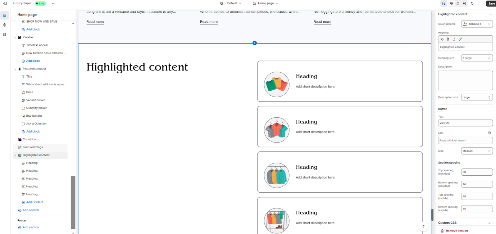
Add the Highlighted Content Section
- Navigate to your Shopify Admin Dashboard.
- Go to Online Store > Themes > Click on Customize.
- In the left-hand sidebar, click Add section.
- Search for Highlighted content and select it.
- The section will now appear on your page. You can rearrange its position by dragging it up or down in the sidebar.
General Settings
- Color Scheme:
- Use the Color scheme dropdown to select a pre-defined style that matches your store's branding.
- Options include your theme’s color presets, e.g., Scheme 1, Scheme 2, etc.
- Heading Style:
- Customize the section title by typing in the Heading field. Example: "Our Top Picks" or "Explore Highlights".
- Description:
- Add a short description below the heading to provide context or call-to-action text.
- Description Size:
- Add a short description below the heading to provide context or call-to-action text.
- Button Settings:
- Add a Button Label (e.g., "View All") and link it to a page, collection, or product.
Content Blocks
The Highlighted Content section supports multiple content blocks. Each block contains an image, title, and description. Follow these steps to add or edit blocks:
- Add Content Block:
- Image: Upload an image or select one from your library. This is the visual anchor for each block.
- Heading: Enter the block’s title. Example: "Stylish Summer Collection".
- Description: Provide a short description that complements the title.
- Enlarged Image: Toggle this option if you want the image to appear larger.
- Button (Optional): Add a button label and link it to a specific page, collection, or product.
- Positioning: Adjust image alignment (left or right).
Rearrange Blocks
- Drag and drop blocks to reorder them.
Remove Block
- Click on a block, then scroll to the bottom and select Remove block.
Section Customization
- Spacing Options:
Adjust the spacing to fine-tune the layout:
- Section Padding Top/Bottom: Controls vertical spacing.
- Content Spacing: Adjusts the gap between items within the section.
- Custom CSS (Optional):
If you're comfortable with code, use the Custom CSS field to further style the section.
Save and Preview
- After making changes, click the Save button in the top-right corner.
- Preview your store to ensure the Highlighted Content section looks as expected.
Tips for Best Results
- High-Quality Images: Use high-resolution images to maintain a professional look.
- Concise Text: Keep headings and descriptions short for better readability.
- Consistent Design: Ensure all blocks follow a similar style for visual harmony.
Feel free to experiment with different layouts and settings to find what works best for your store!
Footer Configuration
The Footer Section in the Desert Shopify theme is designed to enhance your store's functionality and aesthetics, offering several customizable settings. Below is an overview of the available settings and their functionalities.
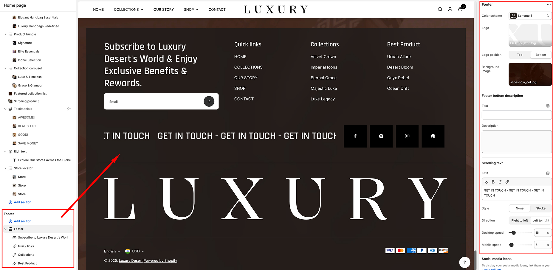
Customization Options
Color Scheme
- Color Scheme:
- Select from predefined color schemes for the footer
- This helps maintain consistency with your store’s branding.
- Logo
- Upload a logo image to be displayed in the footer.
- Supported formats: SVG, PNG, JPG.
- Logo Position: Choose between: Top and Bottom
- Footer Bottom Description
- Text: Enter a short text to display in the footer.
- Description: Add additional details or messages for customers.
- Scrolling Text
- Text Input: Add a marquee-style scrolling message.
- Style Options: None and Stroke
- Direction: Set the scrolling direction: Left to Right & Right to Left
- Scrolling Speed: Desktop Speed & Mobile Speed
- Social Media Icons
- Option to enable social media icons in the footer.
- Icons link to your social media accounts.
- Can be managed via theme settings.
- Currency Selector
- Option to enable a currency selector.
- Allows customers to switch between different currencies.
- Requires configuration in Market Settings.
- Payment Methods
- Toggle to show or hide payment method icons.
- Icons represent available payment methods (e.g., Visa, MasterCard, PayPal)
- Copyright Text
- Enable or disable copyright text in the footer.
- Option to override default copyright text with custom content.
- Supports bold, italic, and links.
- Follow on Shop
- Enable or disable the "Follow on Shop" button.
- Allows customers to follow your store on the Shopify app.
- Requires Shop Pay to be enabled.
- Back to Top Button
- Enable or disable a "Back to Top" button.
- Position Options: Left & Right
- Helps customers navigate to the top of the page quickly.
- Color Settings
- Overlay Color: Set an overlay color for the footer
- Overlay Opacity: Adjust the transparency of the overlay (0% - 100%)
- Section Spacing
- Adjust spacing for the footer section: Top, Bottom
- Controls the amount of space above and below the footer for different devices
- Custom CSS
- Add custom CSS for advanced styling modifications.
- Menu Selection
- Choose an existing menu from your store’s navigation settings
- Style Customization
- Adjust text size and font style to match your theme.
- Customize alignment for better placement within the footer.
- Link Behavior
- Open links in the same tab or a new tab
- Add dropdowns for multi-level menus
- About US
- Contact
- Privacy Policy
- FAQs
- Shipping & Returns
- Newsletter Signup Form:
- Enable or disable email signup.
- Customize placeholder text (e.g., "Enter your email").
- Add a custom success message after signup.
- Logo Display:
- Upload a custom logo
- Adjust logo size and position within the footer
- Building an email subscriber list.
- Keeping customers informed about promotions, new products, or updates.
- Displaying branding elements consistently in the footer.
- Navigate to Online Store > Themes > Customize.
- Scroll down to the Footer section.
- Click Add Block and select either Menu or Newsletter/Logo.
- Configure the settings according to your preferences.
- Click Save to apply changes.
Available Footer Blocks
The Footer section currently supports the following blocks:
Menu Block
The Menu Block allows merchants to display navigational links in the footer. This helps customers find important pages such as policies, contact details, or product categories.
Customization Options
Use Case Examples
Use this block to display useful links such as
Newsletter/Logo Block
The Newsletter/Logo Block provides an option to display a newsletter signup form alongside the store logo. This encourages customers to subscribe to email marketing and
Use Case Example
Adding & Managing Blocks
To add a block to the footer