Global Setting
The Schemes and Header sections in the Desert Shopify theme provide extensive customization options to control the color and appearance of your store. This guide walks you through configuring these settings effectively.
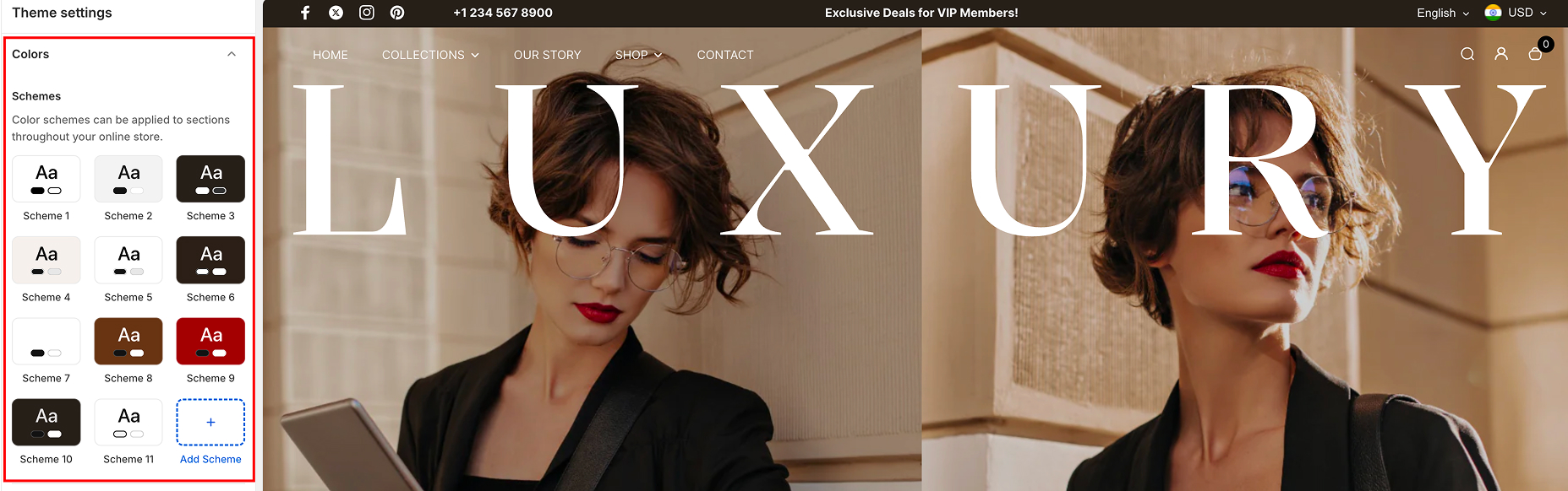
SchemesColor schemes allow you to define consistent styles across various sections of your store. These schemes can be applied to backgrounds, text, buttons, and other elements to ensure a cohesive design.
The Product Badges subsection allows you to configure the text and background colors for product labels.
- Navigate to the Schemes section in your theme editor.
- Choose from the predefined color schemes (e.g., Scheme 1, Scheme 2, etc.) or create a custom scheme.
- To create a new scheme:
- Click on the Add Scheme option.
- Customize the following attributes:
- Background color: Select a color for the section's background.
- Text color: Define the primary text color for this scheme.
- Button color (if applicable): : Choose colors for buttons within this scheme.
- Apply the scheme to specific sections in the theme editor by selecting it from the dropdown.
Header Colors
The Header colors allow you to design the top section of your store, ensuring it aligns with your brand and provides a seamless user experience.
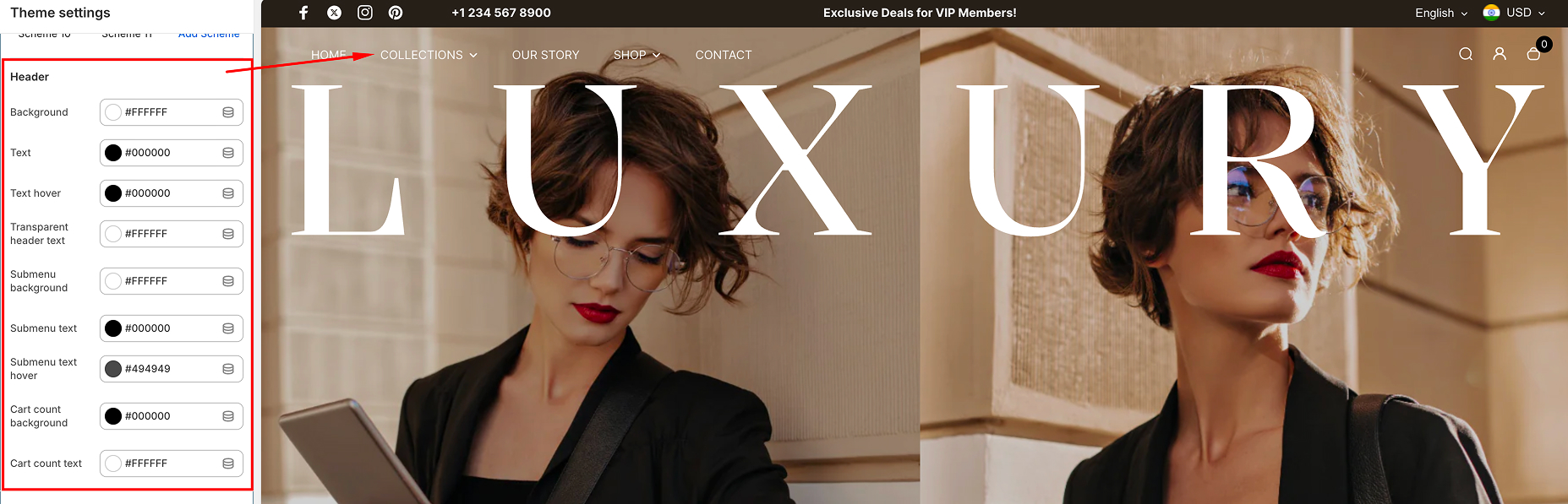
Customizable Options:
- Background: Choose a color for the header background.
- Text: Define the primary text color for menu items and header links.
- Text Hover: Select the hover color for menu items and links to enhance interactivity.
- Transparent Header Text: Adjust the text color for headers with a transparent background (commonly used on homepage sliders or hero sections).
- Submenu Background: Set a background color for dropdown menus or submenus.
- Submenu Text: Choose the text color for items within submenus.
- Submenu Text Hover: Define the hover color for submenu items to create a responsive feel.
- Cart Count Background: Customize the background color for the cart count indicator.
- Cart Count Text: Set the text color for the cart count to ensure visibility.
Typography
Typography settings in the Desert Shopify theme allow you to fine-tune the appearance of text across your store. From headings to body text, these settings enable you to maintain consistency and readability while enhancing the visual appeal of your site.
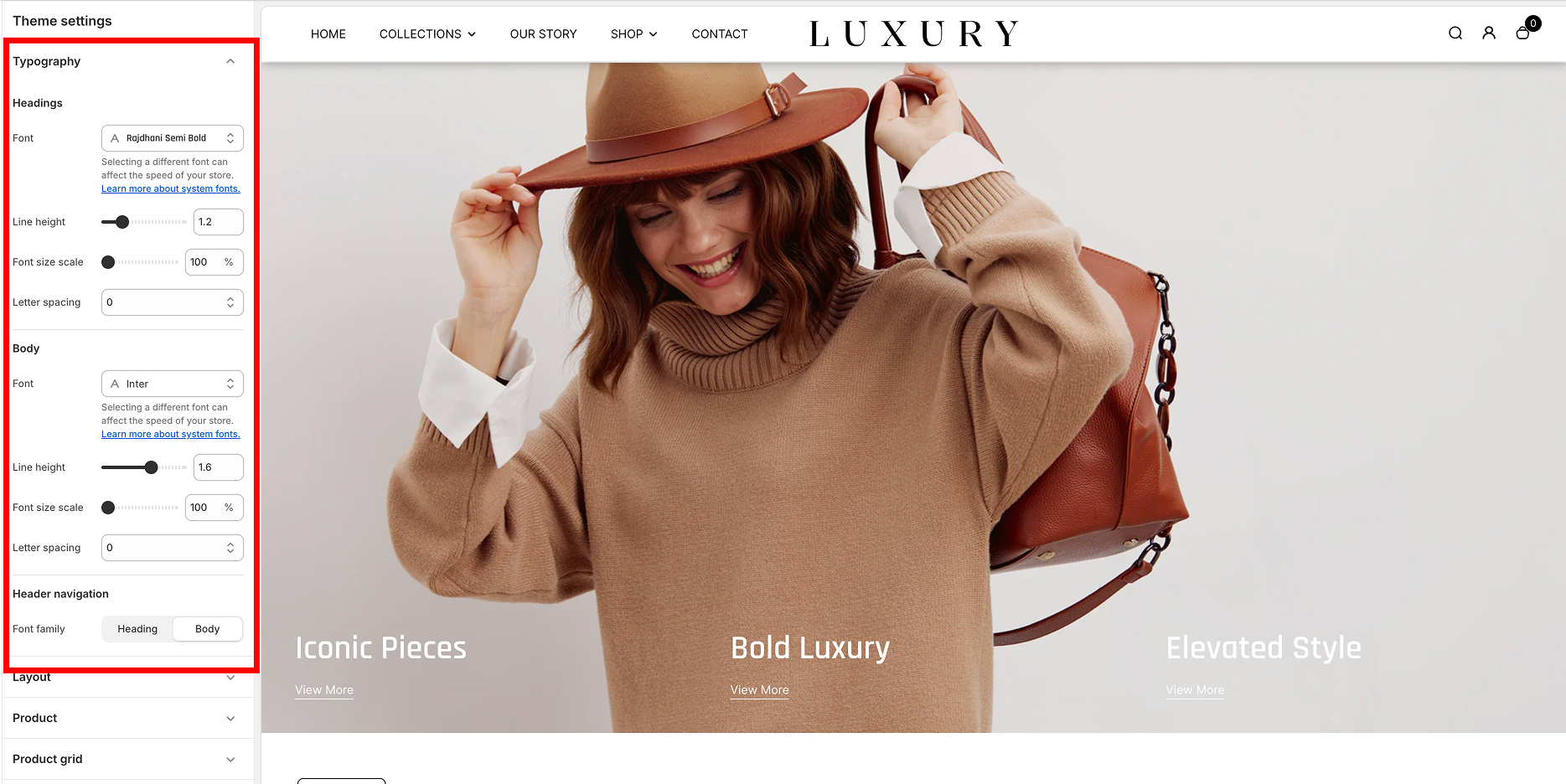
Headings
The Headings settings control the typography of titles and key text elements across your store.
Customizable Options:
- Font:
- Select a font for your headings from the dropdown menu.
- Tip: Choose a bold and distinct font for better visibility.
- Line Height:
- Adjust the spacing between lines of text in headings.
- Example: A setting of 1.2 ensures a compact yet readable format.
- Font Size Scale:
- Scale the size of your headings relative to the default size.
- Example: Setting it to 100% retains the default size.
- Letter Spacing:
- Increase or decrease the space between letters in headings.
- Example: Negative values (e.g., -1) create tighter spacing, while positive values spread letters out.
Body Text
The Body settings affect the primary content text across your store.
Customizable Options:
- Font:
- Choose a font style for the body text.
- Tip: Opt for a simple and legible font like "Inter" for an easy-to-read experience.
- Line Height:
- Set the spacing between lines for body text.
- Example: A setting of 1.6 provides comfortable spacing for paragraphs.
- Font Size Scale:
- Adjust the size of body text relative to the default size.
- Example: Keeping it at 100% ensures text remains balanced with headings.
- Letter Spacing:
- Modify the spacing between letters in body text for better readability.
Header Navigation
The Header Navigation setting determines the font family used for navigation links in your store's header.
Customizable Options:
- Font Family:
- Select whether navigation links adopt the font style of your headings or body text.
Steps to Customize Typography:
- Open the Typography section in your theme editor.
-
Adjust the desired settings for Headings, Body, and Header Navigation:
- Use the sliders for line height and font size scale.
- Select fonts from the dropdown menus.
- Preview the changes to ensure your text aligns with your brand’s style and is easily readable.
Best Practices for Typography Design
- Ensure sufficient contrast between text and background for accessibility.
- Use consistent fonts for headings and body text to create a cohesive look.
- Experiment with line heights and letter spacing to improve readability across devices.
Layout
The Layout section under Theme Settings allows you to control the overall structure and styling of your theme's layout. Below are the available settings:
Container Width
- Adjust the width of the container to suit your design needs.
- Control: Slide toggle.
- Range:
- Minimum Width: 1160px
- Maximum Width: 1920px
Container Padding
- Define the padding inside the container to create spacing around the content.
- Control: Slide toggle to adjust padding as desired.
Styling Options
Customize the style of key elements on your store using the following settings:
Buttons- Choose the shape of buttons used across the theme.
- Options
- Curved
- Rounded
- Square
- Define the style of input fields (e.g., search boxes, forms).
- Options
- Curved
- Rounded
- Square
- Select the corner style for product cards.
- Options
- Curved
- Square
- Customize the shape of blocks used in layouts.
- Options
- Curved
- Square
Product Grid
The Product Grid settings in the Desert theme provide you with powerful customization options to control how products are displayed on your store's collection pages. This feature is designed to enhance both the visual appeal and functionality of your product listings.
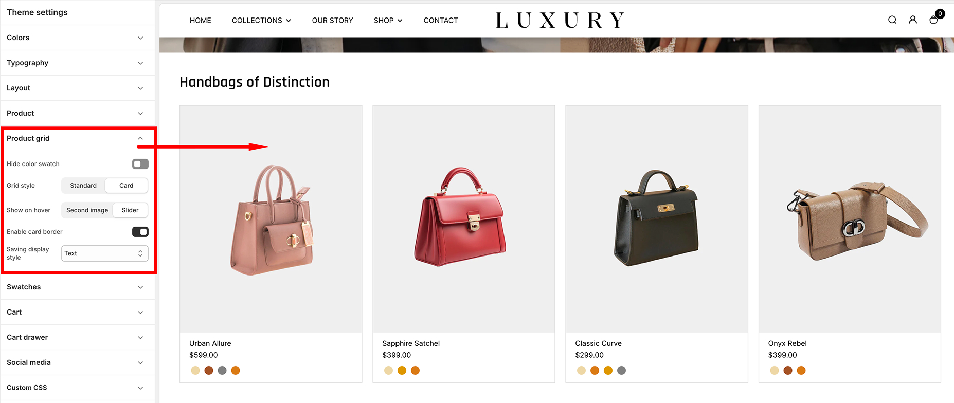
Product Grid Settings Overview
The Product Grid settings can be found in the Theme Editor (Online Store > Themes > Customize) under the "Product grid" section. Below is a detailed explanation of the available options:
Hide Color Swatch
- Toggle Switch: Enables or disables the display of color swatches below the product thumbnails.
- Default Setting: OFF (swatches are visible).
- Purpose: Useful for stores with products that have multiple color variants. When enabled, the color swatch options will not be shown.
- Size Options Name: The option that represents the product size.
Grid Style
- Options:
- Standard: Displays products in a classic grid format with a simple, clean design.
- Card: Wraps each product in a "card" style, providing a visually distinct layout with borders and shadowing.
How to Use:
- Switch between Standard and Card styles to determine the aesthetic of the product grid.
- The Card style works well for a more modern, distinctive design, while the Standard style is ideal for minimalist themes.
Swatches
The Swatches Settings in the Desert theme allow you to enhance the variant selection experience by displaying color or image-based swatches instead of traditional dropdowns.
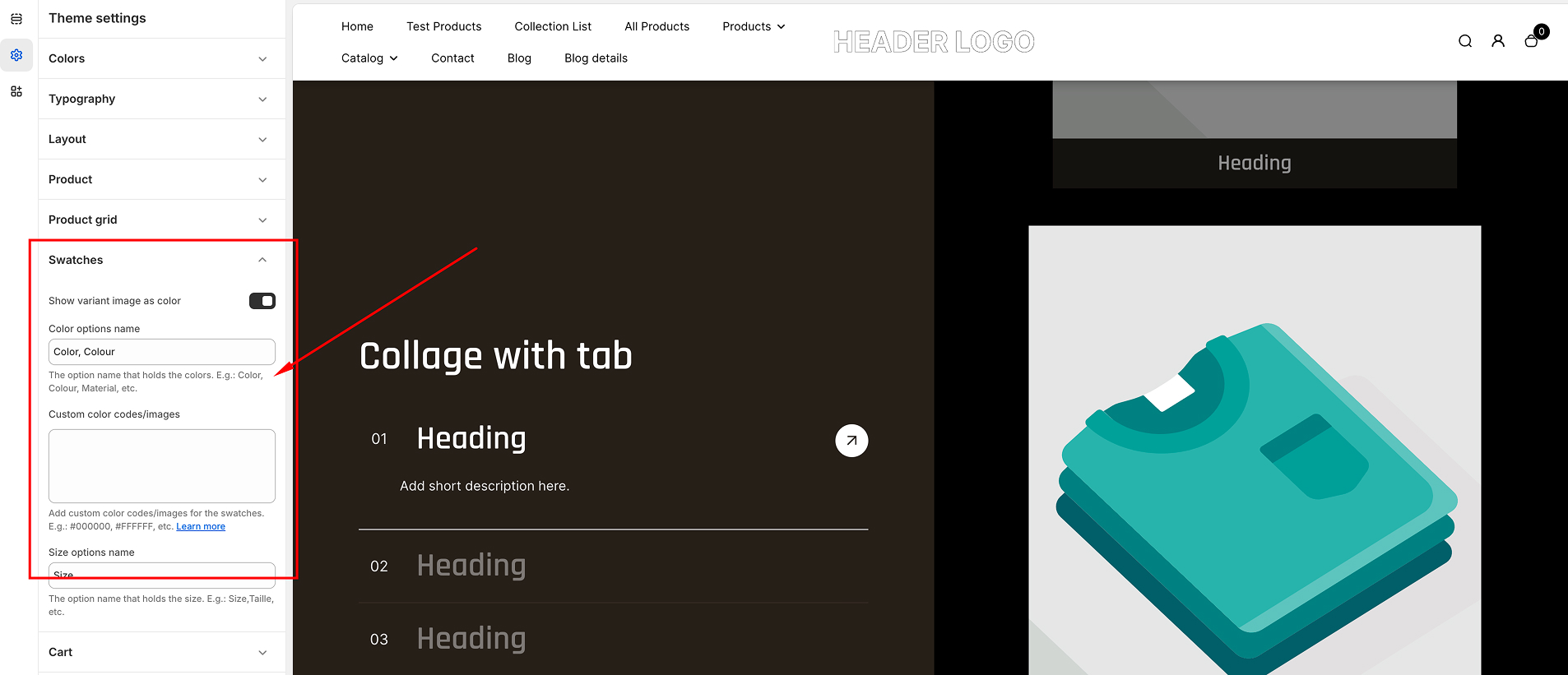
Show Variant Image as Color
- Toggle Switch: Toggle this option ON to automatically use the variant image as the swatch color.
- Default Setting: If disabled, the custom color codes or images provided will be used instead.
Color Options Name
- Enter the name of the product option that represents colors.
- Example: Color, Colour, Material, etc.
- This ensures the theme correctly identifies and applies swatches to color variants.
Custom Color Codes/Images
- Define custom colors by assigning a hex code to each variant.
- Format: Variant Name: #HexCode
- Example:
- Gold: #FF8975
- Bronze: #95C2FF
- Beige: #7ADDBF
- Black: #000000
- Gray: #AA5516
- If a variant does not match a defined color, a default color or text label will be used.
Size Options Name
- Enter the name of the product option that represents sizes.
- Example: Size, Taille, etc.
- This helps in correctly displaying text-based size swatches.
How It Works
- If Show Variant Image as Color is enabled, the variant image will be used instead of the defined hex colors.
- The swatches will replace the traditional dropdown selection, improving user experience and making it visually appealing.
This feature ensures a seamless, intuitive, and visually appealing variant selection process for your customers.
Social media icons
The Social Media settings in the Desert Shopify theme provide a simple way to integrate your social media profiles with your online store. These settings allow you to add links to your social media accounts, which can be displayed in various areas of your storefront, such as the footer or header, depending on your theme configuration.
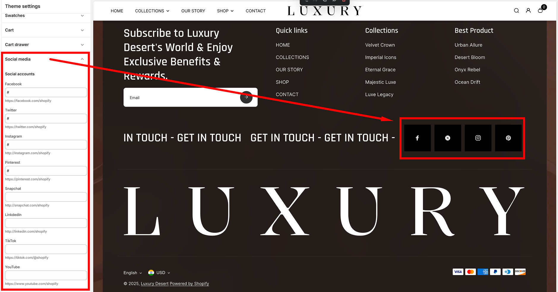
Social Media Settings Overview
The Social Media section is accessible in the Theme Editor (Online Store > Themes > Customize) under the "Social media" panel. Here, you can input the URLs of your social media accounts for quick and easy linking.
Supported Social Media Platforms
The Desert theme supports links to the following popular social media platforms:
- Facebook:
- Input your Facebook page URL (e.g., https://facebook.com/yourpage).
- Default: # (placeholder, no link).
- Twitter:
- Input your Twitter page URL (e.g., https://twitter.com/yourhandle).
- Default: # (placeholder, no link).
- Instagram:
- Input your Instagram page URL (e.g., https://instagram.com/yourhandle).
- Default: # (placeholder, no link).
- Pinterest:
- Input your Pinterest page URL (e.g., https://pinterest.com/yourprofile).
- Default: # (placeholder, no link).
- Snapchat:
- Input your Snapchat page URL (e.g., https://snapchat.com/add/yourhandle).
- Default: # (placeholder, no link).
- LinkedIn:
- Input your LinkedIn page URL (e.g., https://linkedin.com/in/yourprofile).
- Default: # (placeholder, no link).
- TikTok:
- Input your TikTok page URL (e.g., https://tiktok.com/@yourhandle).
- Default: # (placeholder, no link).
- YouTube:
- Input your YouTube page URL (e.g., https://youtube.com/channel/yourchannelID).
- Default: # (placeholder, no link).
How to Configure
- Go to your Shopify Admin Dashboard.
- Navigate to Online Store > Themes and click Customize on the Desert theme.
- In the theme editor, locate the Social media section.
- Enter the full URL for each social media platform you want to link to.
- Leave the fields blank or with the # symbol if you don't want to display a link for that platform.
- Save your changes.
Cart Drawer
These settings allow you to customize how the cart behaves and looks in your store. Adjust features like upselling, shipping estimates, gift wrapping, and more to enhance the customer shopping experience.
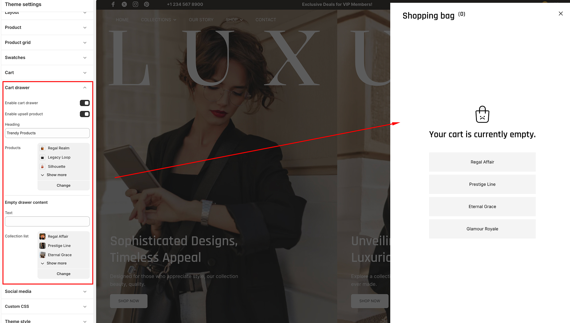
Cart Drawer
The Cart Drawer is a sliding cart panel that appears when a customer adds an item to their cart. It enables customers to quickly view and edit their cart without leaving the current page.
- Enable Cart Drawer:
- Toggle this option to activate or deactivate the sliding cart drawer.
- When disabled, customers will be directed to the standard cart page.
- Enable Upsell Product:
- Show additional products in the cart drawer to encourage upsells.
- Select upsell products using the Select Products button.
- Heading:
- Enter a custom heading for the cart drawer.
- Example: “Your Cart” or “Review Your Items.”
- Products:
- Use the Select Products button to add specific items to the upsell section.
- Example: “Your Cart” or “Review Your Items.”
- Empty Drawer Content:
- Text: Customize the message displayed when the cart drawer is empty.
- Example: “Your cart is empty. Start shopping now!”
- Collection List: Display a list of collections for customers to browse and add products.
Cart
The Cart settings control additional features like notes, shipping estimates, and gift-wrapping options, adding value to the cart experience.
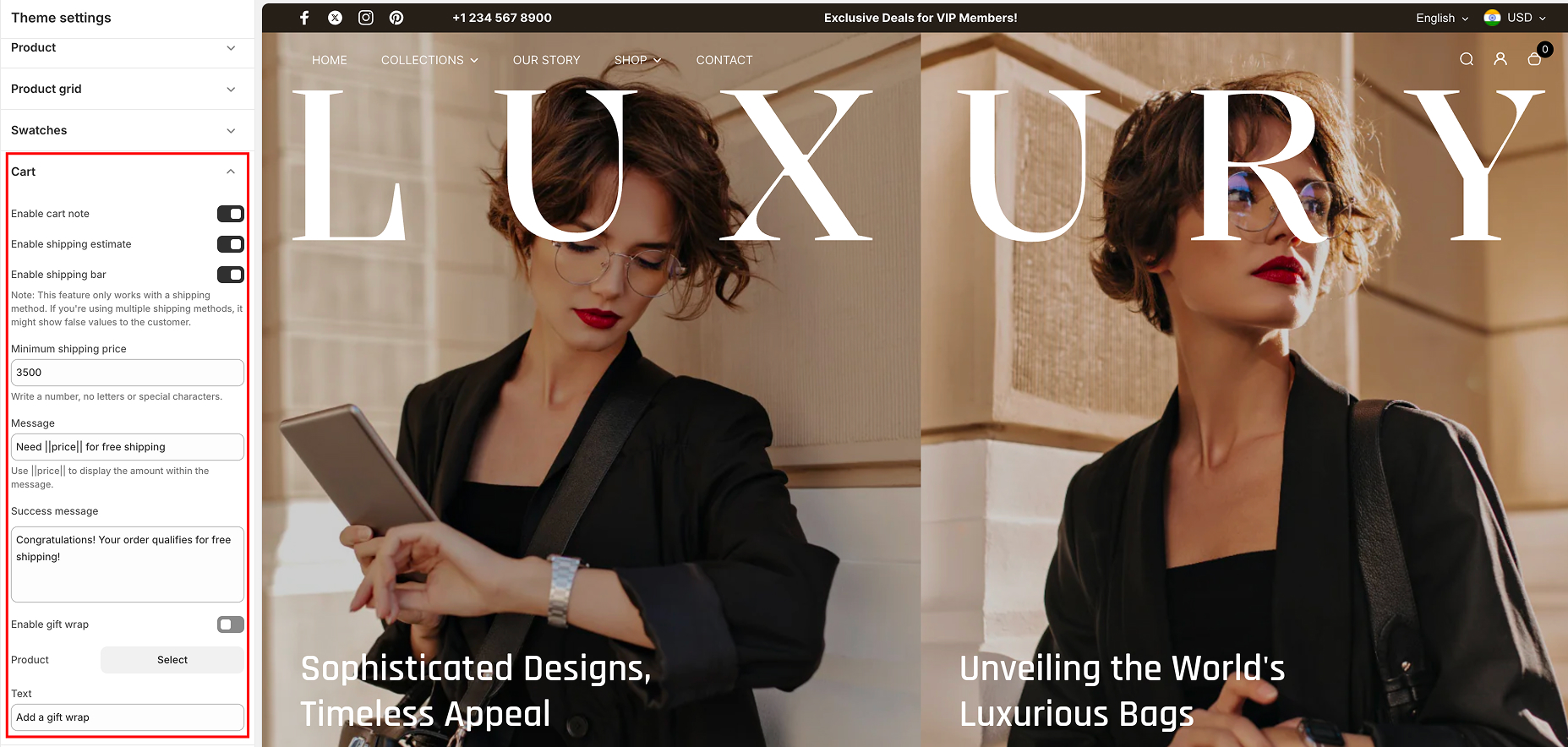
Customizable Options
- Enable Cart Note:
- Allow customers to add special instructions or notes to their order.
- Enable Shipping Estimate:
- Display an estimated shipping cost in the cart.
- Note: This works only if a shipping method is configured. Avoid using this feature with multiple shipping methods, as it might display incorrect values.
- Enable Shipping Bar:
- Display a progress bar encouraging customers to reach a minimum order value for free shipping.
- Minimum Shipping Price:
- Set the target amount for the shipping bar.
- Enter only numbers (no letters or special characters).
- Products:
- Use the Select Products button to add specific items to the upsell section.
- Example: “Your Cart” or “Review Your Items.”
- Message:
- Customize the message to display under the shipping bar.
- Use ||price|| to dynamically show the remaining amount customers need to qualify for free shipping.
- Example: “Add $||price|| more to get free shipping!”
- Success Message:
- Enter a custom message displayed when the free shipping goal is achieved.
- Example: “Congratulations! You qualify for free shipping!”
- Enable Gift Wrap:
- Allow customers to add gift wrapping to their order.
- Product:
- Use the Select Product button to assign a gift-wrap product.
- Text:
- Customize the message displayed for the gift-wrap option.
- Example: “Add a gift wrap for $5.”
Steps to Customize the Cart Drawer and Cart:
- Navigate to the Cart Drawer or Cart sections in your theme editor.
- Toggle the features you want to enable or disable.
- Customize fields such as headings, messages, and products using the respective input boxes and buttons.
- Save your changes and preview the updates to ensure the cart functions as desired.